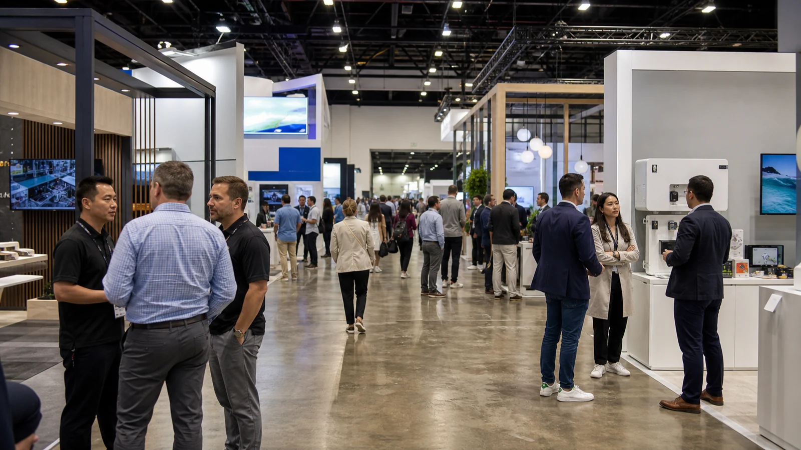
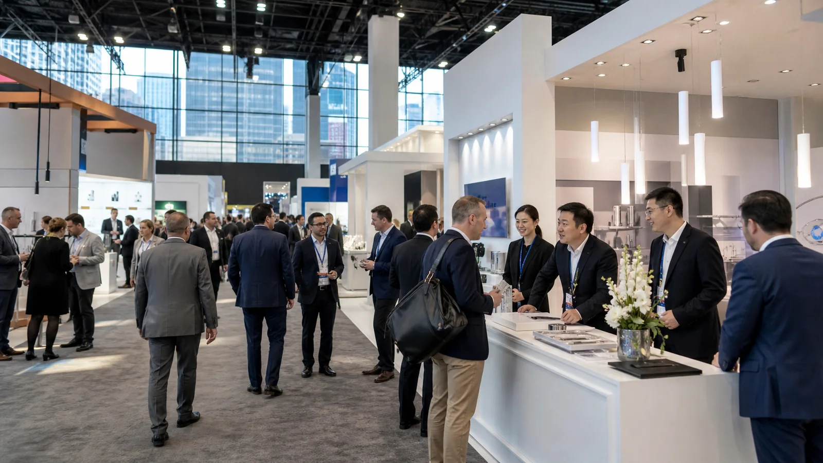
An inline booth gives you one front edge, a shallow space, and only a few seconds to show the right visitor why they should stop. The usual mistake is to fill the back wall with every product and use the remaining floor for furniture. The booth then contains plenty of information but leaves no clear place for a conversation.
If you are planning a 10×10 or 10×20 inline exhibit, start with the visitor’s path. Decide what they should understand from the aisle, what they should do after they step in, and what can stay out of the booth.
This article focuses on the limits created by one open side. For a complete small-footprint planning process, including real layout examples, use the 10×10 trade show booth design guide.
Confirm the Rules for Your Exact Booth
Inline, or linear, booths normally sit between neighboring exhibits and open to one aisle. IAEE’s display guidelines describe 10-foot increments as a common U.S. convention and show how line-of-sight rules may limit tall materials near the aisle. These are reference guidelines, not your show contract. For a booked 10 × 30 linear space, use the 10×30 trade show booth rental page to compare the longer front-facing layout with your show rules.
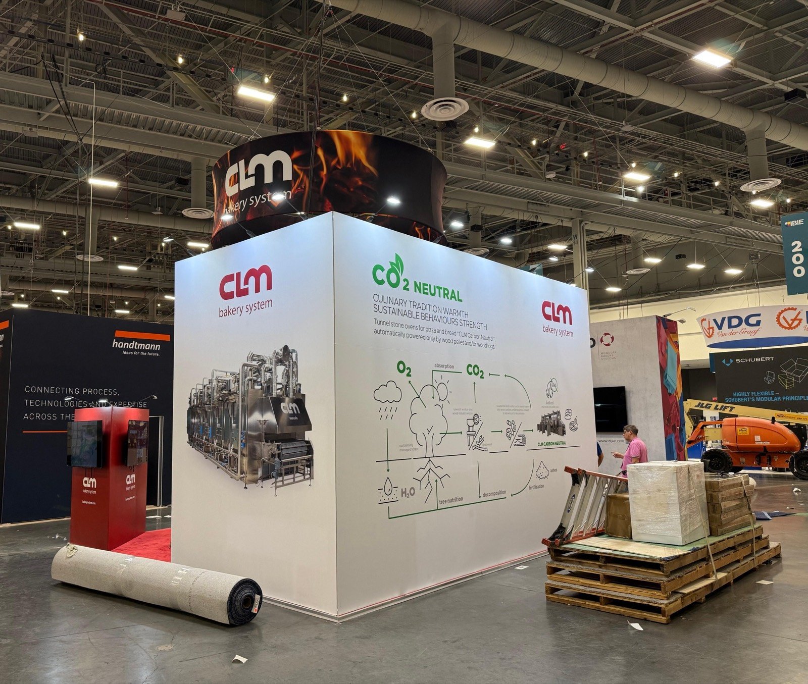
Use the current exhibitor manual and your assigned booth orientation to confirm back-wall height, side-wall limits, flooring, lighting, product projections, sound, storage, and whether an extended header or other feature needs approval. A 10×20 booth is wider than a 10×10, but it may still be governed by the same linear-booth sightline logic. Check 10×20 trade show booth rental options against the current height, sightline and utility rules before choosing an extended layout.
Give the Back Wall One Job
The back wall is the surface most people will see. Its first job is not to explain your company history. It is to help a qualified visitor answer three questions while walking: For an inline booth that needs one clear brand wall and a compact product presentation, compare a trade show backwall display before adding freestanding structure.
- Is this relevant to my work?
- What is different or useful here?
- Where should I look next?
Use one short category-and-benefit message at the highest useful reading position. Place proof, product detail, and supporting graphics lower or closer to the product they explain. A wall that treats the logo, headline, six product families, certification icons, QR code, website, and contact details as equally important gives the visitor no starting point. The trade show booth graphics guide explains how to match the headline, proof, and supporting detail to viewing distance. For approved wall artwork and print production, review trade show graphics after the reading order and viewing distances are set.
Before approving artwork, print the main message at scale or project it onto a wall. Step back to the distance of the aisle and walk past it. If you must stop and study the layout, the message is doing the salesperson’s job badly.
Keep the Front Open for the First Conversation
Do not put a counter across the full front edge simply because it came with the booth package. A solid counter can become a barrier between staff and visitors, especially in a 10×10 space.
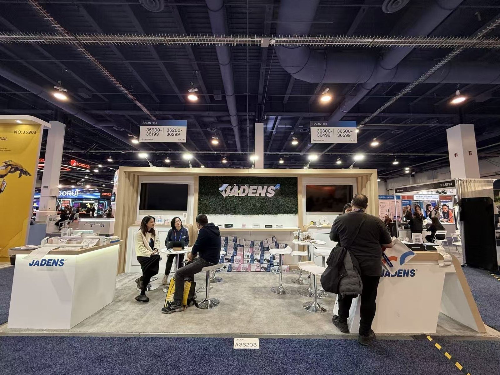
Keep at least one natural entry point open. Move the reception surface to one side or use a narrow movable counter. Staff should be able to greet from inside the booth without standing in the aisle. The first step into the space should lead to the main product, sample, or discussion—not to the back of a chair.
In a 10×20, width gives you the option to create two actions, such as a quick demonstration and a short standing conversation. It does not automatically justify two complete messages. Both actions should still support the same reason for stopping.
Show Fewer Products, With More Proof
Choose products according to the visitor and the conversation you want. If six items solve the same problem, displaying all six may make the differences harder to understand. One working unit, one cutaway, or a small set of compared samples can create a better discussion than a shelf full of options.
For each product in the booth, ask:
- What question should this product answer?
- Can the visitor see the answer without a long explanation?
- What proof supports the claim?
- What happens after the person shows interest?
If an item has no job in the conversation, leave it in a digital catalog or bring it only for scheduled meetings.
Plan Storage Before Adding Furniture
Inline booths collect more material than their floor plans admit: staff bags, coats, water, cleaning items, literature, giveaway stock, packaging, tools, and lead devices. If you do not assign a place for them, they appear under tables or behind the drape.
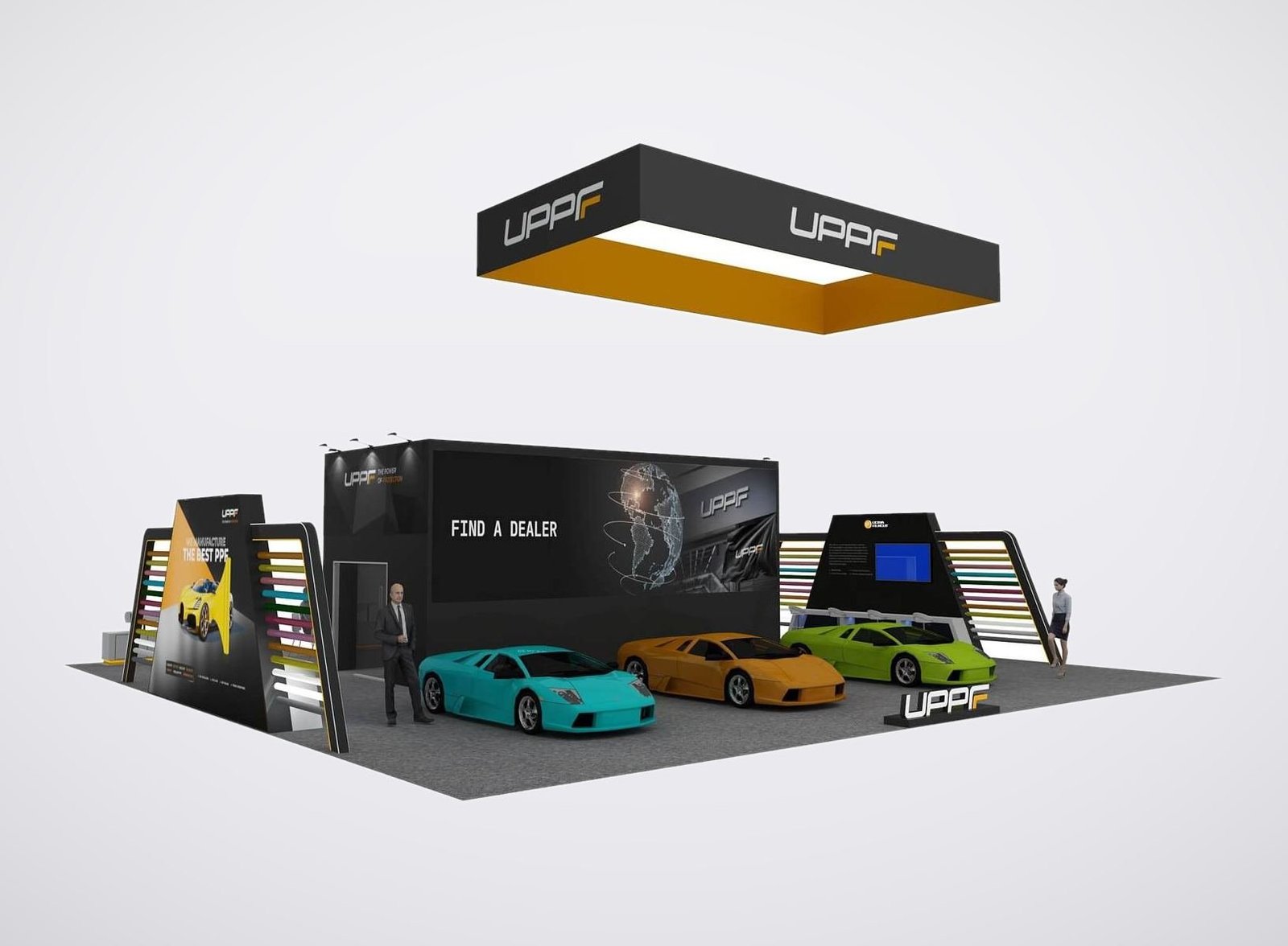
Use lockable storage inside a counter or a shallow cabinet that fits the approved wall zone. Keep only the amount needed for the day in the booth, and confirm fire and access rules before planning any concealed storage. Empty cartons and packing materials normally follow the show’s empty-container process rather than staying behind the back wall.
Every chair, table, screen stand, and cabinet needs a clear use. A chair that is rarely used but constantly blocks movement creates a traffic problem rather than a better visitor experience.
Choose a Meeting Style the Space Can Support
A 10×10 is usually better for quick standing conversations than for a private seated meeting. If privacy is important, schedule serious meetings elsewhere or choose a larger configuration rather than pretending a small café table is confidential.
For a 10×20, a small semi-private conversation area may work if it does not block the product or entry. Test the plan with the actual number of staff and visitors. Drawings show furniture; a rehearsal shows shoulders, bags, stools, queues, and the person trying to leave.
Treat Lighting and Screens as Attention Tools
Light the product and message, not the entire booth at the same intensity. Confirm who supplies fixtures, how power reaches them, and what the current show permits. Keep cables and power strips out of the visitor path.
A screen should support a visible task: show a process that cannot run onsite, enlarge a small detail, compare results, or guide a discussion. Do not mount a screen just to play a silent corporate reel. If the screen fails, the product and message should still make sense.
Review the Booth From the Aisle, Then From Inside
Run two separate checks before production.
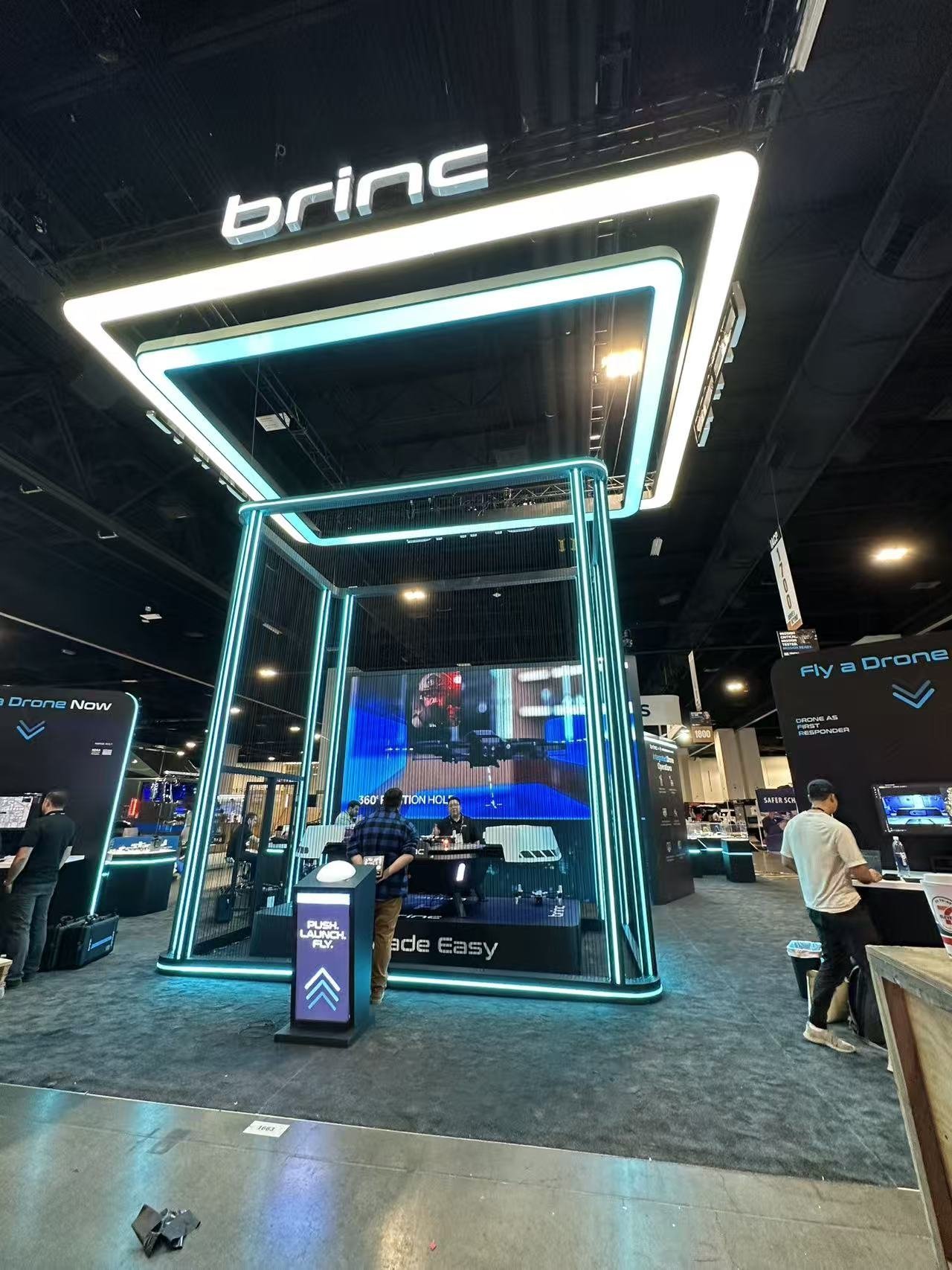
From the aisle, confirm that the category, main benefit, product, and entry are easy to identify and that neighboring booths will not hide the message. From inside, confirm staff positions, product access, storage, power, lead capture, and a clean route back to the aisle.
The most useful inline booth is not the one that uses every square inch. It is the one that lets the right visitor enter, understand, talk, and leave without friction.
Frequently Asked Questions
What should you do if a neighboring booth may block the side view?
Check the floor plan from both aisle directions before artwork is final. Keep the most important message where it can still be seen from the open front, and do not rely on a side-facing graphic as the only explanation of the booth. If the neighbor’s approved height is uncertain, ask the organizer rather than designing around an empty space in a rendering.
Is a corner booth planned the same way as an inline booth?
It normally follows the show’s linear-booth rules, but the second open aisle changes how people see and enter the space. Decide which side carries the main message and keep both entry paths clear. Do not simply rotate an inline layout and assume the corner exposure will take care of itself.
How many staff should work in a 10×10 booth?
There is no universal number. Test the space with the products and furniture in place, then count the working positions the layout actually supports. If adding another person pushes staff into the aisle or blocks a visitor’s route, use a rotation schedule instead of putting the full team inside at once.
Can products or furniture extend into the aisle?
Do not plan on it. Keep products, furniture, demonstrations, and staff inside the contracted footprint unless the current show has approved a separate area. An item that looks harmless in a drawing can still obstruct circulation or violate the event’s display rules.
Before You Approve the Inline Layout
An inline booth cannot win by containing more. It wins by making one open side easy to understand and easy to enter.
Give the back wall one main message, protect the front conversation space, bring only the products that create proof, and make storage invisible but accessible. If the plan still feels crowded, remove the weakest function before making every function smaller.