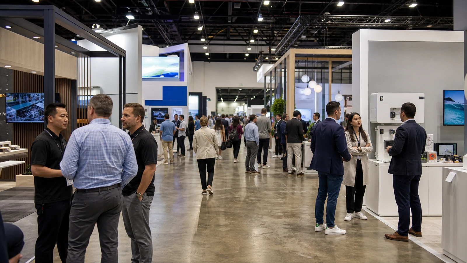
Most booth graphics are approved on a laptop by people who already know the company. The trade show visitor sees them while walking, from an angle, among competing signs, without the background knowledge that made the layout seem obvious in the review meeting.
If you are approving booth graphics, judge them in the order a stranger will see them: category, relevance, proof, and next action. Then prepare the artwork so the print team can reproduce what you approved.
Write the Aisle Message Before Designing the Wall
Start with one sentence a qualified visitor should understand without staff help. It should name the product category or problem clearly enough to create recognition, then give a reason to look closer.

Avoid headlines that could belong to any exhibitor: “Innovating the Future,” “Your Trusted Partner,” or “Solutions Without Limits.” They sound positive but force the visitor to search for the actual offer.
Use a hierarchy:
- Aisle message: category and primary value.
- Stopping proof: product, result, image, demonstration, or specific capability.
- Conversation detail: supporting claims and comparisons staff can explain.
- Follow-up information: QR code, contact path, or material used after interest exists.
Do not give all four levels the same size and contrast.
Match Content to Viewing Distance
A high fascia or hanging sign is for identification, not a product specification sheet. A back wall can carry a short claim and strong image. A counter graphic is viewed closer and can support a specific action. For suspended identification, the trade show hanging sign guide covers distance, orientation, rigging, and approval questions.
For every surface, record the main viewing direction, nearest and farthest useful distance, expected obstruction, and time available to read. Then test the design at approximate finished size and distance. If the message works only when enlarged on screen, it is not ready.
Keep important copy away from seams, hardware, cabinet doors, monitor mounts, product edges, and places where staff will stand. Check the actual elevation, not an isolated artwork rectangle.
Use Images as Evidence
A large image should help the visitor understand the product, application, scale, result, or customer situation. Generic factories, city skylines, handshakes, and abstract technology backgrounds use valuable space without proving the offer.

Choose images that remain clear at distance. A close view of the relevant product action may work better than a wide photograph containing many small objects. If scale matters, show it honestly with a recognizable reference or dimension.
Do not use a rendering that implies a feature the delivered product does not have. Graphics are part of the sales promise, even when the fine print is elsewhere.
Make Claims Easy to Defend
Replace broad superlatives with bounded proof. “Fastest,” “best,” “leading,” and “most advanced” require strong support and still may not tell a buyer what changes in their operation.
Useful proof can be a measured result with conditions, a visible construction detail, a before-and-after comparison, a recognized certification that applies to the shown product, or a process the visitor can inspect. Put the condition close enough that the claim is not misleading.
If the booth team cannot explain where a number came from, do not make it the largest sentence on the wall.
Build the File From the Final Production Specification
Ask the producer for the exact finished size, visible area, bleed, safe area, scale, resolution, color mode, accepted file type, linked-file requirement, font treatment, contour-cut path, panel split, material, and submission method.

Freeman’s current graphics guidance emphasizes resolution, viewing distance, file packaging, and submission. Exact specifications vary by product and producer, so use the project’s current template rather than copying a number from another graphic.
Create an artwork map with one identifier per surface, such as G01-Back-Wall-Center or G07-Counter-Front. The same identifier should appear on the elevation, file name, proof, packing list, and installation note.
Control Color and Proofs
Screens emit light; printed materials reflect it. Brand color can shift with material, ink, lighting, and the profile used by the producer. Provide current brand values and identify which colors are critical.
For important colors, ask what proof method is available and what the proof does or does not represent. A small proof may verify color and content but not reveal whether type is readable across the aisle.
Approve three things separately:
- content and spelling;
- scale, crop, panel breaks, and placement;
- color and material expectation.
Record the approved proof and revision. “Looks good” in a chat is not enough when several files have similar names.
Inspect Graphics Before and After Installation
If possible, inspect production before freight closes: finished dimensions, image quality, color, edge finishing, mounting hardware, labels, and damage. Roll or pack graphics in the direction and method specified by the producer.

Onsite, compare each installed graphic with the elevation. Check orientation, sequence, seams, wrinkles, damage, sightline, lighting, and whether a product or screen hides key words. Photograph the completed view from the actual aisle. Screen-based content has separate playback and viewing requirements covered in the trade show AV planning guide.
Keep a correction file that can be printed locally if a critical factual error appears. It will not rescue every large graphic, but it can prevent the team from covering a mistake with improvised paper.
Frequently Asked Questions
What if a product name or claim changes after the files are approved?
Stop only the affected files, identify every surface and language version that contains the old wording, and issue a new proof with a new revision number. Recheck QR destinations and digital screens too. A corrected wall beside an outdated counter still gives the visitor two answers.
Can graphics be reused in a different booth size?
Sometimes, but check the new visible area, panel breaks, crop, hardware, sightline, and finished scale before approving reuse. A file that prints cleanly can still put the headline behind a monitor or cut a product image across a new seam.
Which graphics are reasonable to print locally near the show?
Small corrections and simple low-risk signs may be practical locally when the material, finish, color expectation, dimensions, and delivery time are confirmed. Critical brand-color panels, matched sets, and large fitted graphics are safer after a controlled proof and pre-show fit check.
What if an installed product or screen hides a key message?
First confirm whether the object can be moved without violating the approved plan, utilities, or safety clearances. If it cannot, use an approved secondary surface or a properly produced correction graphic. Do not cover the problem with an unbranded paper sign unless it is a true emergency.
Final Artwork and Installation Check
Before release, check the message, evidence, spelling, finished size, crop, panel breaks, material, color expectation, surface ID, and approved revision. After installation, stand in the aisle and confirm that the correct message appears on the correct surface at a readable distance. The screen mockup is only an approval view; the installed graphic is what the visitor must understand.