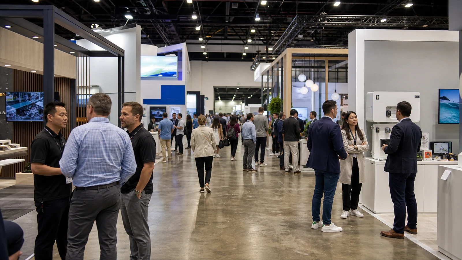
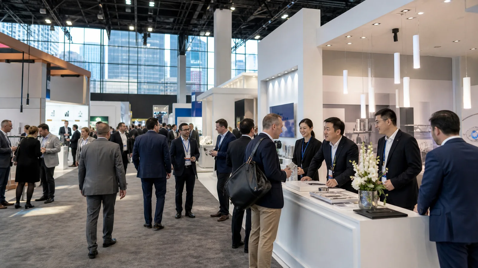
A 10×20 trade show booth gives you 200 square feet, but the 10-foot depth makes placement more important than feature count. A counter that is only two feet too far forward can turn the entrance into a barrier. A demo that looks spacious in an empty rendering can send its audience into the aisle once the show opens.
The six layout ideas below show where products, demos, conversations, screens, samples, storage, and staff roles can work inside the footprint. Use them as starting points, then test the selected concept against your assigned open sides, real exhibits, budget, reuse plan, and current show rules.
Quick Answer
Before approving one, mark the actual aisle sides, place staff and stopped visitors in the plan, assign storage and service access, and compare the full project cost—not only the structure or rental price.
Start With the Visitor Job and the Assigned Open Sides
Do not select a concept from a front-facing rendering alone. Start with what you want visitors to do and how they will actually approach the booth.
Choose the first useful visitor action
Finish this sentence: “The first useful thing a visitor should do here is…”
- see and understand one flagship product or offer;
- compare a product range, material set, or configuration;
- watch a live demonstration;
- explore a technical story with staff guidance;
- handle or test samples;
- move from visible proof into a short qualification conversation.
Keep one action primary. You can add one compatible supporting action when it happens in another position or at another stage. If two activities need the same screen, staff route, and stopping area, they will compete when the booth is occupied.
Mark the real approaches and show constraints
A 10×20 measurement describes the footprint, not the complete booth condition. The IAEE Guidelines for Display Rules and Regulations distinguish linear, corner, end-cap, and other configurations. Your current exhibitor manual, floor plan, and organizer approvals control the actual project.
Annotate the official floor plan before reviewing a concept:
- booth number, dimensions, and every confirmed open aisle side;
- the most likely visitor approaches;
- neighboring booths, walls, columns, and service areas;
- product doors, operating clearances, and staff access;
- current conditions affecting walls, headers, lighting, rigging, power, fire review, and accessibility.
This one-page check prevents you from approving a beautiful view that faces the wrong approach or depends on an unconfirmed wall or opening.
Six 10×20 Trade Show Booth Layout Ideas
These concepts use the 20-foot edge as one visual story. The staffing notes describe functional positions, not a required headcount. Your product size, demo duration, meeting format, and event conditions determine the final operating plan.
The diagrams and renderings are conceptual illustrations, not delivered project case studies. The current organizer floor plan and exhibitor manual control your real project.
1. Open Product Display Layout
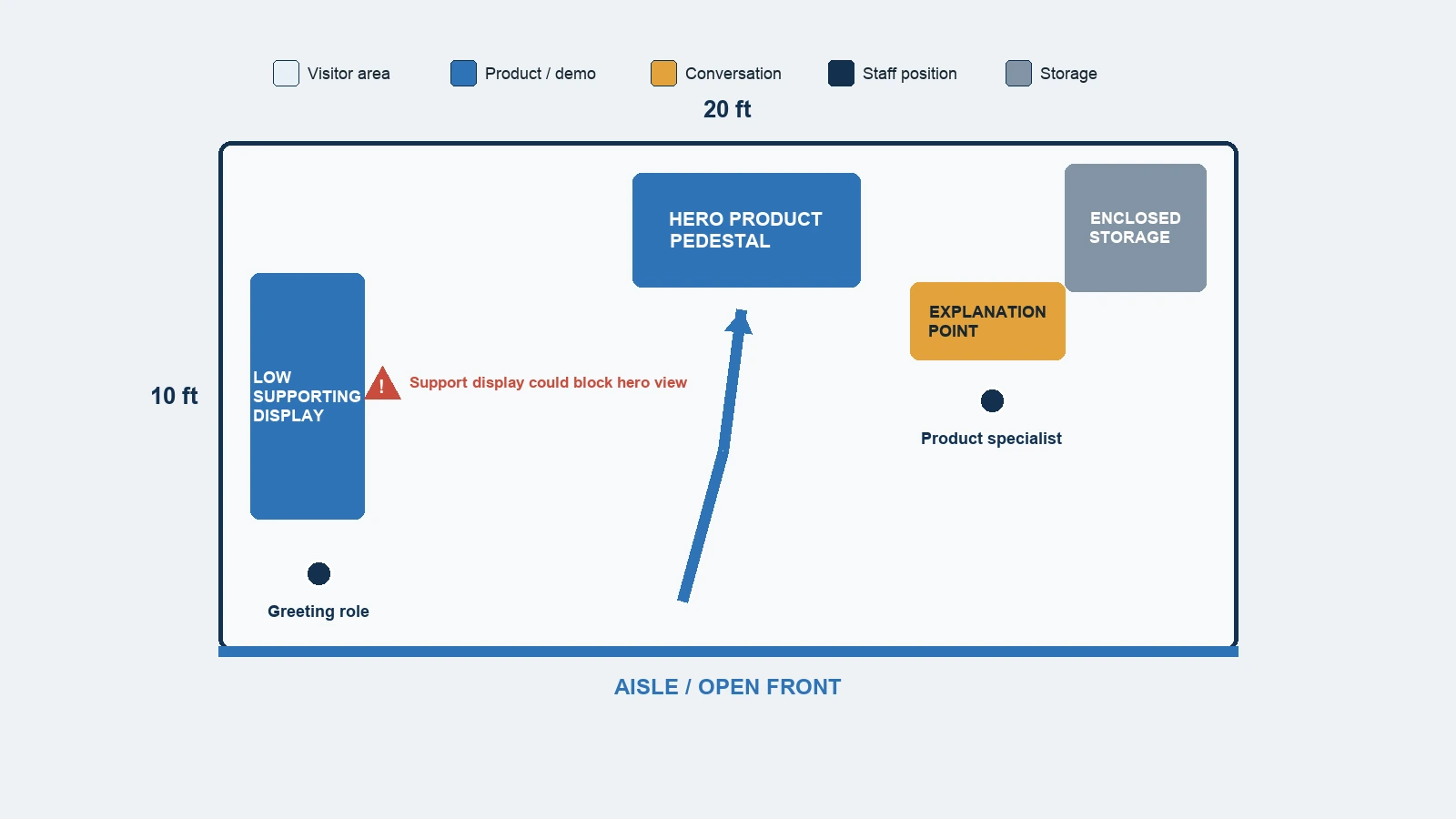
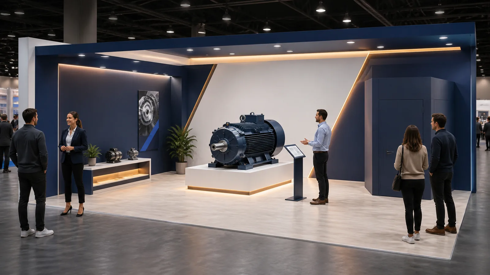
Place one hero product or pedestal near the back center, where it stays visible above an open foreground. Use one side for a low supporting display and put the explanation point beside the hero rather than directly in front of it. This gives a passerby a clear first view and lets a product specialist step into the explanation without becoming the visual subject.
Keep the secondary display genuinely secondary. If it needs its own headline, screen, and counter, the booth no longer has one hero story.
Best for: Helping visitors understand one flagship product, application, or offer quickly.
Example staffing positions: A greeting or consultation role near an open side; a product specialist beside the hero display.
Storage position: An enclosed rear-corner cabinet or integrated counter with staff-side access.
Main traffic-flow risk: Staff or supporting displays cover the product from the main approach. Move the explanation point sideways and lower or simplify anything in the foreground.
2. Demo-Focused Layout
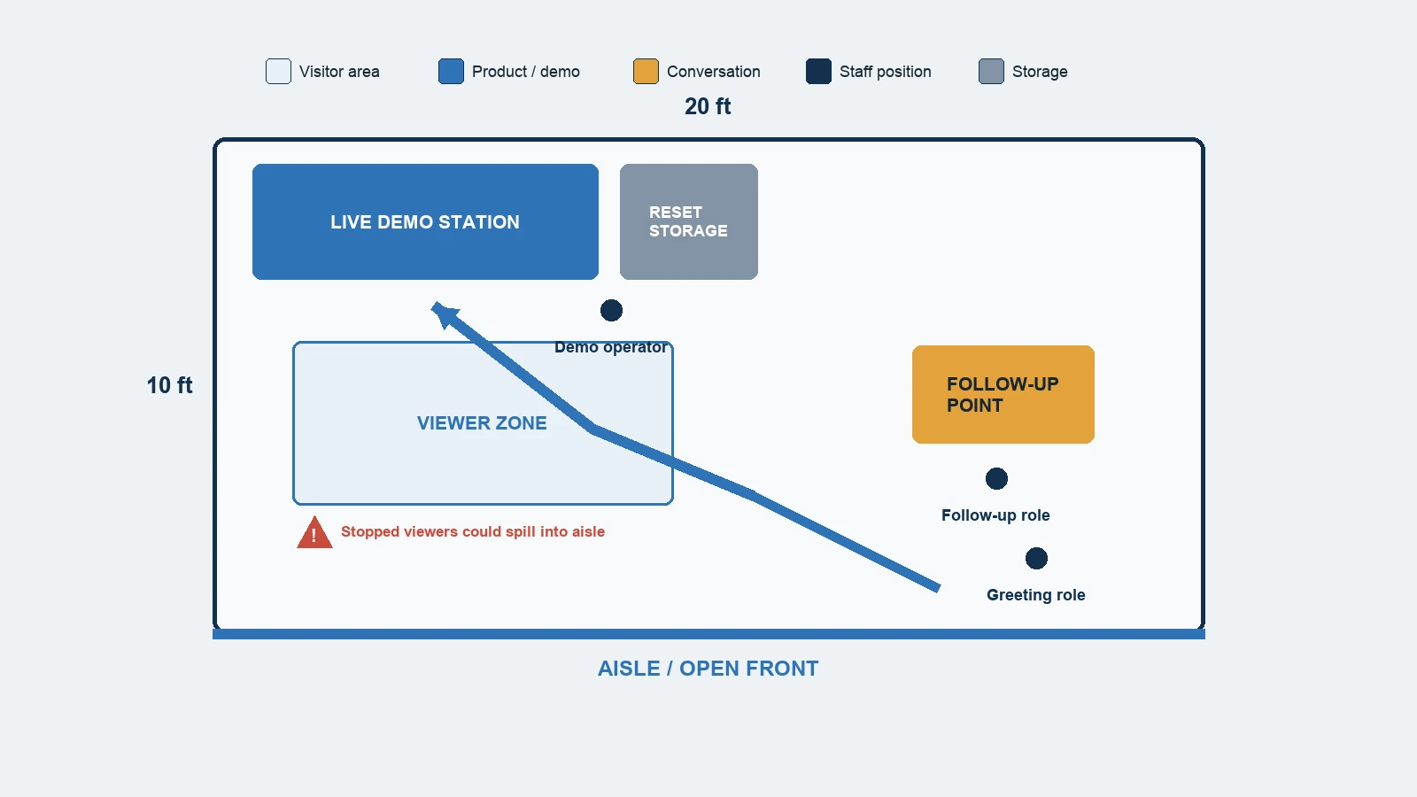
Put the demo station against the back or one side, not in the middle of the entrance. Mark a viewing zone inside the footprint and place the follow-up point on the opposite side of the audience line. The operator needs direct access to controls, consumables, and reset materials without walking through the viewers.
Review the busiest planned moment, not the empty booth. If a small group cannot stop without extending into the aisle, rotate the demo, shorten the presentation, reduce furniture, or schedule demonstrations rather than hoping traffic will organize itself.
Best for: Showing visible proof through a live product, process, or equipment demonstration.
Example staffing positions: Demo operator at the equipment; greeting role at the outer side; follow-up role beyond the viewer line.
Storage position: Close to the operator’s reset route but behind the visible demo face.
Main traffic-flow risk: Stopped viewers block the entry or spill into the aisle. Move the viewing line deeper inside and keep the next-conversation point out of that line.
3. Product Wall Layout
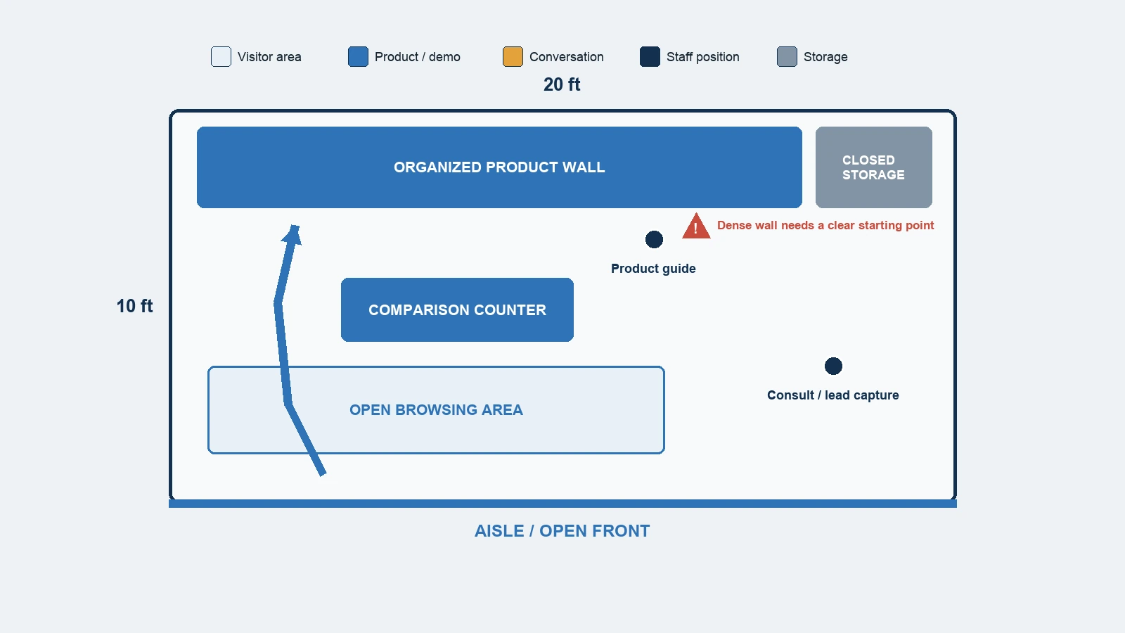
Use the back wall for an organized product story and keep the front open for browsing. Arrange products by a useful decision logic—application, product family, material, performance question, or selection step—not by the order in your catalog. An off-center comparison counter gives staff a place to handle products without building a reception barrier across the entrance.
Give visitors an obvious starting point. A short headline, highlighted first comparison, or numbered selection sequence can turn a dense collection into a guided decision.
Best for: Comparing components, materials, finishes, packaged products, or multiple configurations.
Example staffing positions: Product guide along the display; consultation or lead-capture role near one open side.
Storage position: Below the comparison counter or behind a closed section of the product wall.
Main traffic-flow risk: The wall reads as a catalog with no clear place to begin. Reduce the visible range or group it around one buyer question.
4. Demo + Meeting Layout
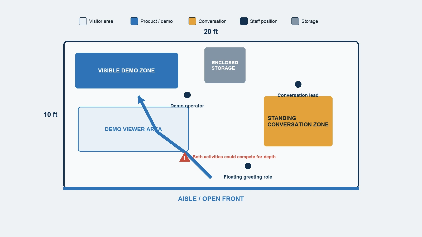
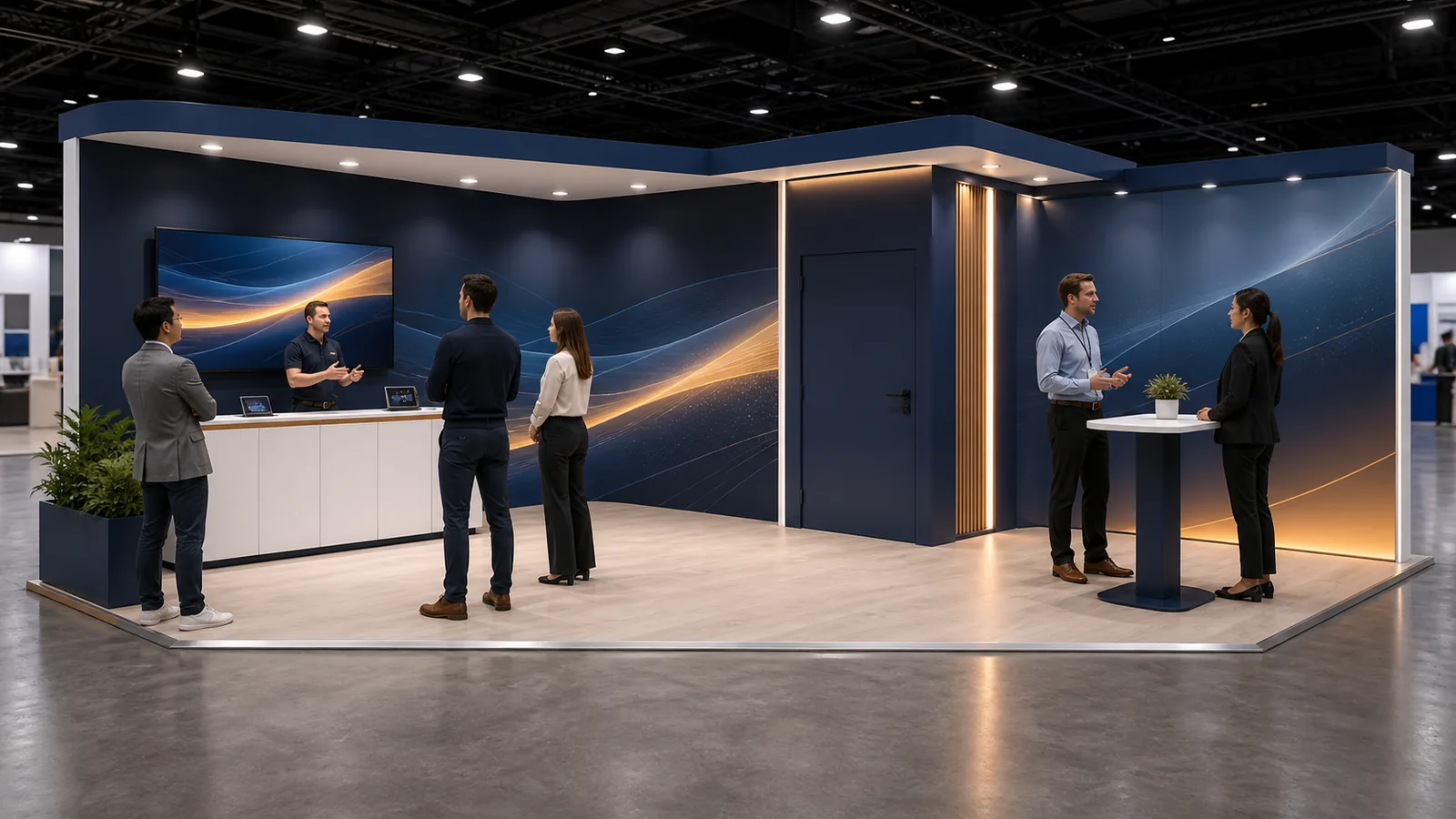
Use one half for a visible demo and the other for a compact conversation point, but connect them with one backwall story. Make the demo or the conversation zone visually dominant; equal emphasis often makes the booth look like two unrelated 10×10 displays.
A standing-height table usually preserves more depth than lounge furniture for a short qualification discussion. Position it so people leaving the demo can continue the conversation without crossing the operator’s route or blocking new visitors.
Best for: Moving visitors from visible proof into a short technical or commercial qualification conversation.
Example staffing positions: Demo operator; conversation lead; floating greeting role positioned outside both working paths.
Storage position: Rear center or behind the quieter conversation-side element.
Main traffic-flow risk: Demo viewers and the conversation group compete for the same depth. Reduce the meeting footprint and separate the two staff routes.
5. Screen-Led Layout
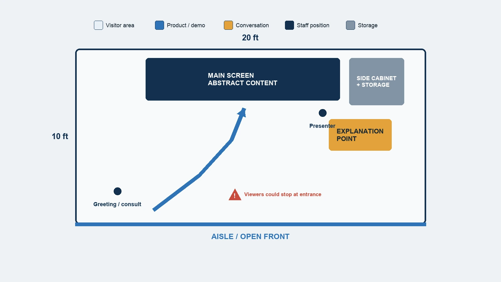
Mount one main screen on the back wall and leave standing explanation space beside it. Do not put a large counter in the center front; it pushes viewers toward the aisle and separates the presenter from the content. A side cabinet can combine equipment storage and service access when the cable route remains staff-side.
Assign the screen one job: show an overview, explain a process, compare options, demonstrate software, or present a proof sequence. Passive video without a defined next action rarely justifies the viewing space and show services it consumes.
Best for: Explaining software, processes, large equipment, or systems that cannot be shown physically.
Example staffing positions: Presenter beside the screen; greeting or consultation role near an open side.
Storage position: Below or beside the screen with separate staff-side cable and service access.
Main traffic-flow risk: Viewers stop at the entrance and turn the screen into a barrier. Move the explanation point inward and keep the front-center area open.
6. Sample Bar Layout
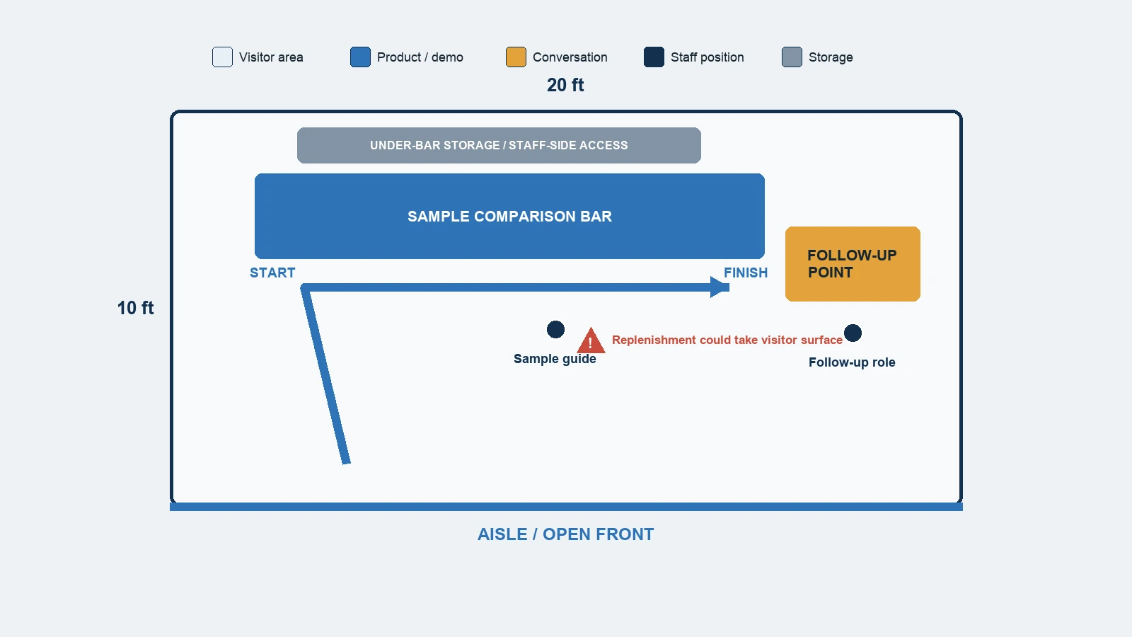
Place the sample bar along the back or one side and organize it as a sequence with a clear start and finish. The order might follow material, finish, fit, performance, application, or selection step. Keep the front open so a visitor can join the sequence without first crossing a reception counter.
Design the staff side as carefully as the visitor side. Reserve samples, cleaning supplies, packaging, waste, and lead-capture tools need assigned storage. Otherwise, replenishment work will gradually take over the comparison surface.
Best for: Guided touch, finish, fit, taste, or side-by-side sample comparison.
Example staffing positions: Sample guide beside or behind the bar; follow-up role at the end of the sequence.
Storage position: Under the bar with staff-side access for reserve samples and reset supplies.
Main traffic-flow risk: Packaging, waste, or replenishment blocks the visitor surface. Separate reserve stock from the active sample sequence and define a reset route.
Build One Visual Story Across the 20-Foot Frontage
Even when the booth supports two functions, visitors should see one company story. Use one long-range message from the meaningful aisle approaches and one visual anchor: a hero product, demo, screen, illuminated graphic, or organized product wall. Put detailed claims where someone can stop and read them.
Approve a creative feature only when it performs a useful job and its service impact is understood.
| Feature | Useful job | Budget or service implication | Approval question |
|---|---|---|---|
| Lightbox or backlit graphic | Create one strong visual anchor | Graphics, power, structure, access, packing | Is it emphasizing the main message or illuminating clutter? |
| Screen or interactive display | Explain a process, interface, or proof | Content, mounting, AV, power/data, viewing space | Where will viewers stand, and what happens next? |
| Product shelving | Organize a range for comparison | Load, security, replenishment, packing | Can staff reset it without crossing the visitor path? |
| Angled or curved structure | Address an approach or add depth | Structure, finish, packing, sightline review | Does it reveal the offer or hide part of the booth? |
| Focused lighting | Direct attention and aid inspection | Fixtures, power, installation, glare review | Is it helping the product or competing with a screen? |
| Flooring or material change | Define a zone or reinforce the concept | Installation, edge transitions, maintenance | Does it clarify movement without creating an access issue? |
How Design Choices Change the 10×20 Booth Budget?
A useful budget compares the complete scope. The Freeman booth budget guide identifies categories such as structure, graphics, labor and show services, AV, shipping, and material handling. Your quote still needs to reflect the current show, city, venue requirements, schedule, and exact inclusions.
| Design decision | Budget lines affected | What to confirm in the quote |
|---|---|---|
| Structure and finish complexity | Rental or fabrication, labor, packing, freight | Included components, finish level, engineering or approvals, installation scope |
| Graphics and lightboxes | Artwork, production, lighting, power, replacement | Sizes, materials, proofing, installation, future replacement method |
| Screens and interactive content | Hardware, mounting, content, AV, internet, electrical | Who supplies content and equipment, power/data orders, support responsibility |
| Product demos | Utilities, safety review, operator space, reset materials | Product dimensions, operating needs, approvals, consumables and onsite owner |
| Furniture and storage | Rental/purchase, floor area, handling | Quantities, delivery, lockable storage, staff and visitor use |
| Freight and show-floor delivery | Packing, transport, material handling, I&D | Origin, deadlines, carrier scope, drayage/material-handling basis, labor scope |
| Reuse after the show | Storage, inspection, repair, graphics, reconfiguration | Asset owner, inventory record, storage term, refresh process and next footprint |
Compare rent, own, and hybrid options across your show calendar
Rental can be useful when the future footprint is uncertain, the concept will change, or you do not want to manage stored assets. An owned or reusable core is worth evaluating when the footprint, message system, and show calendar are stable and you understand storage, freight, repair, and refresh responsibilities. A hybrid approach combines reusable core components with rented or project-specific additions.
Do not compare options using the structure price alone. Use the same scope on both sides:
Total program cost = structure or rental + graphics + storage + freight + material handling + installation and dismantle + repairs or refresh + show services
There is no universal number of shows at which ownership automatically wins. A lightweight repeatable program and a complex custom program can have very different logistics and refresh costs.
Treat reconfiguration and replaceable graphics as requirements
Treat one 10×20 or two 10×10 uses as an inventory requirement, not an automatic feature. The structure, hardware, graphics, and assembly documents must support both configurations.
For graphic refreshes, confirm the templates, attachment method, panel condition, and parts that remain. A different footprint or open-side condition may still require new components and a new rule review.
Review the Occupied Booth Before Design Release
An empty rendering cannot show congestion, reset work, or service conflicts. Review the selected layout with:
- staff positions and visitor stopping points;
- demo operator, audience, reset, and follow-up routes;
- product doors, moving parts, samples, and replenishment;
- storage doors, staff items, cleaning supplies, and waste;
- screens, cables, power, internet, and service access;
- entry and floor transitions under the project’s accessibility review;
- current organizer approvals, deadlines, and delivery responsibilities.
How a 10×20 Concept Becomes a Delivered Project
The result depends on more than receiving a rendering. The design must connect to show services, production or rental preparation, logistics, installation, operation, and what happens after dismantle.
| Step | Project decision | Output to confirm |
|---|---|---|
| 1. Brief and constraints | Show, floor plan, manual, visitor job, products, budget, reuse context | Agreed brief and responsibility list |
| 2. Concept and technical coordination | Layout, visualization, graphics, product/AV needs, approvals | Approved direction and unresolved technical items |
| 3. Rental/build preparation | System, fabrication or rental scope, graphics, packing, pre-show review where included | Production and readiness evidence appropriate to scope |
| 4. Freight and show-floor delivery | Shipping, show services, material handling, installation, onsite decisions | Move-in and installation plan |
| 5. Dismantle and next-show planning | Return, storage, inspection, repair, graphic refresh, reuse options | Post-show asset record and next-use plan |
According to project scope, KingExhibits can support design coordination, rental/build planning, pre-show preparation, freight and show coordination, installation and dismantle, and post-show planning. Confirm the exact deliverables, third-party show services, approvals, and responsibility boundaries in your proposal rather than assuming every item is included.
Avoid These 10×20 Design Mistakes
- Choosing a rendering before confirming the open sides. Mark the official approaches and restrictions first.
- Treating the frontage as two unrelated 10×10 displays. Use one message and one visual anchor across the width.
- Letting a counter, viewers, or meeting furniture block the entry. Put stopping points inside the footprint.
- Giving products or screens equal priority. Organize them around one decision or story.
- Budgeting only the structure. Include graphics, show services, freight, material handling, I&D, and post-show work.
- Assuming the system can split, expand, or reuse graphics. Confirm the inventory, templates, and drawings for every planned configuration.
Frequently Asked Questions
Is a 10×20 trade show booth always an inline booth?
No. The measurement describes the footprint. Many 10×20 spaces are linear or inline booths, but a corner, end-cap, or organizer-defined condition changes the exposed sides and restrictions. If the floor-plan legend is unclear, obtain written confirmation before placing walls, headers, entrances, and primary messages.
How much does a 10×20 trade show booth cost?
There is no useful single price without aligned scope. Comparable quotes should include the structure or rental, finish, graphics, AV, furniture, demo requirements, freight, material handling, installation and dismantle, show services, and post-show handling. The city, venue, schedule, approvals, and reuse plan can also change the total.
Should you rent or own a 10×20 booth?
Evaluate how stable your show calendar, footprint, structure, and graphics are, then include storage, freight, repair, refresh, and asset-management responsibility. Rental can reduce long-term asset obligations; ownership or a reusable core can support repeat programs. Compare both with the same full-program scope instead of using a universal show-count threshold.
Can a 10×20 booth be reconfigured into two 10×10 booths?
Yes, but only when the selected system, hardware inventory, graphics, and assembly documents support both layouts. Each 10×10 also needs its own complete visual story and must be checked against the future show’s floor plan and rules.
Can you replace the graphics without rebuilding the booth?
Often, when the exhibit system was designed for replaceable graphics. Confirm the artwork templates, panel dimensions, attachment method, hardware condition, and which structural parts remain. A new campaign that changes the product mix, screen position, or visitor job may require more than a graphic swap.
Final Thoughts
A useful 10×20 concept makes the main visitor job clear and still works when people, products, and services are present. Send your show, booth number, floor plan and manual, product or demo details, brand assets, budget range, reuse context, and support scope so KingExhibits can compare suitable directions and identify the project questions that remain.