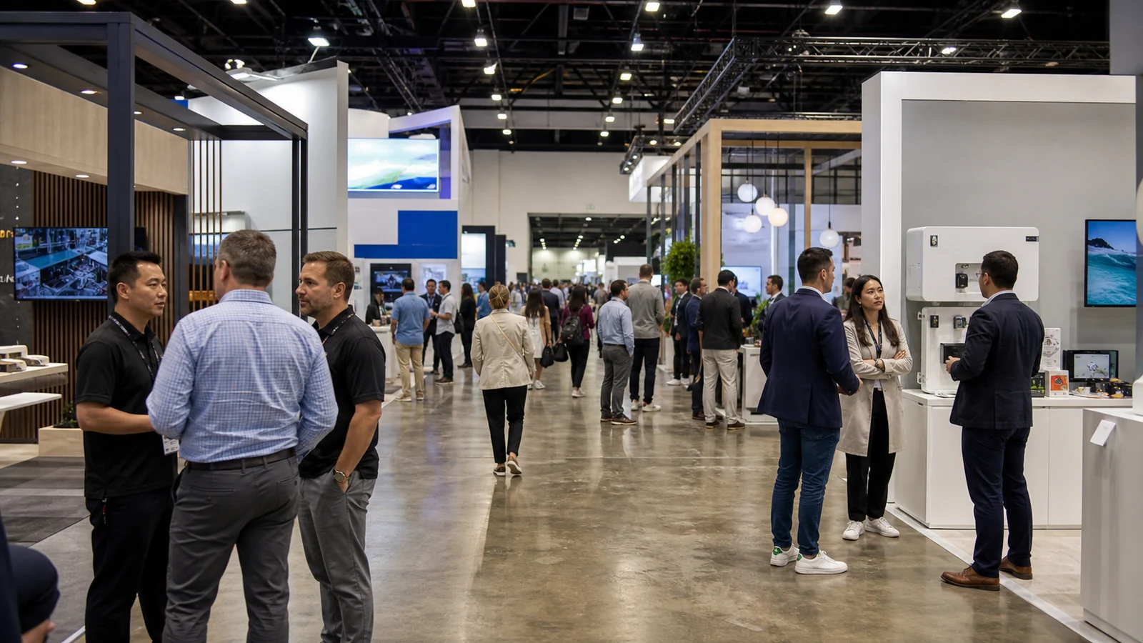
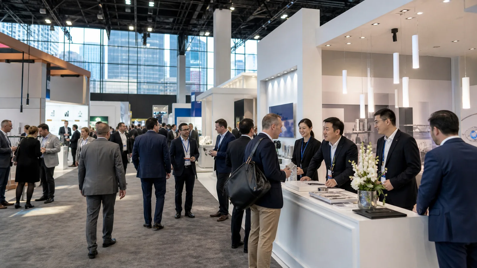
A 20×20 trade show booth gives you 400 square feet for demonstrations, products, conversations, storage, and staff operations. That flexibility is useful, but it also makes the space easy to overload. The three practical layout examples below show how different priorities can organize the same footprint, followed by the show-floor, industry, measurement, and cost questions that should be resolved before release.
Quick Answer
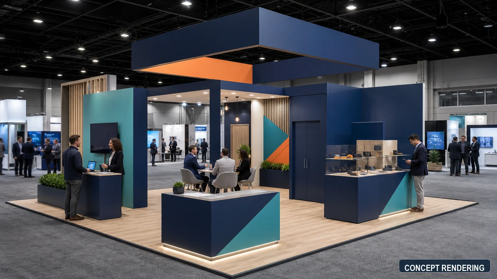
Start With One Primary Result—and Decide How You Will Measure It
Your first design decision is what the right visitor should do, not which wall, screen, or counter looks most impressive. A clear action gives the floor plan a priority and gives your team something observable to evaluate after the show.
The action may be watching a product work, inspecting a physical sample, following a software walkthrough, moving into a scheduled conversation, or completing a defined lead-capture step. Each one uses the footprint differently. A machine demonstration needs operating and viewing space. A screen-led explanation needs a readable angle and room for people to stop. A meeting-led program needs separation from noise without turning the booth into a closed room.
Decide how the result will be measured before design begins. This prevents a vague objective such as “engagement” from justifying every feature on the wish list.
| Primary result | Operational measure | Collection method needed | Interpretation boundary |
|---|---|---|---|
| Product demonstration | Demo starts, completions, or attendance by session | Staff tally, schedule, or approved event tool | Attendance alone does not establish lead quality |
| Scheduled conversation | Scheduled versus completed meetings and agreed next steps | Appointment list and follow-up record | Completion does not establish revenue |
| Qualified conversation | Count based on a written qualification definition | Lead form or CRM field | Define qualified before the show |
| Lead capture | Captures relative to a clearly defined interaction denominator | Scanner or form plus interaction count | Capture rate also changes with staffing and process |
| Time in the space | Sampled dwell time for a defined activity | Observation or approved measurement tool | Longer is not automatically better |
| Event economics | Cost per qualified conversation or lead | Total event cost plus consistent qualification data | This measures the event program, not design alone |
Internal teams will still bring competing requests. Sales may want a private room, marketing may want a large screen, and product teams may want the full range on display. Ask what must be visible from the aisle, what requires dwell time, what supports the agreed measure, and what can happen through scheduled content or an off-floor meeting. One action remains primary; the others support it.
Read the Floor Plan Before You Place Any Design Element
A 20×20 footprint does not tell you where the front is. The assigned open sides, aisle directions, neighboring structures, and physical obstructions determine how people will first see and enter the space.
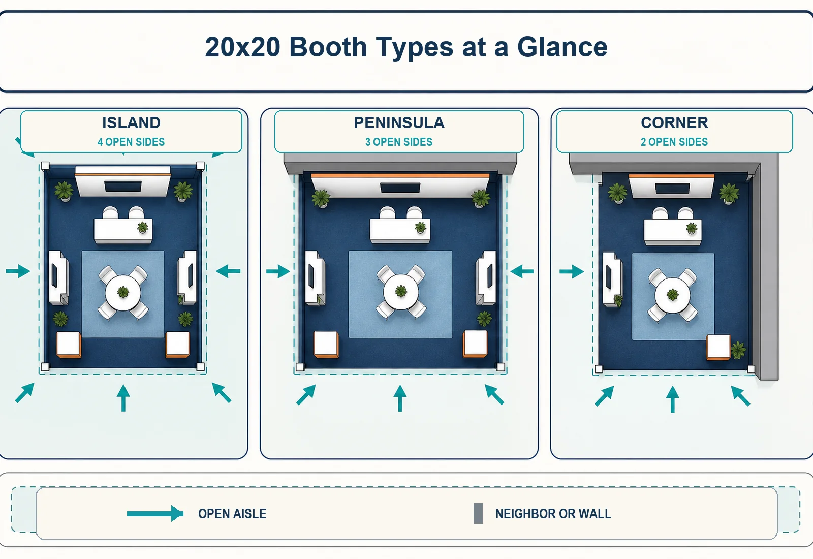
Do not assume every 20×20 space is an island. The International Association of Exhibitions and Events defines an island booth by aisle exposure on all four sides and describes 20×20 as a typical, not mandatory, island size in its published display guidelines. The same footprint may be assigned as a peninsula, corner, or another configuration. That distinction changes where entrances, walls, demonstrations, and graphics can work.
Mark these conditions before reviewing a concept:
- primary and secondary aisle approaches;
- hall entrances, intersections, and nearby destination exhibits;
- neighboring walls or structures that affect sightlines;
- columns, floor ports, service areas, or other obstructions;
- sides that should remain open and a possible staff or service side.
The highest-traffic aisle is not automatically the only useful approach. A side facing a hall entrance may support long-distance recognition, while a quieter side may be more useful for scheduled conversations or product reset. The design should respond to the assigned location rather than a generic square.
Show rules can change an apparently strong concept. Height and sightline limits, hanging signs, rigging, floor coverings, level changes, fire requirements, and open-side restrictions vary. IAEE provides industry guidance, but the organizer’s current exhibitor manual and project approvals control. Accessibility also belongs in the initial plan. Review circulation, level changes, and usable components against applicable requirements, including the U.S. Department of Justice ADA design standards, instead of treating access as a late adjustment.
Island, Peninsula, and Corner Booths at a Glance
| Configuration | Typical aisle exposure | Where structure often works | What changes in the plan |
|---|---|---|---|
| Island | Four sides | Central core or carefully placed freestanding elements | Every exposed approach needs identification and an entry decision |
| Peninsula | Three sides, with one closed or backed side | Meeting, storage, or graphics can use the closed side | The three open faces must remain readable without the back structure becoming a barrier |
| Corner | Two adjoining aisle sides | Structure commonly uses the back and non-aisle side, subject to show rules | Prioritize the two approaches and protect the open corner |
This comparison is a planning shortcut, not a substitute for the organizer’s assigned configuration and rules.
Choose the Layout Priority Before You Study the Examples
The three layouts below are priorities, not product packages. Start with the visitor action, then select the pattern that gives it enough space without creating a second obstacle.
| Layout priority | First visitor action | Space priority | Strong configuration fit | Main conflict to test |
|---|---|---|---|---|
| Open demo | See or join a demonstration | Demo, viewer, and reset space | Island or open-corner condition when approaches support it | Audience blocks an entry |
| Meeting-focused | Start or continue a focused conversation | Compact meeting and handoff space | Peninsula or island with a controlled service side | Enclosure consumes visibility and circulation |
| Product-display | Inspect a hero product and supporting range | Hero product, display wall, and explanation point | Peninsula, corner, or island depending on product access | Too many products create clutter |
Configuration fit is conditional. An island with four useful approaches may support an open demo, but an equipment door, column, or dominant aisle can still make one side operationally different. A peninsula can support a meeting area against its closed side, but the enclosure must not create a visual barrier from the three open sides.
3 Practical 20×20 Trade Show Booth Floor Plan Examples
These examples translate the three priorities into more concrete planning blocks. They are illustrative starting points, not construction drawings, code dimensions, or promised capacities. Replace every block with the actual product, furniture, staff, utility, and approved clearance requirements for your show.
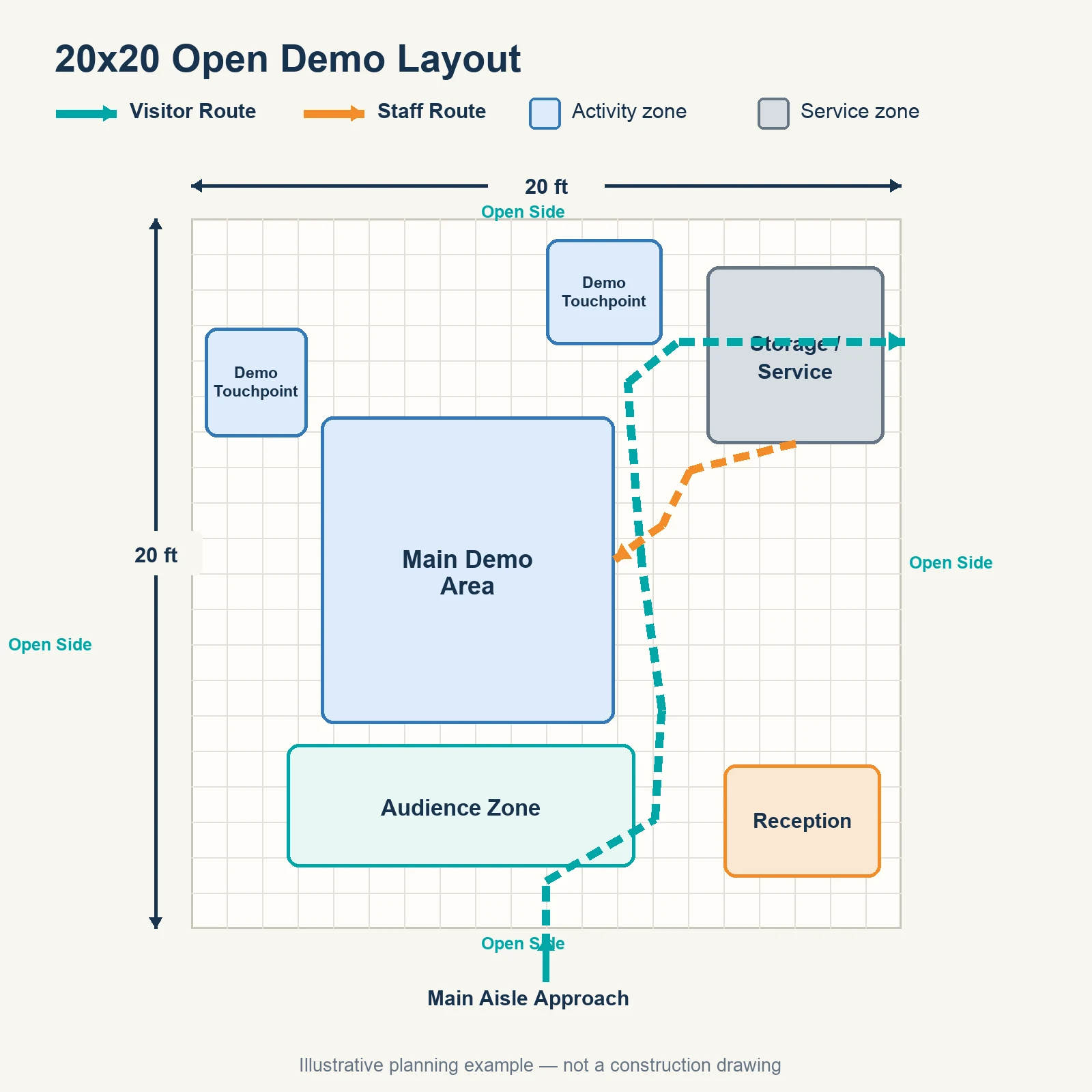
Example 1—Open Demo Layout
This example uses a four-side-open island and makes the demonstration visible without placing it directly across every entrance.
An illustrative arrangement could include:
- one main demo block of about 8×10 feet, set slightly toward the strongest approach rather than centered mechanically;
- a visible standing audience area beside the demo, with a pass-through route behind or around it;
- one or two secondary touchpoints on the perimeter for short interactions;
- a compact service and storage core of about 5×5 feet on the weaker approach side;
- staff access to the service core that does not cut through the audience.
This direction can fit software, technology, or equipment that must be seen in use. Confirm: simultaneous equipment/operator/viewer positions, clear entries, power and data, sound, reset access, and aisle sightlines.
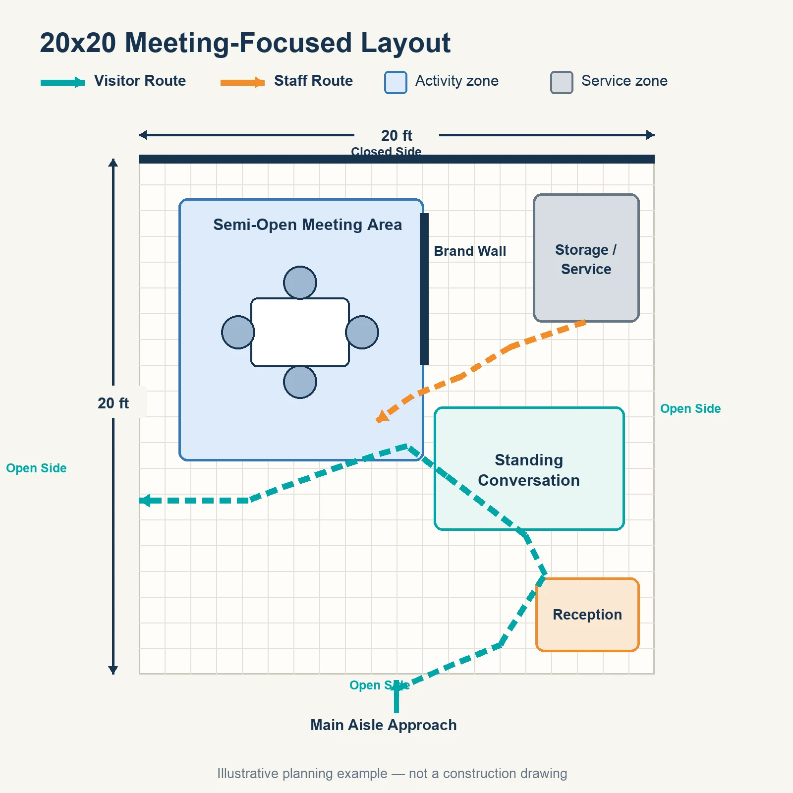
Example 2—Meeting-Focused Layout
This example uses a three-side-open peninsula and places longer conversations toward the closed side while keeping a visible entry and a shorter handoff point near the aisle.
An illustrative arrangement could include:
- one semi-open meeting block of about 8×10 feet against the closed side;
- one four-seat table shown inside that block;
- one standing conversation point for shorter discussions;
- a compact reception point near a front corner rather than across the center entry;
- a brand wall or tower that screens the meeting area without hiding the booth;
- a storage block of about 4×5 feet with staff access from the service side.
This layout can suit professional services, healthcare, finance, or another program centered on scheduled discussions. The four seats shown are illustrative, not a capacity rule. Confirm: privacy, hall noise, chairs in use, accessibility, greeting-to-meeting flow, storage access, and whether long private meetings belong outside the booth.
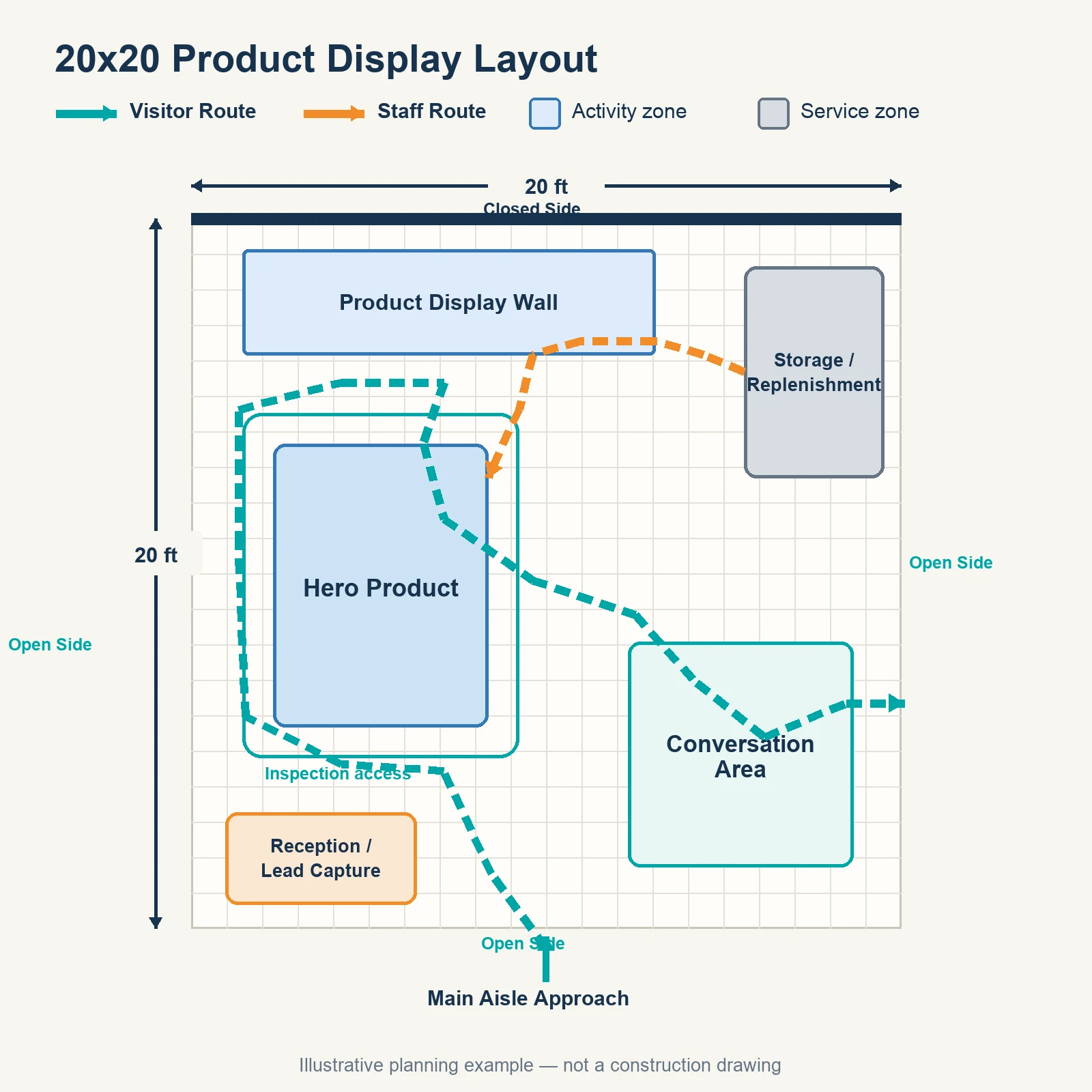
Example 3—Product Display Layout
This example uses a peninsula or corner condition with a closed display side. It makes one hero product easy to inspect and uses the wall for a supporting range instead of filling the entire floor with products.
An illustrative arrangement could include:
- a hero-product block of about 6×8 feet with access on the sides needed for inspection or operation;
- a 10- to 12-foot supporting display wall on the closed side;
- a compact explanation or conversation area of about 6×6 feet;
- a reception or lead-capture point positioned outside the main inspection route;
- a storage and replenishment block of about 4×6 feet near the product wall;
- an open route that allows people to approach, inspect, and leave without reversing through a queue.
This direction can fit industrial components, automotive parts, packaged products, and other physical comparisons. Confirm: product dimensions and weight, doors or moving parts, mounting, approved clearances, labels, replenishment, service access, and simultaneous inspections.
The three examples can also change configuration. An open demo in a peninsula may move the service core to the closed side. A product-display island may use a central product tower instead of a wall. Keep the visitor priority, but rebuild the arrangement around the actual open sides and product geometry.
Make the Booth Readable From Every Meaningful Approach
Visibility is useful only when people can understand what they are seeing. A large logo identifies the company; it does not necessarily explain why someone should enter.
Use a simple information hierarchy:
- Company or product identity helps people locate the booth.
- One primary message explains the offer, application, or problem being addressed.
- Product-level information appears where someone can stop without blocking the aisle.
Check the primary message in an aisle-view simulation, not only in a close-up elevation. It should remain readable at the angle and distance that matter for the assigned location. Avoid unsupported rules about how many seconds a message has to work. The practical question is whether a walking visitor can identify the subject before reaching the entry.
Graphics should follow the actual approaches. An island may need identification from several directions; a peninsula may need a stronger hierarchy between its main and secondary faces. Repeating dense copy on every surface creates noise rather than clarity.
Vertical elements are conditional tools. A hanging sign requires organizer approval, a permitted height, a viable rigging plan, and budget for the related services. Tall structures also affect engineering, packing, freight, and installation. Add them to solve a long-distance identification problem, not because a 20×20 footprint is assumed to require height.
Lighting and screens need defined jobs. Use lighting to separate the hero product, key message, or work area. Position screens so glare, viewing direction, and the group standing in front of them do not undermine circulation. If a screen supports a live demo, include its power, data, mount, playback device, and service access in the design review.
Fit Products, Conversations, Storage, and Utilities Into the Occupied Booth
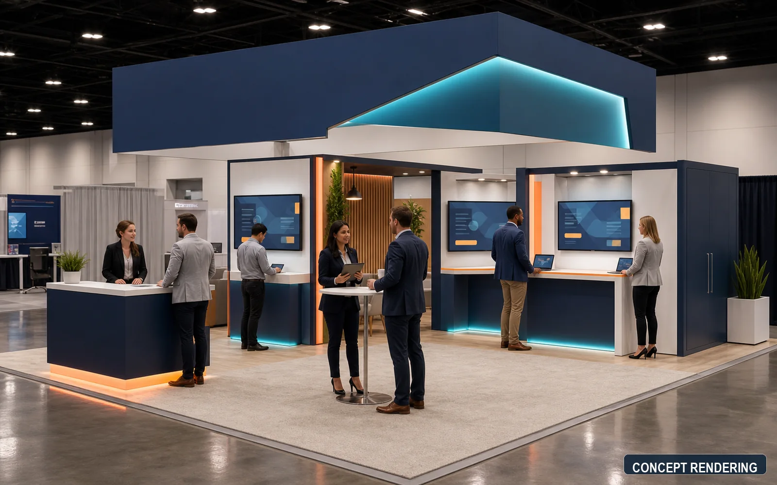
An empty rendering can make almost any plan look spacious. Test products, operators, viewers, occupied furniture, open storage doors, and staff movement at the same time.
Physical products need room for doors, moving parts, mounting, reset, and service access. Match furniture to conversation length and privacy. List what storage must hold and who replenishes it. Place AV, electrical, internet, and cable routes before visual sign-off, using actual equipment and the official service plan rather than generic allowances.
Adapt the Same 20×20 Footprint to Different Industries
The footprint stays the same, but the operating inputs change by product and show. Use industry scenarios to identify questions, not to assume every company in one sector needs the same booth.
| Industry scenario | Likely design priority | Layout response | Inputs to confirm |
|---|---|---|---|
| Industrial equipment | Product operation and technical explanation | Hero equipment zone, controlled viewing area, and service access | Product size and weight, movement, floor/load inputs, power, and approved safety clearances |
| Medical or healthcare | Demonstration plus focused conversation | Clean product zone and semi-private discussion area | Approved claims and content, cleaning workflow, privacy needs, and show/product rules |
| Software or technology | Multiple short demos and handoff | Screen/demo stations with separated viewing and meeting paths | Internet/data, screen count, audio, device reset, and appointment flow |
| Food or beverage | Sampling, replenishment, and sanitation | Service counter, sample handoff, and back-of-house storage | Sampling approval, water/drain if needed, refrigeration, waste, and cleaning requirements |
| Automotive or industrial components | Hero part plus comparison range | Main product, sample wall, and engineering conversation point | Weight and mounting, sample handling, comparison labels, and replenishment |
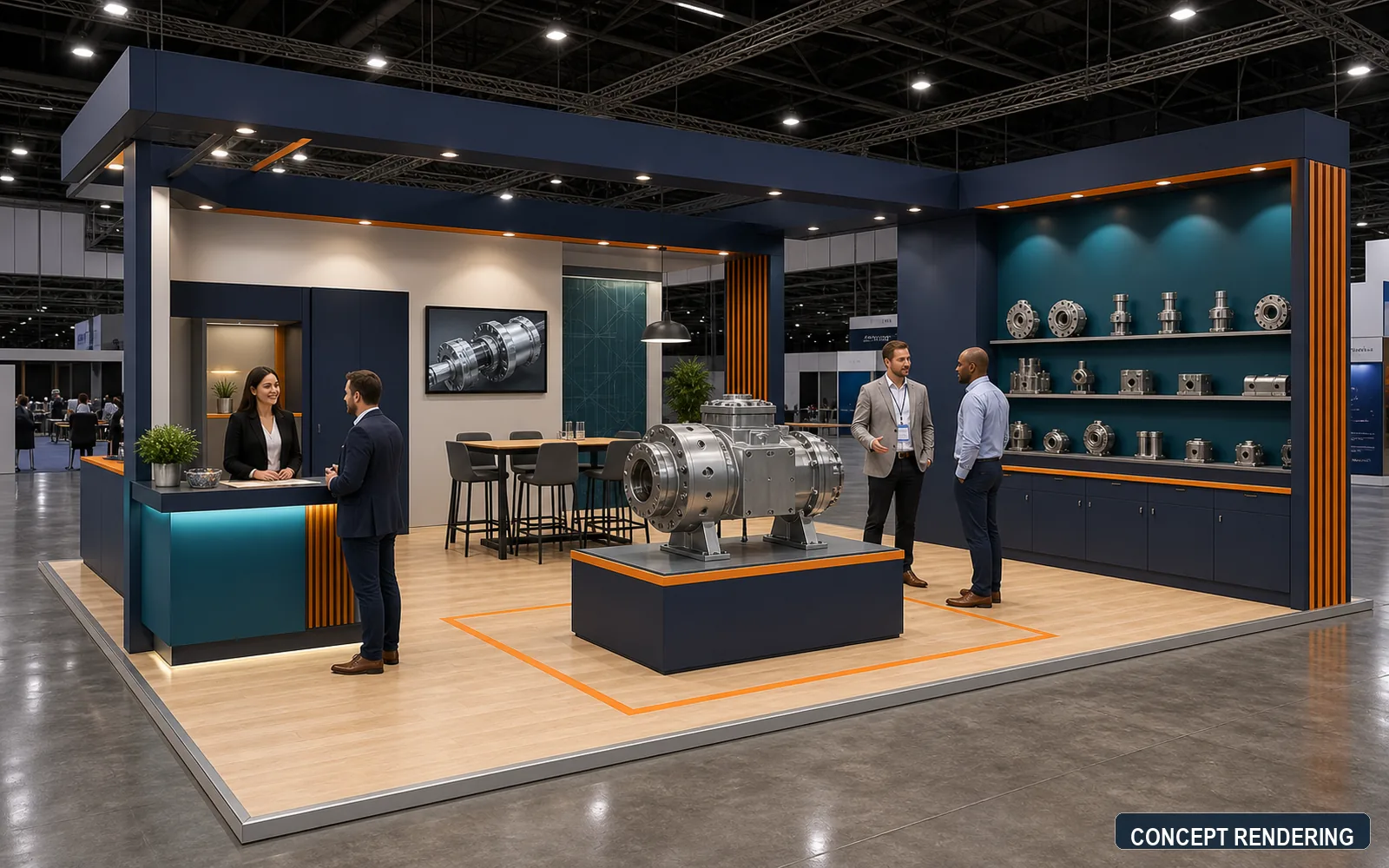
For industrial equipment, the product can determine the architecture. Delivery route, floor/load inputs, moving parts, utilities, and approved operating clearance must be understood before placing walls. Medical and healthcare exhibits may need a cleaner information hierarchy and controlled conversations, but the product, claims, privacy needs, and show rules determine what is appropriate.
Software and technology programs often need several short demonstrations, yet more screens do not automatically improve the layout. Decide whether stations tell different stories or repeat one walkthrough, then prevent their audiences from merging into a barrier. Food and beverage projects can add sampling approval, cleaning, waste, refrigeration, replenishment, and water or drain requirements. Automotive and industrial component displays need secure mounting, clear comparison labels, handling space, and a place for detailed technical discussion.
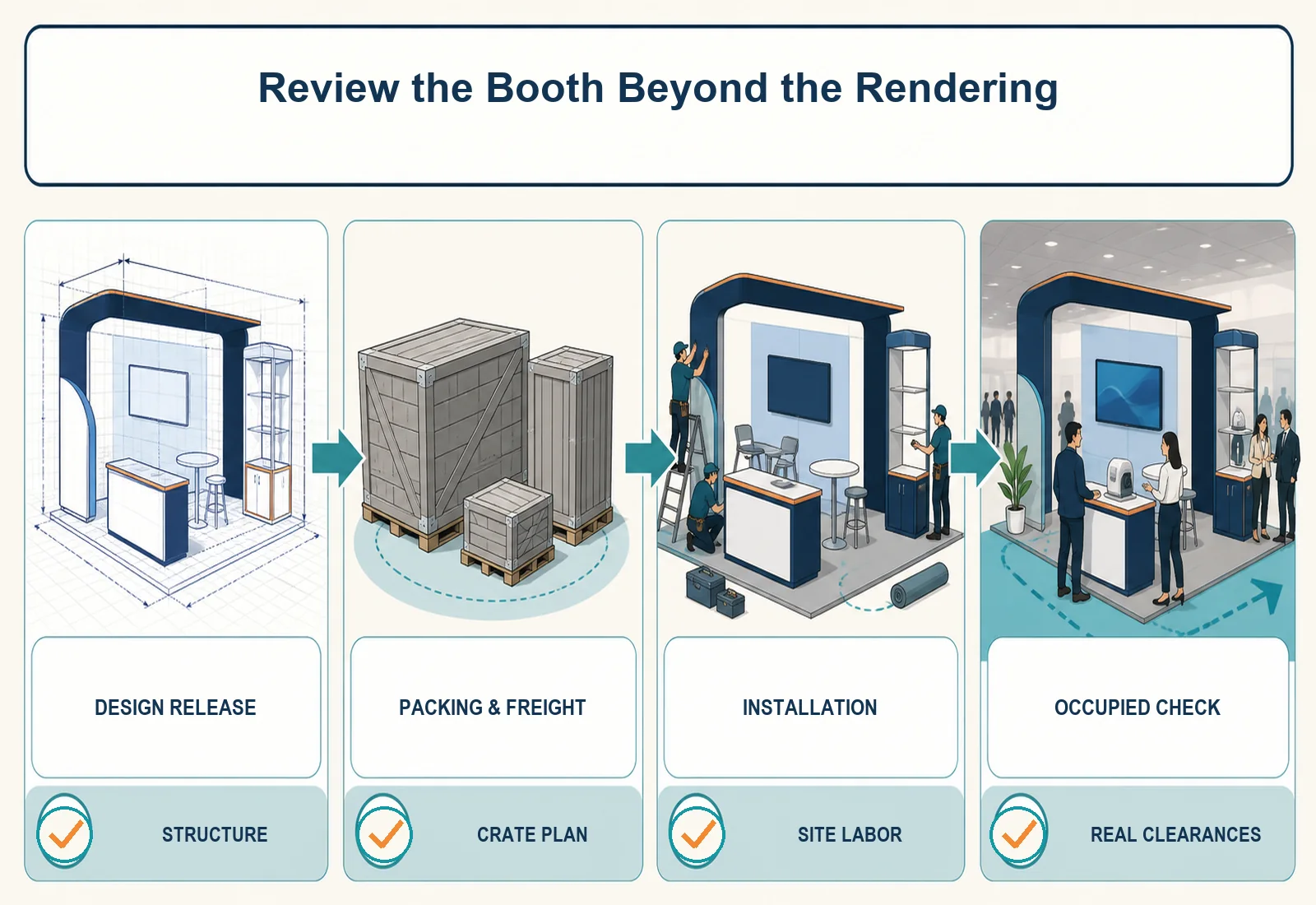
Check Whether the Design Can Be Built, Shipped, and Installed
A rendering shows appearance; a release review shows whether the same booth can arrive and operate. Identify the responsible party and required input for:
- structure, engineering, and organizer submissions;
- graphics, artwork versions, and installation method;
- products, demonstrations, and replenishment materials;
- AV, electrical service, internet, and rigging;
- packing or crating, freight timing, and material handling;
- installation and dismantling tasks, access sequence, and on-site approvals.
The visual concept, packing plan, service access, product arrival, and installation sequence must describe the same booth. Review it occupied from each aisle; use 3D review or prebuild when included in scope. For multiple shows, recheck open sides, rules, products, graphics, and services before declaring the plan reusable.
How Much Does a 20×20 Trade Show Booth Cost?
There is no responsible single price for every 20×20 trade show booth. Total cost changes with the exhibit solution, structural and graphic scope, products and technology, city and venue services, labor schedule, freight, and the responsibilities included in the proposal. A hardware, rental, or fabrication number is not automatically the total show-floor cost.
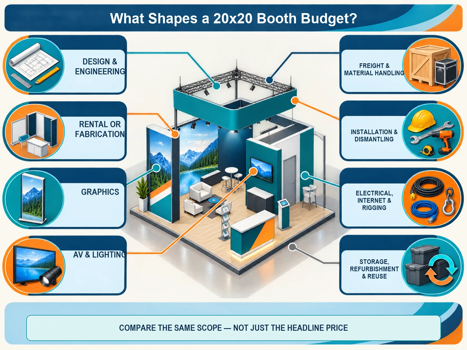
Use a common scope before comparing proposals:
| Cost category | What changes it | What to ask about |
|---|---|---|
| Design and engineering | Custom structure, revisions, structural review, and approvals | Included design rounds, technical drawings, engineering, and approval boundary |
| Rental or fabrication | Structure, finishes, materials, custom components, and reuse plan | What is rented, purchased, reused, or returned |
| Graphics | Surface area, material, finishing, file changes, and replacement | Production, installation, removal, and ownership |
| AV and lighting | Screen or LED choice, mounts, playback, control, lighting, and service | Equipment, content, labor, power, and on-site support boundaries |
| Freight and material handling | Pack volume and weight, origin, timing, advance warehouse or direct-to-show route, and show billing | Freight versus drayage or material-handling responsibility |
| Installation and dismantling | Structure complexity, labor jurisdiction, schedule, and supervision | Estimated versus included labor and possible schedule premiums |
| Electrical, internet, and rigging | Equipment loads, service drops, network, hanging elements, and official providers | Which items are ordered from the show or venue and billed separately |
| Storage, refurbishment, and reuse | Ownership, show frequency, repair, graphic refresh, and future configurations | Post-show destination, inspection, and next-show work |
Ask what is included, excluded, estimated, ordered through the show, or billed by a third party. Two proposals with the same headline price may cover different responsibilities.
Rental or purchase is a show-program decision
Compare the show calendar, configuration changes, asset ownership, storage, refurbishment, graphic updates, and logistics. Do not use a fixed number-of-shows rule. A hybrid approach may combine rented structure with owned graphics or custom components, but the actual proposal must define availability and responsibility.
Allocate budget in the order of project risk
First protect the primary visitor action and the requirements needed for the product or demonstration to work. Next fund mandatory show services and approved technical needs. Protect packing, freight, and installation execution before adding optional visual or hospitality features. Keep third-party estimates and exclusions visible instead of forcing universal percentages onto the budget.
Avoid These 20×20 Design Mistakes Before Approval
Most preventable problems come from approving appearance before use, scope, and delivery are aligned.
- Assuming every 20×20 space is an island. Confirm open sides and rules before placing walls or entrances.
- Giving every internal request equal priority. Make one visitor action primary.
- Treating an illustrative layout as a construction drawing. Replace example blocks with actual products, furniture, utilities, and approved clearances.
- Blocking an entry with meetings, counters, or a demo audience. Test the occupied plan, not only the empty rendering.
- Displaying too many products. Select a hero product and a controlled supporting range.
- Adding storage or utilities late. Integrate doors, replenishment, service points, and cables before visual approval.
- Comparing quotes without aligning inclusions. Separate exhibit scope, show orders, third-party estimates, and exclusions.
- Approving appearance without an execution review. Check packing, freight, installation sequence, and on-site responsibility.
Avoiding these errors does not guarantee traffic, lead quality, or ROI. It removes conflicts that can prevent the booth from working as planned and makes post-show measurement easier to interpret.
What to Prepare Before You Request a 20×20 Booth Design
A useful design brief contains the priorities, constraints, and responsibility questions needed to make tradeoffs. Prepare:
- show name, city, dates, and booth number;
- the official floor plan and assigned open sides;
- the current exhibitor manual and important deadlines;
- the primary visitor action and measurement definition;
- product and demo dimensions, operation, and sample inputs;
- conversation, storage, staff, and accessibility needs;
- AV, electrical, internet, and rigging inputs;
- approved brand assets and required messages;
- target budget range and quote inclusion or exclusion expectations;
- approval owners, delivery scope, and future show calendar.
You do not need to solve the layout before sharing the brief. These inputs help the design team show the real tradeoffs—for example, when a large demo, enclosed meeting room, four open entries, and extensive storage cannot all receive equal priority.
Frequently Asked Questions
Does a 20×20 trade show booth have to be an island?
No. The dimensions describe the footprint; open sides determine the configuration. The same 20×20 plan cannot always move unchanged between an island and a peninsula because entrances, walls, sightlines, and graphics may need to be redesigned.
Can a 20×20 booth include both a demo area and meeting space?
Yes, when one activity remains primary and the routes do not compete. Place the expected demo audience, working staff, and occupied meeting furniture on the plan at the same time. If an entry closes or staff repeatedly cross the audience, move or reduce one zone.
How many demo stations or meeting seats fit in a 20×20 booth?
There is no universal count. The open-demo example uses one main demo with one or two secondary touchpoints; the meeting-focused example shows one four-seat table. Actual capacity depends on product or equipment size, audience, furniture, open sides, storage, staff movement, and applicable clearance requirements.
How early should you start planning a 20×20 booth?
Back-plan from organizer submissions, internal approvals, structural or rigging complexity, production, freight, and move-in. A custom or technically complex project needs unresolved decisions closed earlier than a simple configuration using approved assets, but one universal lead time would be misleading.
Final Thoughts
A strong 20×20 design makes its primary action visible in both the floor plan and the occupied booth. The three examples help you compare directions, but the real design must be rebuilt around the assigned open sides, products, people, and project responsibilities. Cost comparison becomes meaningful only when the exhibit scope and show-service boundaries match.
If you already have a 20×20 space, send the show and booth details, floor plan, exhibitor manual, preferred layout direction, product or demo inputs, industry-specific requirements, budget range, quote-boundary expectations, and support scope. KingExhibits can use that brief to review layout priorities and identify design, production, cost-scope, and on-site questions that should be resolved before release.