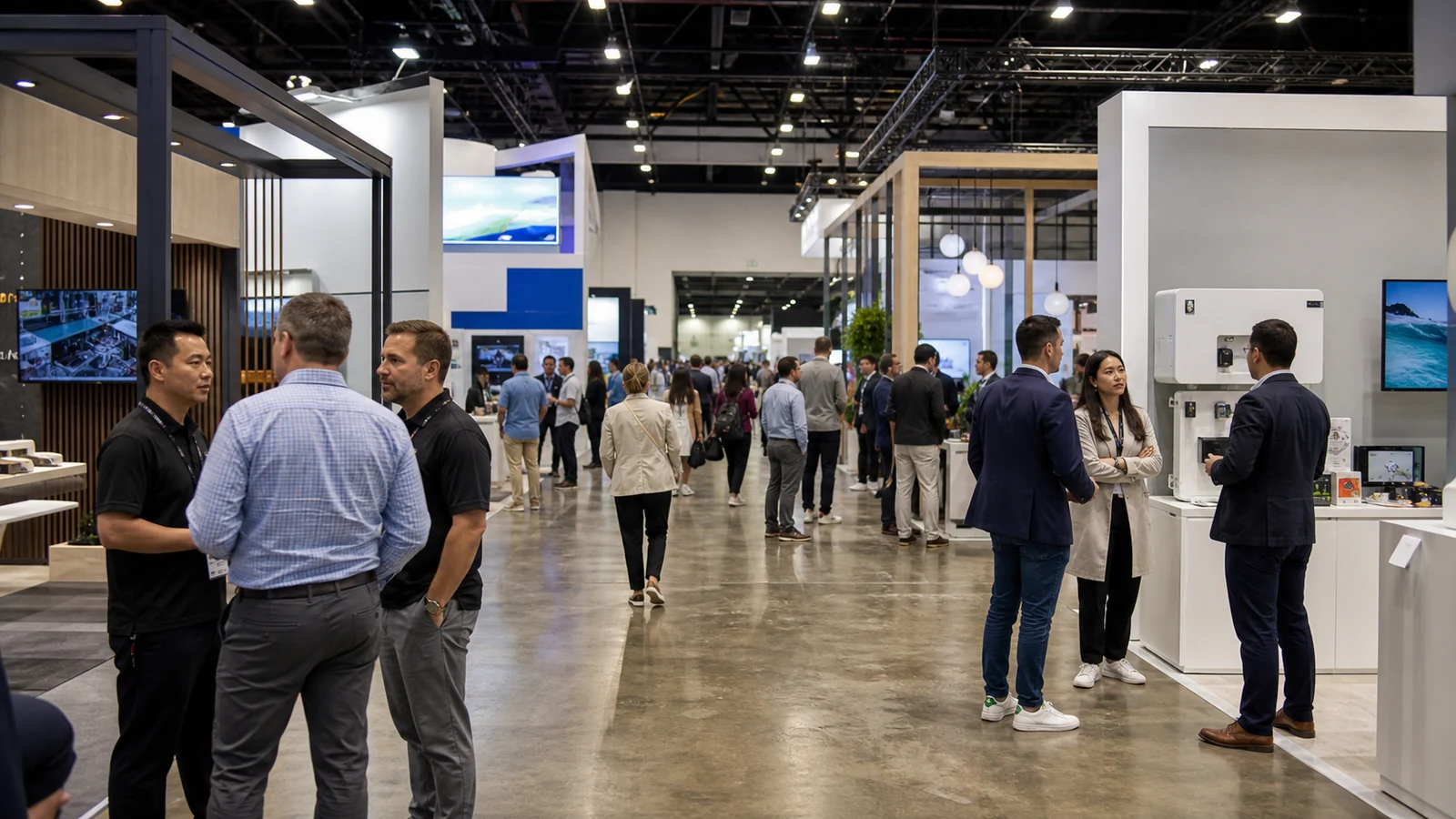
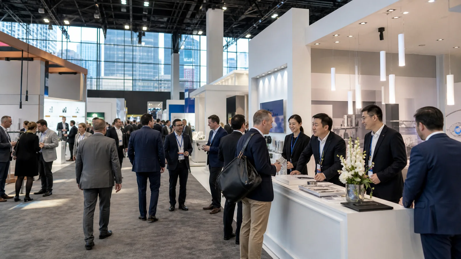
You need a fresh idea for your next booth, but a room full of props will not help if visitors leave without understanding your product. The useful question is: what could someone do in this space that would make your offer easier to understand?
These seven trade show booth themes connect a visual idea to a product message and something visitors can try, compare, or discuss. The strongest choice is one your team can demonstrate convincingly, with a clear reason for visitors to continue the conversation.
All examples below are proposed concepts, not accounts of completed KingExhibits projects or measured results.
1. The Test Lab: let the product make its case
Picture a workbench with two samples, a camera, and a screen showing a close-up of an assembled joint. The wall says “See How the Joint Comes Together.” For a component supplier, that is a more useful starting point than a wall announcing “Innovation.” Visitors can see the specific difference the company wants to discuss.
Build the scene around one repeatable comparison. At a fastener supplier’s booth, a staff member could demonstrate two assembly methods with clearly labeled samples. The visitor chooses a sample, watches the steps, and examines the finished assembly. A small card beside the bench identifies the materials and conditions used, so the demonstration has context.
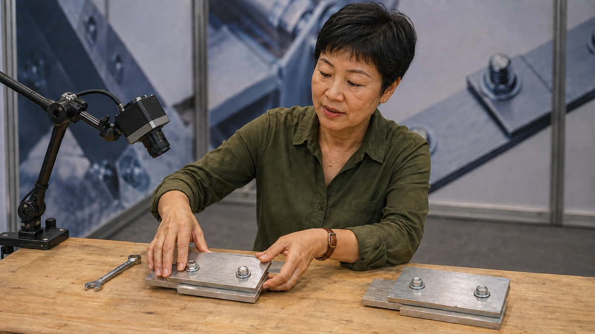
The lab appearance should come from the work: labeled trays, uncluttered benches, and visible instruments where they are actually needed. Lab coats and unexplained numbers can make a simple sales demonstration look like an independent certification test. Keep the distinction clear. A booth demonstration shows what happened under its stated conditions; it does not establish every claim a customer might make about a product.
Choose this theme when the difference is visible and the test can be run safely and consistently. If the product needs hours to show a result, use prepared samples and an accurately labeled recording instead of creating a misleading shortcut.
2. Mission Control: make an invisible process visible
Software and connected systems can be difficult to explain from a product display alone. A control-room theme gives you a setting for showing what your system notices, what a person decides, and what happens next.
For a maintenance platform, you could put “Find the Fault. Choose the Next Move.” above one large display. Give the visitor a choice of simulated problems, such as an unexpected alert or a machine awaiting inspection. Staff then follow that scenario through the interface. The visitor leaves with an annotated example of the action sequence, rather than a brochure containing every software feature.
Dark surfaces, a clear incident board, and focused lighting can suggest a control room without hiding the booth behind a wall of screens. One visible sequence is easier to discuss than several unrelated dashboards. Label demonstration data as simulated, and have an offline version ready if the live connection fails.
If you use a touchscreen, let the visitor make the choice on it. If staff control the screen, give the visitor a scenario card to choose from. Either way, make their decision change the demonstration; a touchscreen that only plays the same sales video adds little to this theme.
3. A Day in Your Customer’s World: put the product to work
Sometimes the strongest setting is one your customer already recognizes. Re-create a small part of their working day: a packing bench, a retail shelf, or a service counter. Give the scene a specific job rather than trying to build an entire workplace.
A packaging supplier could use a packing-station theme with the message “Pack This Order With Us.” An open carton, a sample product, and several inserts give visitors something concrete to handle. A staff member asks which item they ship, then shows how the proposed pack is assembled. Cutaway samples reveal the parts that would otherwise disappear inside the carton.
The useful conversation is about their actual packing problem. A visitor might point out that a lid takes too long to close or that the product shifts too much inside the carton. Those observations give your team a starting point for discussing a trial, without claiming the exhibition exercise proves shipping performance.
Keep only props that help explain the job. A decorative warehouse backdrop adds little if the table still holds an unrelated row of products. The setting earns its space when it helps visitors imagine using the product in their own operation.
4. The Pit Stop: make a changeover the main event
A racing-inspired theme has a practical connection to products used for maintenance, replacement, setup, or changeover. The subject is getting a job ready to run again. That gives the flags, numbered steps, and tool-board graphics a reason to be there.
For an equipment supplier, the wall might read “Watch a Changeover, Step by Step.” One staff member demonstrates the changeover on a suitable training unit while a colleague explains each step. Visitors identify the part that resembles a problem on their own line. A parts tray or removed component can carry the conversation after the demonstration ends.
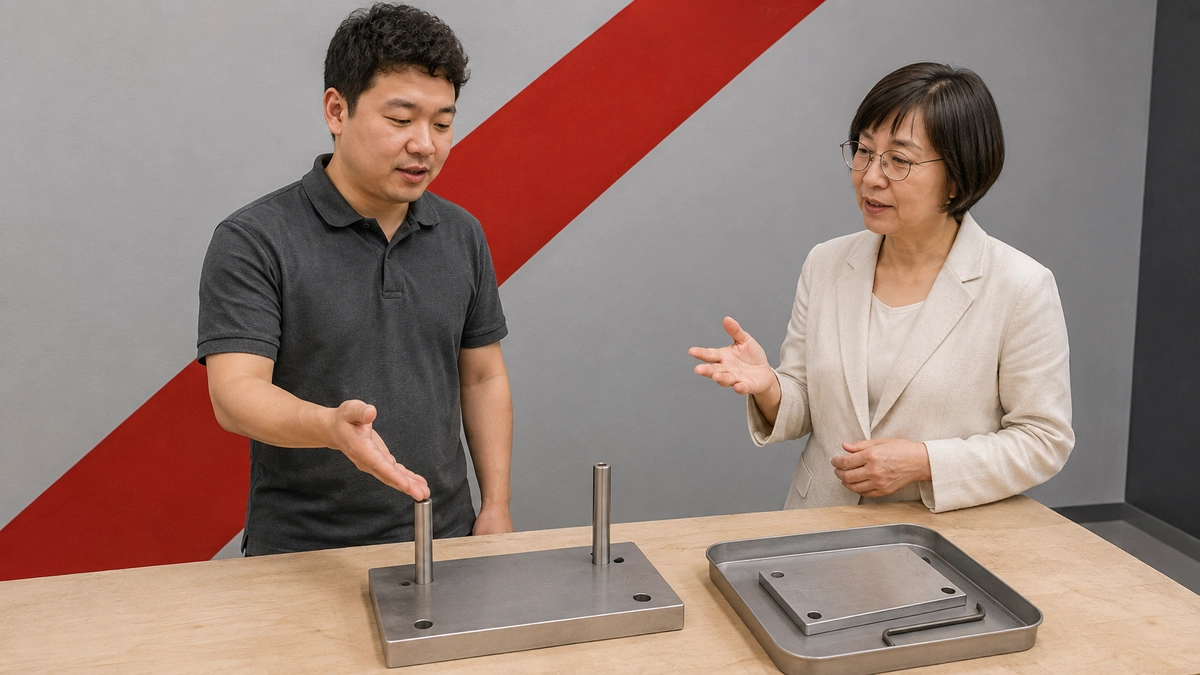
A timer is optional. Use one only when the start and finish are defined and the comparison is fair. An unusually fast demonstration by a trained operator is not a promised customer changeover time. If those conditions cannot be explained simply, show the sequence without a speed claim.
The theme loses its purpose if the attraction becomes a racing game with no connection to the equipment. Keep the product task at the center and leave space for people to watch without crowding the working area. This is a good direction when the changeover itself is revealing; it is a weak choice when staff have to invent a link between racing and the offer.
5. The Material Library: turn selection into discovery
Not every theme needs movement, sound, or a performance. A material library creates a quieter experience for visitors who need to choose between things they can see and feel.
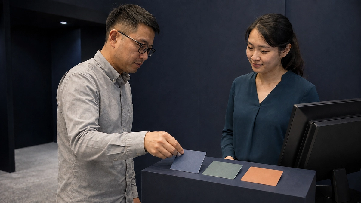
Imagine a supplier of decorative surfaces arranging samples in shallow drawers and on angled shelves. The heading “Find the Finish for Your Next Project” tells visitors what to do. Consistent sample sizes and lighting make comparison easier, while labels separate material, finish, and intended application. A large installed sample shows how a choice looks beyond a small swatch.
Start the interaction with the application: “Where will you use it?” The visitor selects a few candidates, compares them together, and records their codes on a takeaway selection sheet. That sheet gives the sales team something specific to discuss later. Touch and appearance help narrow the choices; technical suitability still needs the relevant product information and testing.
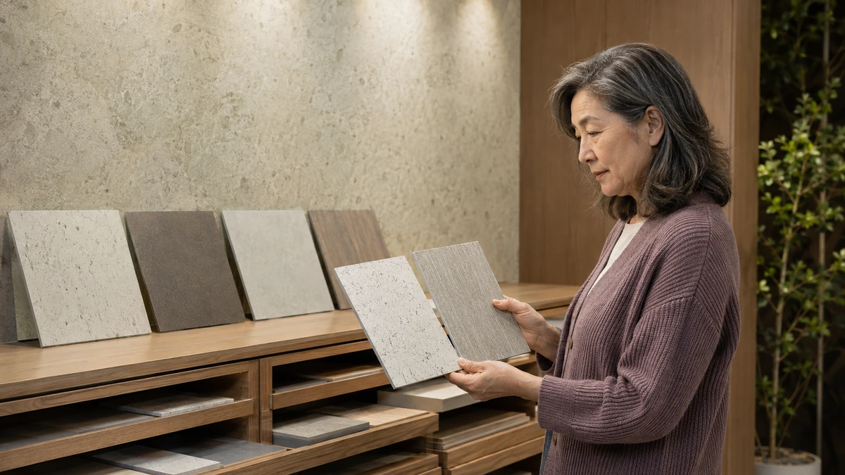
Resist filling every shelf. A dense catalog wall can make the visitor do the sorting work alone. Present a manageable starting selection and keep the wider range available when a conversation calls for it. This theme is especially useful when the product’s physical differences deserve more attention than a screen presentation would give them.
6. The Field Station: connect outdoor atmosphere to an outdoor job
An outdoor theme can create a distinctive booth, but plants and a scenic backdrop need a product reason. A field station gives that atmosphere a task: preparing equipment, inspecting a site, or planning work away from a desk.
An inspection-equipment exhibitor could use a worktable, equipment cases, and a large site illustration under “Plan Your Next Inspection.” The visitor picks a point on the illustration, chooses a sample tool, and watches staff demonstrate how it would be used. The takeaway is a marked-up equipment list for that scenario.
Use a restrained landscape image and durable-looking finishes to establish the setting. Keep the tools well lit and easy to identify. There is little benefit in surrounding a small instrument with so much artificial foliage that visitors cannot find it.
This scene helps when the setting explains the application. It does not prove that equipment is weatherproof, that a material is sustainable, or that the company has environmental credentials. Those claims need their own evidence. If your product has no meaningful outdoor application, choose a different setting instead of relying on greenery to carry the idea.
7. Then, Now, Next: show what has changed
A retro theme can support an anniversary or product evolution without becoming a collection of nostalgic decorations. Put the old approach beside the current one, then show the next question you are working on.
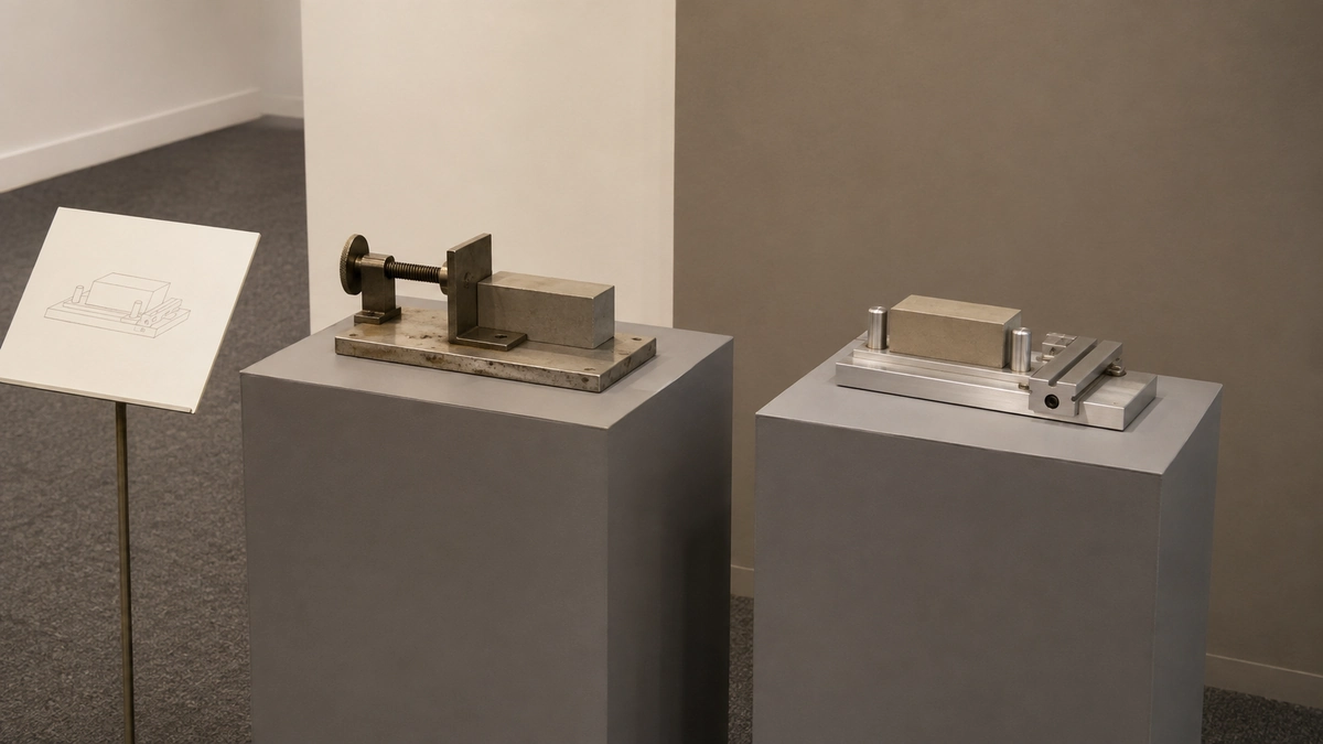
For an industrial supplier, “From Manual Setup to Guided Setup” could connect an older tool, the current product, and a demonstration screen. Visitors follow the change by looking at the objects. A staff member asks which version resembles their present process, then explains the relevant improvement.
Use the visual language of the period sparingly: an old drawing, a previous interface, or packaging from an earlier product can do more than costumes. Verify every date and product-history claim before putting it on a wall. Mark prototypes or future concepts clearly so visitors do not mistake them for available products.
The strongest reason to choose this theme is a change your customer cares about. An anniversary alone tells visitors how long the company has existed; a useful comparison shows why its current offer deserves attention. If you have no documented history or meaningful before-and-after example, the Test Lab is a stronger starting point.
Choose a trade show theme you can demonstrate
Put your two strongest concepts beside the product material you already have. A Test Lab needs a credible comparison. Mission Control needs an understandable scenario. A Material Library needs samples that make selection easier. If the necessary demonstration does not exist, a more elaborate booth will not fix the gap.
Before asking for a full design, rehearse the central interaction at a table. Ask a colleague unfamiliar with the product to try it, then explain what the company offers. If they remember the setting but cannot explain the product, change the message or the activity.
Once the idea is clear, have your exhibit partner check the space, viewing positions, equipment, and applicable show rules. A theme drawing should show where visitors enter, watch, participate, and continue a conversation. Those movements matter as much as the wall graphics.
FAQ
Can a 10 × 10 booth support a theme?
Yes. In a 10-by-10-foot booth, reduce the scene to its essential pieces. A Material Library might use one sample drawer, one larger panel, and a clear heading. A Mission Control concept might use one screen and one scenario. Draw the furniture, staff positions, and visitor space to scale before adding decorative pieces. If the interaction has nowhere to happen, remove a prop rather than making the demonstration harder to use.
Should our booth follow the organizer’s theme?
Only when you can make a clear connection to your offer. NAVC’s 2024 exhibitor guidance on booth themes suggests considering the show’s theme and also offers alternatives. For your event, check the current theme and any instructions for using campaign artwork. Keep your own product message clear even if the setting echoes the wider show.
How do we use one theme for several product lines?
Organize the booth around a shared customer job, then give each line a role in that job. Products used for inspection, repair, and verification could sit within one service-workshop scene. If the lines serve different people with unrelated problems, forcing them into one story will make the booth harder to understand. Use distinct demonstration areas with consistent branding instead.
How can we tell whether the theme helped?
Agree on a useful next step before the show, such as a sample evaluation or a scheduled technical discussion. Record which interaction led to that step and what the visitor wanted to investigate. Foot traffic and photos can tell you that the scene attracted attention; they cannot, by themselves, show that it clarified the offer. Treat comparisons with earlier shows cautiously because the audience, location, staffing, and product offer may also have changed.
Final Thoughts
Choose the theme that makes your product easier to understand, then test its central interaction before commissioning a detailed rendering. Share the theme, sample, wall message, and intended visitor takeaway with KingExhibits. We can help develop a booth design that brings those elements together and gives visitors space to watch, take part, and continue the product conversation.