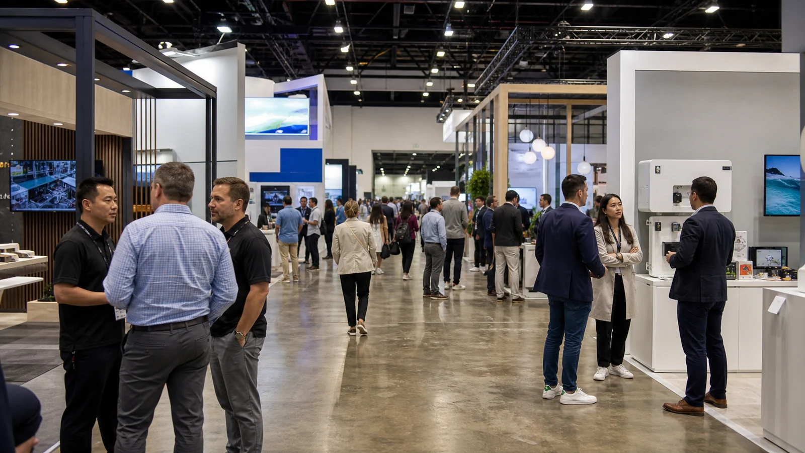
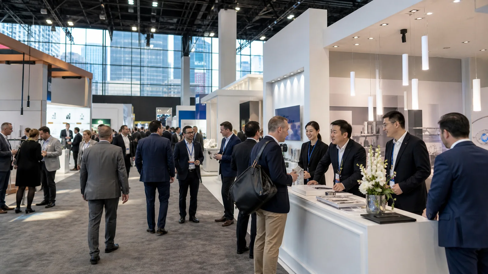
A polished rendering can still produce a booth that is difficult to understand, enter, operate, or build. The design has to work from the aisle and from inside the space. It must first give a passing visitor a reason to look, then support the product discussion or meeting that follows.
Why Good Booth Design Is More Than Visual Appearance?
One weak decision can affect both jobs. A counter placed across the entrance may create storage and a reception point, but it can also make the booth feel closed. A large screen may attract attention, yet hide the product that should begin the conversation. If a demonstration area has no room for observers, the audience will spill into the aisle.
Judge the stand as a working sales environment, not as a collection of attractive features. A good result is easy to recognize from the correct approach, supports a relevant product experience, and remains practical for the team using it throughout the show.
Identify the Booth Type and Experience Type Before Applying the Rules
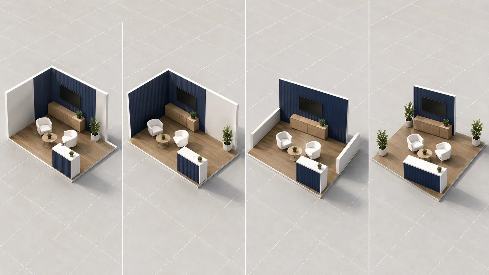
The same rule produces a different layout when the stand has a different number of open sides. Use the assigned floor plan—not the nominal booth size—to confirm where people can approach.
| Booth type | Typical open sides | Main design priority | Common mistake |
|---|---|---|---|
| Inline booth | 1 | Strong front-facing recognition and efficient use of depth | Placing furniture across the only entrance |
| Corner booth | 2 | A clear message and entry from both aisles | Designing one side as the “front” and neglecting the other |
| Peninsula booth | 3 | Multi-direction visibility with a controlled central feature | Letting a tall center structure block important sightlines |
| Island booth | 4 | 360-degree recognition, multiple entry points, and staff coverage | Creating several open sides without a clear first contact point |
Next, define the experience. A product-led booth needs a display that people can approach and examine. A demonstration-led booth needs a visible presentation area, room for observers, and a reset route that stays out of their way. A meeting-led booth normally benefits from a welcoming front area and a quieter meeting space farther inside. If the booth combines all three, decide which experience should dominate the first view.
This distinction prevents you from copying a layout that worked at another show but does not fit the way your current booth will be approached, staffed, or used.
Best Practices for Goals and Aisle Messaging
Set the commercial goal first, then turn it into a layout priority and one clear aisle message.
Best Practice 1: Choose One Primary Booth Goal
Choose the primary outcome before deciding where the screen, counter, product, or meeting room should go. The table below gives useful starting points; they are layout defaults, not fixed templates.
| Primary goal | Layout priority |
|---|---|
| Product demonstration | Put the demo where it is visible from the aisle, allow space for observers, and keep the equipment reset route behind or beside the presenter |
| Lead generation | Use an open entrance, one easy place for a short conversation, and a scan or registration point that does not block the threshold |
| Private meetings | Create a reception point at the front and place the semi-enclosed meeting area toward the rear or side |
| Product display | Provide one clear display face, space for close inspection, and nearby concealed storage for replenishment |
| Brand awareness | Prioritize long-range identification, one strong message, and a simple foreground that does not hide the graphics |
If you have several goals, rank them. A booth can support secondary activities, but the first view and the most valuable floor area should serve the primary one. Record that priority in the design brief so later additions can be challenged against it.

Best Practice 2: Make One Main Message Understandable From the Aisle
From the aisle, visitors should understand who you are and what the booth is about without reading several paragraphs. Use one headline for the central idea. Supporting copy should prove or clarify that message, not introduce a second campaign.
Build the message in layers. The logo and category need to work at longer range. As someone approaches, show the main application or advantage. Keep specifications and process detail close to the product, demonstration, or conversation where they become useful.
Test the final wording from every confirmed approach direction. Ask someone unfamiliar with the project what the company offers and what they would look at next. If the answer changes by viewpoint, correct the hierarchy before adding more copy.
Best Practices for Focal Proof and Brand Hierarchy
The focal point should show why the offer deserves attention. The visual system around it should make that proof easier to recognize.
Best Practice 3: Make the Focal Point Prove Something
Choose the focal point according to the strongest proof you can show. For a machine, that may be the operating area or a cutaway. For a material, it may be a comparison visitors can touch. For a service, it may be one clear application story supported by a short visual explanation. A dramatic structure or moving screen earns its space only when it directs attention to that proof.
If the physical product is present, keep its important face visible from the main approach and leave room to inspect it. When a screen supports the product, place the content where an observer can connect the explanation to the real object. Do not let the screen become a separate attraction that sends attention away from the product.
Review each aisle view and identify the first thing the eye reaches. Then state what that feature proves. If the only answer is “it looks impressive,” the focal point is not doing enough work.
Best Practice 4: Make Every Visual Element Support One Brand Hierarchy
Give each visual element one level in the reading order. The logo identifies the company. The headline explains the main offer. The product or hero image supplies proof, and close-range copy answers the next question. If every item is enlarged or illuminated, visitors have to decide for themselves where to begin.
Keep the main type styles, image treatment, and color logic consistent across signs and screens. The architecture can be quieter. Its job is to frame the message and create usable space, not to repeat every graphic treatment on every surface.
Protect the hierarchy with contrast and breathing room. Before approving another illuminated logo, image, or decorative surface, decide whether it strengthens the main message or competes with it.
Best Practices for Entry and Real-Use Space Planning
Treat entry and space capacity as two separate decisions. First make the way in obvious; then prove that each zone still fits when it is being used.
Best Practice 5: Give Every Open Side a Clear Entry and Starting Point
An open floor does not automatically create an inviting entrance. A full-width table or high counter can make the booth feel closed even when there is space behind it. Chair backs, product plinths, and staff standing shoulder to shoulder can create the same problem.
For every open side, mark the intended entry point and the first place a visitor can comfortably stop. Keep a direct line from that opening to the initial display or welcome point. Test the entrance again while a conversation or demonstration is active; the next visitor should still be able to enter without passing through another group's activity.
Use partial enclosure when the activity genuinely needs privacy, sound control, or a safety boundary. Even then, the opening should read as an entrance rather than an unexplained gap in the structure.
Best Practice 6: Size Each Zone for Real Use
Start with actual product and furniture dimensions, then add the space needed to use them. A meeting table is not only the tabletop; it also needs room for chairs to pull back. A display cabinet needs space for its door to open. A demonstration needs a presenter position and a place for observers to stand.
Show those conditions on an in-use floor plan. Test the busiest likely combination rather than one zone at a time. For example, run the demo while the meeting seats are filled and someone is retrieving a sample. This reveals whether a crowd blocks the entrance, a chair traps a cabinet door, or staff circulation cuts through a conversation.
Keep the required access route clear under the rules for the current show. Approve the space only after a plan showing visitors, staff, furniture, and equipment demonstrates that every core zone can operate at the same time.

Best Practices for Product Display and Meaningful Interaction
Product display explains what you sell; interaction helps an interested visitor move toward a useful sales conversation. Design each for that specific job.
Best Practice 7: Display the Product for Close Evaluation
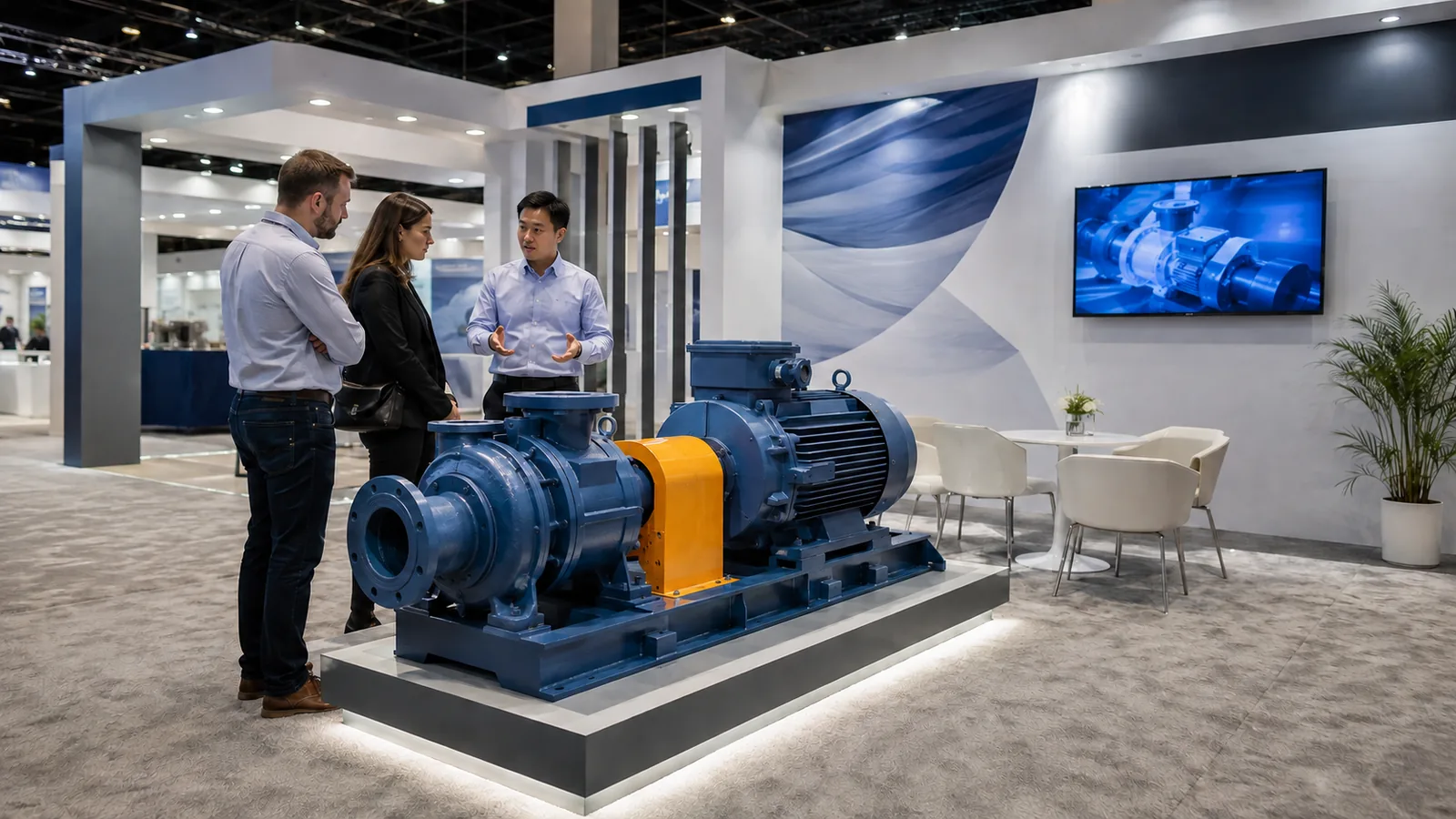
Place the main product where people can recognize it from the aisle and reach the side they need to inspect. If the important feature is on the rear or inside, do not push that face against a wall. Leave a staff position beside the product so the explanation does not happen from across the visitor's shoulder.
Match the display method to the product. Small items often benefit from one organized comparison surface rather than several scattered plinths. Large equipment needs a clear viewing face and a safe operating boundary. Samples that visitors handle need a return position and nearby replenishment storage. Add power, ventilation, or guarding at the start when the product requires them.
When the complete product cannot come to the show, preserve the proof with a working sample, cutaway, material comparison, or application display. The substitute should answer a product question that the full item would normally answer.
Best Practice 8: Design Interaction Around a Useful Next Step
Decide what should happen after the interaction before choosing the device or activity. A short demonstration might lead to a product comparison. A sample test may lead to a technical discussion. A configurator can end with a saved specification or scheduled follow-up. The next step should be easy for staff to recognize and continue.
Build the station around the interaction itself. Provide a clear participant position, an observer view, and a place for the staff member operating it. Put any scan or registration step beside the activity rather than across the entrance. If the experience depends on power or connectivity, decide what useful version can still run when the connection fails.
Avoid games that create a queue but reveal nothing about the offer. Activity alone is not conversion. The interaction earns its floor space when it helps a relevant visitor understand the product and gives the team a sensible reason to continue the conversation.

Best Practices for Graphics, Lighting, and Technology
Treat graphics, lighting, and technology as one communication system. Each part needs a clear job, and all three must work together under show-floor conditions.
Best Practice 9: Approve Graphics at Final Scale and in Real Sightlines
Trade show booth graphic design should follow the viewing sequence. Put the main idea on the surface that faces the strongest approach. Use side panels or lower-priority areas for evidence and detail. When every panel carries a headline, product list, and call to action, the visitor has no obvious place to begin.
Approve final copy and artwork at the intended output size. Then check it against the print supplier's requirements and the material being used. Enlargement can expose weak images; panel joins can split a face or a word; reflective material can reduce readability under direct light. These are production questions, not problems that a screen preview can settle.
Finally, review the sightlines under real-use conditions. A monitor or displayed product may hide the headline, and a staff member standing at the welcome point may cover a key claim. Move critical information before production rather than asking the team to work around it onsite.
Best Practice 10: Give Every Light and Device One Specific Job
Use trade show booth lighting in layers. Ambient light keeps the overall booth readable. Accent light should lead the eye to the main product or message. Task light belongs at a demonstration surface or another place where someone needs to inspect or operate something.
Give screens and devices an equally clear purpose. A screen is useful when it can show movement that the physical display cannot, explain an internal process, or help compare options. If the same job can be done more clearly with the real product or one printed diagram, the screen may not deserve the space.
Test the screen, printed graphics, and real product together. Look for glare and unwanted reflections, then confirm mounting and cable routes. Check the available power and decide how content will be started each day. If the presentation depends on a network connection, prepare an offline version so a failed feed does not become the focal point.

Best Practices for Operations, Compliance, and Build Approval
The final design must support daily booth operation and pass a separate production-validation step. These are different from entry or product-display decisions.
Best Practice 11: Design Staff Work and Reset Into the Stand
Plan the support work that should remain out of the visitor's view. Staff need a defined place for personal items and packaging. Samples need a replenishment point. Waste and cleaning materials need storage that does not share a product-display surface. Equipment controls and service points must remain reachable.
Walk through a normal reset between conversations. Can a staff member retrieve the next sample without crossing a meeting? Can the demo be prepared again while another visitor is watching? If the only convenient place for working stock is the reception counter, the back-of-house plan is not finished.
A visually simple booth often depends on disciplined support space. Decide what must stay within reach, what can remain in remote storage, and who is responsible for restoring each customer-facing area during the day.
Best Practice 12: Validate the Complete Booth Before Production
Create one validation package that shows the same final design across the floor plan, elevations, artwork, product dimensions, furniture schedule, and technical plan. Include an occupied plan showing visitors, staff, furniture, and equipment so the team is not approving an empty version of the space. Resolve any difference between these files before release to production.
Check the current exhibitor manual before production. Structural limits, fire-rated materials, and sightline rules affect the booth itself. Rigging, power, installation, and dismantling requirements affect how it will be delivered onsite. Do not rely on a rule remembered from another event.
Match the test to the risk. Use a product-fit check when equipment clearance is critical, a material sample when finish or color matters, and a lighting test when glare could hide the display. A focused mockup or pre-build review is justified when an error would be costly or difficult to correct onsite.

Common Exhibit Stand Design Mistakes
Several common mistakes can be spotted before a detailed design review. The booth may have too many messages, or its most dramatic feature may say nothing about the product. Furniture can make an open entrance feel closed. A demonstration may work on the drawing but leave no place for an audience.
Other problems appear later: graphics are hidden after equipment is installed, a touchscreen has no useful next step, or storage and power are added after the main layout has been approved. Treat these as signs of an unresolved design decision. Adding another sign, screen, or counter rarely fixes the underlying conflict.
Run a Five-Part Final Design Approval Check
Do not move from visual approval to production approval until these five connected areas have evidence.
| Approval area | Question for your review | Evidence to request |
|---|---|---|
| Purpose and message | Is one visitor action and one main idea clear? | Marked visitor sequence and final-copy aisle views |
| Proof and interaction | Does the focal point help visitors evaluate the offer? | Product or demonstration logic and next-step flow |
| Entry and real-use capacity | Can people enter and use each zone without creating a conflict? | In-use floor plan with real dimensions |
| Visual and technical system | Do graphics, lights, and devices have defined jobs? | Scaled artwork and combined tests |
| Operations and buildability | Can staff operate, reset, and comply under current show conditions? | Operating review, current rule check, and risk-matched build evidence |
Frequently Asked Questions
What Makes a Good Trade Show Booth Design?
A good trade show booth design communicates one main idea, directs attention to relevant proof, makes entry and the first useful action easy, works when people and products occupy it, and can be built under current show conditions. If the offer is visible but the product cannot be approached—or the layout works only when empty—the design is not complete.
What Are the Most Common Trade Show Booth Design Mistakes?
Common mistakes include competing messages, an irrelevant focal feature, blocked entry, zones sized without people or queues, poor product access, graphics hidden by objects, technology without a communication job, missing storage or power planning, and approval based only on an empty rendering. Use these as concept-review warnings rather than waiting for the onsite build to reveal them.
What Is the Best Trade Show Booth Design for a 10×10 Space?
For most inline 10×10 trade show booth spaces, start with an open front and one strong backwall or focal display. The limited floor area usually works better with one main product experience than several small displays.
- Keep tall graphics and storage toward the back, with lower elements near the entrance.
- Avoid multiple freestanding tables or chairs that divide the usable floor.
- Build storage into the backwall, a counter, or another lockable structure where possible.
- If you run a demonstration, show where observers will stand without occupying the aisle.
Treat this as a planning default. The current exhibitor manual controls height, setback, access, and open-side requirements, while the product may introduce additional safety or operating needs.
Should You Choose a 10×20 or 20×20 Trade Show Booth?
Choose by the experience and staffing requirement, not by area alone.
| Decision factor | 10×20 trade show booth | 20×20 trade show booth |
|---|---|---|
| Typical approach | Often organized around one long aisle-facing side | Often approached from several directions |
| Zoning | Works well for two connected zones, such as demo then conversation | Can support several activities operating in parallel |
| Meeting space | Usually limited or semi-open | More practical for a separate meeting area when the plan allows |
| Staffing | Fewer open directions are normally easier to cover | More staff may be needed to cover several entries and activities |
| Main design risk | A long counter or crosswise furniture can split the space | A central structure can block sightlines and weaken 360-degree access |
Confirm the assigned location and open sides before using this comparison. Product footprint, meeting demand, show rules, and your team's operating capacity may change the better choice.
What Trade Show Booth Lighting Works Best?
A layered LED approach is a practical starting point: ambient light for comfortable overall visibility, accent light for the main product or message, and task light for demonstrations or work surfaces. Test the final choice with your actual graphics, products, screens, materials, venue light, mounting options, and available power before production.
Final Thoughts
Your best booth is not the one with the most features. It is the one that connects message, proof, entry, interaction, operation, and buildability into one clear visitor path.
If you are planning a new exhibit stand, share the show name, assigned footprint and open sides, current exhibitor manual and floor plan, primary visitor action, product or demonstration requirements, approved brand assets, current concept, budget range, and required support scope. KingExhibits can use those inputs to help you develop a clearer booth layout and design direction for review before production.