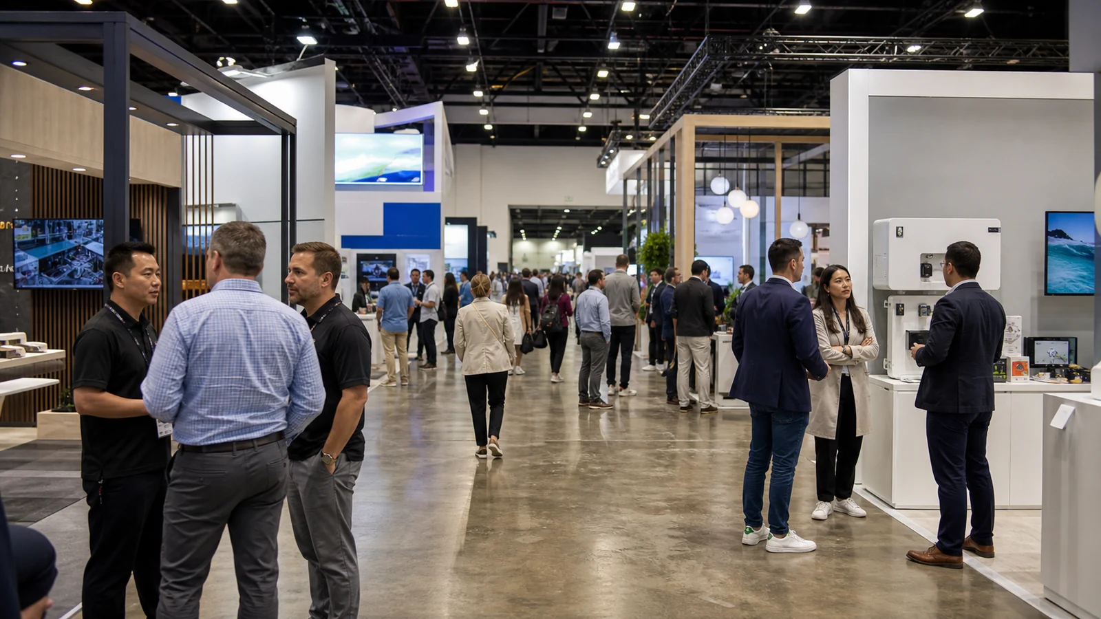
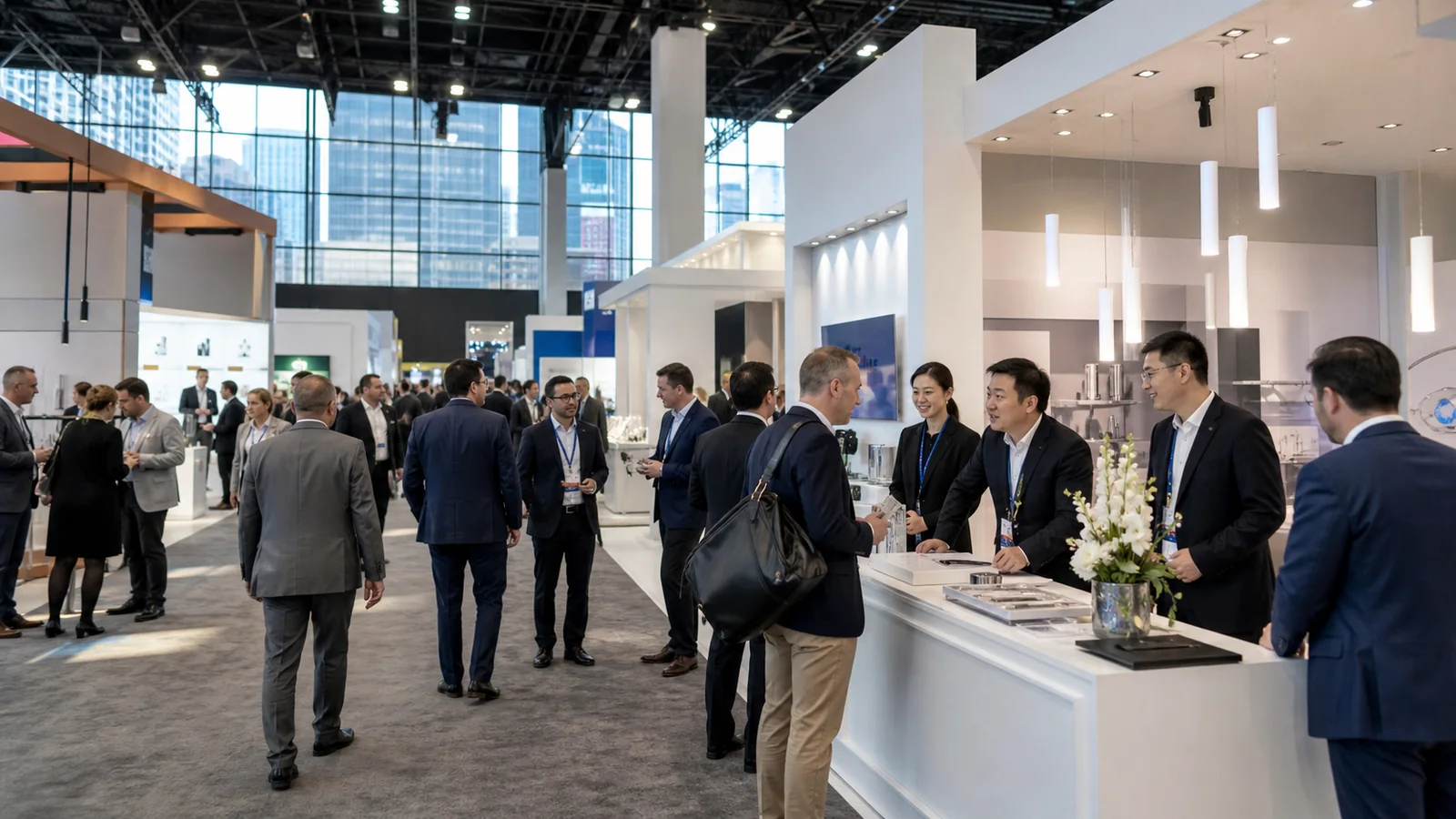
A 20×30 trade show booth gives you 600 square feet, but that space can disappear quickly once products, demonstrations, visitors, meetings, equipment, and staff routes enter the plan. The strongest 20×30 trade show booth ideas do not begin by adding more features. They begin by deciding what visitors should do first, then zoning the footprint around that action. The planning ranges, open-side configurations, and eight layout directions below give you a practical starting point—not a substitute for your official floor plan or exhibitor manual.
What Can Fit in a 600-Square-Foot Trade Show Booth?
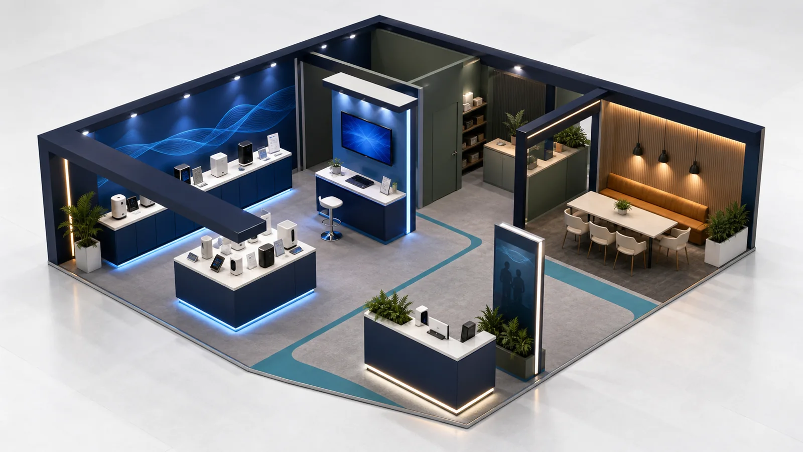
A 600-square-foot trade show booth can support product or demonstration space, visitor circulation, meetings, storage, graphics, screens, and staff support. It usually cannot give every function maximum space at the same time. Use the following ranges only as an early sketching tool. If the booked space is a 20 × 40 island instead, compare a 20×40 trade show island booth rental with the added demonstration and meeting area.
| Functional zone | Illustrative planning range | Area within 600 sq. ft. |
|---|---|---|
| Product or demonstration area | 30%–45% | 180–270 sq. ft. |
| Visitor circulation and viewing | 25%–35% | 150–210 sq. ft. |
| Meeting or consultation area | 15%–25% | 90–150 sq. ft. |
| Storage and staff support | 5%–10% | 30–60 sq. ft. |

These are not industry standards, and you should not add all four maximums. Select values that total 100%. For example, a balanced planning scenario could assign 40% to products or demos, 30% to circulation, 20% to meetings, and 10% to support. In a 20×30 trade show booth layout, that equals 240, 180, 120, and 60 square feet.
Replace that example as soon as you have real dimensions. A machine’s operating envelope, chairs in use, open cabinet doors, a structural column, or a required service point can change the allocation even when the percentages look reasonable.
How Open Sides Change Your 20×30 Booth Design?
The IAEE display guidelines distinguish standard linear, corner, peninsula, and island configurations by how many sides face an aisle. Your assigned floor plan—not the 20×30 dimensions—determines the configuration.
- One-side-open inline layout: Visitors approach from the front. A back wall can carry the main story, but a reception counter or demo crowd can easily block the only entrance.
- Two-side-open corner layout: Visitors approach from two adjacent aisles. Keep the open corner readable and avoid turning either aisle into an accidental back side.
- Three-side-open peninsula booth: A 20×30 peninsula booth has three aisle-facing sides and one neighboring or structural side. That closed side can anchor a screen, meeting enclosure, or service zone while the other sides remain approachable.
- Four-side-open island booth: A 20×30 island booth must work from every direction. Central or low-obstruction structures usually make more sense than treating one edge as a permanent back wall.
Open sides change all five layouts. A gallery needs a clear reading start, a demo needs a primary audience face, a presentation needs a stable background, hospitality needs a quieter edge, and machinery needs both a viewing approach and an installation path.

Compare 8 20×30 Trade Show Booth Layout Ideas
Use this table to shortlist a layout before reviewing the details.
| Layout idea | Best for | Recommended zoning | Main risk |
|---|---|---|---|
| Open multi-product gallery | Comparing several products or applications | Product sequence along the 30-foot dimension with nearby conversation points | Too many displays reduce stopping space |
| Live demo studio | Proving a product function in front of a group | Demo inside the open edge, audience buffer in front, follow-up beside or behind | Crowds block entries and other conversations |
| Presentation hub | Explaining a complex offer to multiple visitors | Screen on a stable background, viewers facing inward, side entry and exit | The audience takes over the booth core |
| Hospitality-first consultation | Appointments and longer business discussions | Open greeting, short standing talk, quieter meeting area | Furniture makes the booth look like a lounge |
| Hero product or machinery | Displaying a large physical product | Product as the anchor, protected viewing route, technical talk nearby | Installation and operating space restrict other zones |
| Interactive trial lab | Letting visitors test a product or workflow themselves | Several controlled activity points around an open waiting and reset route | Queues, resets, and noise overwhelm the experience |
| Multi-brand or partner pavilion | Presenting several divisions, partners, or solution groups together | Shared central brand anchor with distinct perimeter pods | Separate messages feel fragmented or equally important |
| Immersive brand environment | Recreating a customer setting, process, or use experience | Clear threshold, guided experience sequence, and visible conversion point | Architecture consumes space or hides the business offer |
Layout Idea 1: Open Multi-Product Gallery
Best for: Choose this 20×30 exhibit booth idea when visitors need to compare product families, applications, configurations, or solution groups. It works especially well when the range itself helps explain your value.
Recommended zoning: Use the 30-foot dimension as a reading sequence. Put the priority product where it can be understood from the main approach, then arrange supporting groups in a logical order—for example, from a common application to more specialized options. Keep the center visually open and place short conversation points close to the products they support. Storage and replenishment access should sit outside the browsing sequence.
Key design elements: Use a clear product hierarchy, low platforms or angled panels, brief comparison graphics, focused lighting, and enough visual separation between categories. One product or application should have noticeably greater weight than the rest.
Main risk to avoid: Do not turn 600 square feet into a catalog. If every display, wall, and screen competes equally, visitors cannot identify where to start. Reduce the number or depth of displays before sacrificing the main browsing route.

Layout Idea 2: Live Demo Studio With a Follow-Up Zone
Best for: This layout suits equipment demonstrations, product testing, application examples, software walkthroughs, or scheduled launches where proof is more persuasive than a static display.
Recommended zoning: Face the demonstration toward a strong approach, but set it far enough inside the footprint that viewers can stand within the booth. Treat the space between the open edge and the demo as an audience buffer. Put a short technical conversation point beside the demo and a quieter follow-up zone behind or to the side, so interested visitors can continue without interrupting the next session.
Key design elements: Use a defined demonstration surface, a clear presenter position, a visible audience boundary, short graphics explaining what to watch, and an auxiliary screen only when it helps people see detail. Focused lighting should reinforce the product action.
Main risk to avoid: A demo placed on the aisle may attract attention but leave the audience outside your space. It can also block an entrance, interfere with neighboring traffic, and make the follow-up path difficult to find.

Layout Idea 3: Presentation Hub With Multiple Entry Points
Best for: Use a presentation hub for technical explanations, expert sessions, product launches, or scheduled educational content that several visitors need to follow at once.
Recommended zoning: Place the primary screen or presentation wall against the most stable background and direct viewers toward the interior. Keep entry and exit routes on both sides of the viewing area. Product evidence, an expert station, or a short consultation point should sit along those side routes, giving attendees a clear next step when the content ends.
Key design elements: Combine one primary screen, readable topic or schedule graphics, captions where helpful, controlled sound, standing or light seating, and a side handoff point. The screen should support the offer rather than become the entire 20×30 booth design.
Main risk to avoid: Do not let the audience occupy every path through the booth. A late arrival, an attendee leaving, and a follow-up conversation should be able to happen without crossing the speaker position or blocking unrelated visitors.

Layout Idea 4: Hospitality-First Consultation Layout
Best for: This layout supports scheduled appointments, channel meetings, project consultations, and offers that require a longer business discussion.
Recommended zoning: Keep the front edge open with a focused product statement, evidence display, or staffed welcome point. Use the middle for quick qualification and standing conversations. Place semi-private meetings toward the rear or quieter side, using orientation, spacing, or partial-height screening to reduce distraction without closing the booth.
Key design elements: Use one welcome anchor, standing-height consultation points, restrained furniture, semi-private screening, clear brand cues, and concealed hospitality support. Visitors should understand the business reason to enter before they see the seating. For consultation and meeting areas in a complete rental booth, compare trade show rental furniture with the floor plan before approving seating.
Main risk to avoid: Furniture consumes space at its occupied size. Chairs pulled out, people greeting each other, bags beside seats, and drink service all need room. If the front half becomes sofas and tables, passersby may see a rest area instead of your offer.

Layout Idea 5: Hero Product or Machinery Showcase
Best for: Choose this large trade show booth design when a machine, vehicle, large prototype, or physical system is the strongest reason to visit.
Recommended zoning: Position the product so its complete form is visible from the main approach. Protect a viewing route along the sides that contain the features you plan to explain. Place technical graphics and a discussion point beside the related product areas, while keeping meetings and service functions outside the freight, installation, and operating path.
Key design elements: Use low-obstruction structures, focused lighting, clear feature callouts, a technical explanation point, and brand signage that frames rather than competes with the product. Show the operating envelope as part of the layout when doors, arms, panels, or other parts move.
Main risk to avoid: A product can fit inside a 20×30 rectangle and still be impossible to install, maintain, or demonstrate after surrounding structures are built. Static dimensions alone are not enough.

Layout Idea 6: Interactive Trial Lab
Best for: Products or workflows that visitors understand by operating, configuring, sampling, or testing them.
Recommended zoning: Arrange several controlled trial points around an open waiting route, with one shared reset or support area and a visible follow-up point.
Key design elements: Simple instructions, clear start and finish positions, product reset access, durable surfaces, and short proof messages at each station.
Main risk to avoid: Too many stations create queues, noise, and inconsistent resets. Reduce the number of activities before allowing waiting visitors to block the experience.
Layout Idea 7: Multi-Brand or Partner Pavilion
Best for: A parent company, several divisions, or partner brands that need a shared presence while keeping their offers distinguishable.
Recommended zoning: Use one central brand or solution anchor, then assign perimeter pods to each group. A shared welcome or consultation point can connect visitors to the right team.
Key design elements: A common visual system, consistent pod structure, concise individual messages, and a clear directory or category cue.
Main risk to avoid: Equal emphasis can make the pavilion feel fragmented. The overall reason to visit must remain clearer than the separate partner messages.
Layout Idea 8: Immersive Brand Environment
Best for: Recreating a customer setting, service process, material experience, or use environment that cannot be explained as effectively on a standard product wall.
Recommended zoning: Create a clear threshold, a short guided experience sequence, visible product proof, and a conversation point at the exit rather than an unstructured themed interior.
Key design elements: Selective scenery, materials, lighting, sound, or digital content that supports one story, plus an obvious business message and next action.
Main risk to avoid: Architecture can consume the footprint and hide the offer. If visitors remember the setting but not the product, proof, or next step, the environment is not doing its job.
What Drives the Cost of a 20×30 Booth Design?
The same 20×30 booth size can produce very different project scopes. Six groups of inputs usually change what must be designed, produced, transported, or managed:
- Structural complexity, special materials, finishes, and custom millwork.
- Large-format graphics, lightboxes, AV, interactive equipment, and approved vertical or hanging elements.
- Packed volume and weight, freight distance, material handling, and delivery windows.
- Installation and dismantling labor plus show services such as electrical, network, and rigging.
- Rental, purchase, or modular direction; reuse frequency; graphic updates; refurbishment; and storage.
- Changes made after approvals, rush production, or adjustments close to move-in.
When comparing proposals, ask each provider to price the same scope and state the responsibility boundaries. A structure-only price is not directly comparable with a quote that also includes graphics, logistics, installation, or project coordination. Final cost must be based on your show, city, design, services, and deadlines.
Ask for an inclusion matrix instead of comparing totals alone. Mark who owns design revisions, graphics, crating, outbound and return freight, show orders, on-site supervision, damage handling, storage, and post-show changes. This exposes scope gaps before they become late project decisions.
Review the Occupied Layout, Installation, and Reuse
Before approving the concept, add real products, furniture, open doors, staff positions, viewers, queues, equipment, and supplies to the 20×30 trade show booth floor plan. Test a busy demo, two simultaneous conversations, routine replenishment, and the busiest realistic arrival period.
For a complex build, a pre-build review should check assembled dimensions, graphic positions, component identification, missing parts, and installation order. If you plan to reuse the exhibit, identify which structures, graphics, and zones must adapt to different open sides or footprints. Do not assume the same arrangement will transfer unchanged. For an agreed physical check of the selected booth components, review the trade show booth rental pre-build guarantee before approving shipment.
Turn the review into an action list: approve, revise, or verify with the show. Assign an owner and deadline to every unresolved item. This prevents a visually approved concept from entering production while a service route, product clearance, or installation assumption remains unanswered.
Frequently Asked Questions
How Much Space Is in a 20×30 Trade Show Booth?
A 20×30 trade show booth contains 600 square feet. That is the total footprint, not 600 square feet of unrestricted product space. Structures, furniture in use, equipment clearances, visitor routes, storage, and staff access all consume part of the area, so your usable activity zones depend on the final floor plan. For delivered project references at this scale, browse the trade show booth case studies before treating a layout diagram as a finished build.
Is a 20×30 Booth Considered an Island Booth?
Not automatically. A 20×30 booth describes the dimensions. A four-side-open space is an island booth, while a three-side-open space is a peninsula booth. Inline and corner configurations may also use a 20×30 footprint. Confirm the assigned open sides before positioning walls, counters, screens, or entrances.
Can a 20×30 Trade Show Booth Be Rented?
A 20×30 trade show booth can follow a rental-friendly, custom, or mixed structural direction. The better choice depends on how specialized the product integration must be, how often the design will change, which components need to be reused, and who will manage storage, refurbishment, logistics, and show-site services. If rental is the likely direction, compare 20×30 trade show booth rental options against your confirmed open sides, product load and meeting needs.
What Can a 20×30 Exhibit Booth Include Beyond Product Displays?
Beyond product displays, a 20×30 exhibit booth can include a demonstration, presentation, meeting or consultation zone, reception point, screens, storage, and staff support. The useful question is not whether all of them fit, but which activity should receive priority and which supporting functions can remain compact.
What Should You Compare in 20×30 Trade Show Booth Quotes?
Compare proposals using the same scope: structure, graphics, furniture, AV, freight, material handling, installation and dismantling, show services, project coordination, storage, refurbishment, and reuse. Also identify exclusions and third-party responsibilities. Without aligned scope, two 20×30 trade show booth quotes may describe very different deliverables.
Final Thoughts
The best 20×30 trade show booth layout is the one that matches your primary visitor activity, works with the assigned open sides, and still functions when products, people, equipment, and service routes occupy the space. Before approving a concept, make sure you can explain what visitors see first, what they do next, and where a useful conversation happens.
If you have an official floor plan, product or demo dimensions, meeting priorities, and reuse goals, KingExhibits can help turn those inputs into a reviewable 20×30 booth layout.