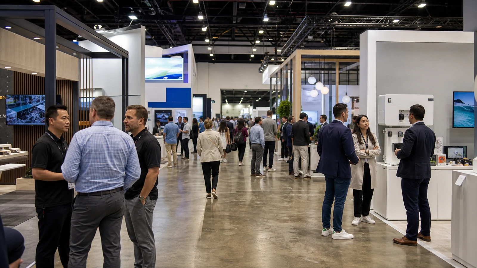
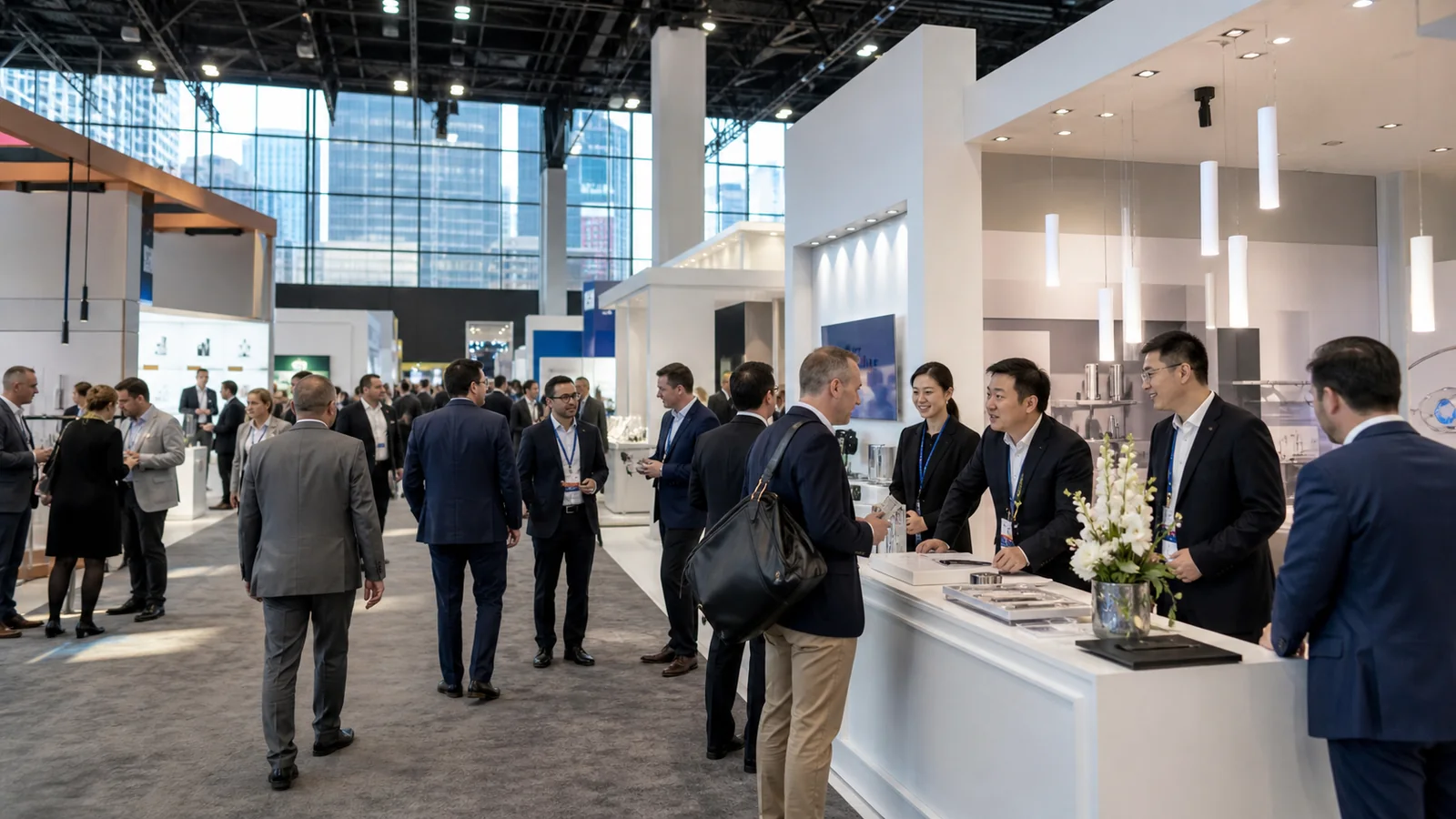
The right booth idea should make your company easier to notice and your product easier to understand. It does not have to be the most complicated feature in the hall. It has to give people a reason to look, step in, and remember what they saw. Here are 18 ideas you can adapt to different products, booth sizes, and exhibiting budgets.
Find an Idea That Matches Your Exhibiting Goal
| What you want the booth to do | Ideas to review first |
|---|---|
| Attract attention from a busy aisle | 1, 2, 4, 5, 6 |
| Make a technical product easier to understand | 3, 4, 7, 10, 11, 17 |
| Let visitors taste, touch, test, or compare | 7, 8, 9, 10 |
| Make better use of a small or open-sided space | 12, 13, 14 |
| Support scheduled sales meetings | 15, 16 |
| Reuse the same booth at several shows | 18 |
Ideas That Help People Notice Your Booth
1. Build a One-Message Backlit Wall
A backlit wall gives your small booth the visual weight of a much larger exhibit without taking away usable floor space. The even light makes the graphic look cleaner than a standard printed panel, and a strong image remains visible when the aisle is crowded. For a 10×10 or 10×20 booth, this is often a better first investment than adding more furniture or several small signs. Choose the product, application, or claim you most want people to remember, then support it with one dominant image. A protective-packaging company, for example, could show a fragile product inside the finished pack and place the real insert directly below. Someone walking past sees the application; someone who stops can inspect the material.
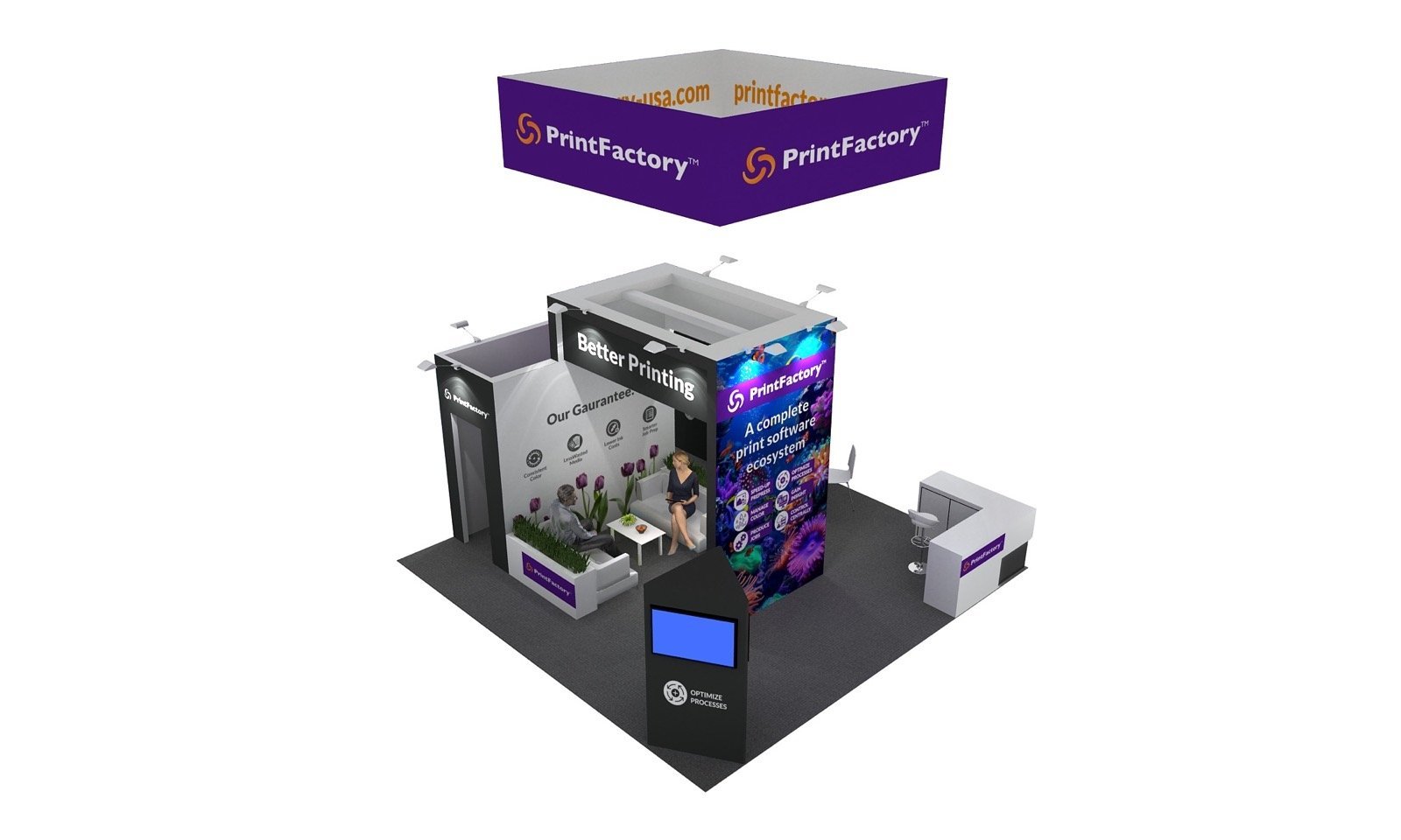
The common mistake is using the extra brightness to display more information. Five product photos, a company history, two QR codes, and a list of services remain cluttered even when they are illuminated. Backlighting makes a clear message stronger. It does not decide which message matters.
2. Add a High-Level Brand Frame
At a busy trade show, the upper part of the booth often does the first job: helping people locate you over the heads, screens, and structures between the aisle entrance and your stand. A high-level frame, tower, or suspended sign gives scheduled visitors a landmark and helps the brand remain recognizable after they have passed several competitors.
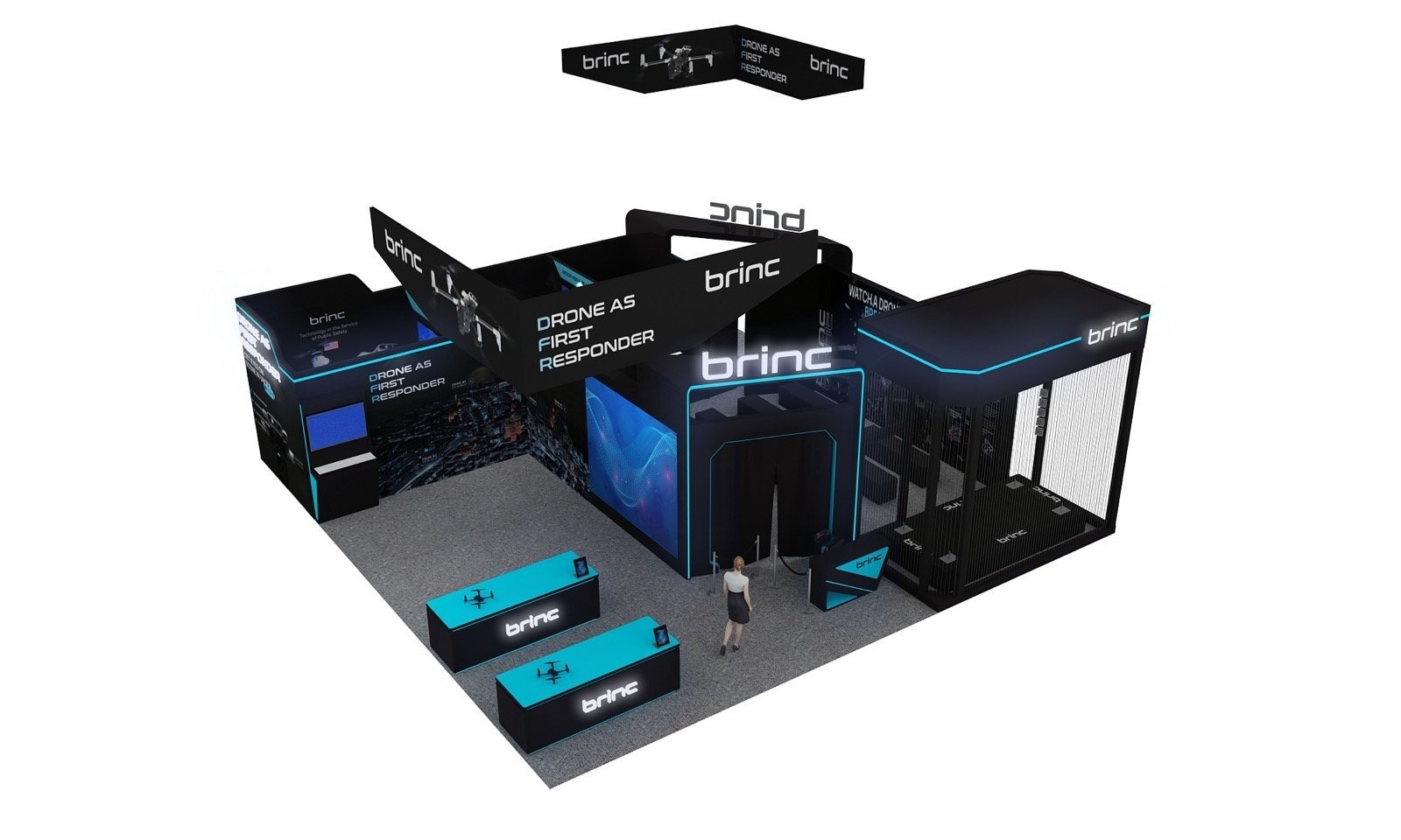
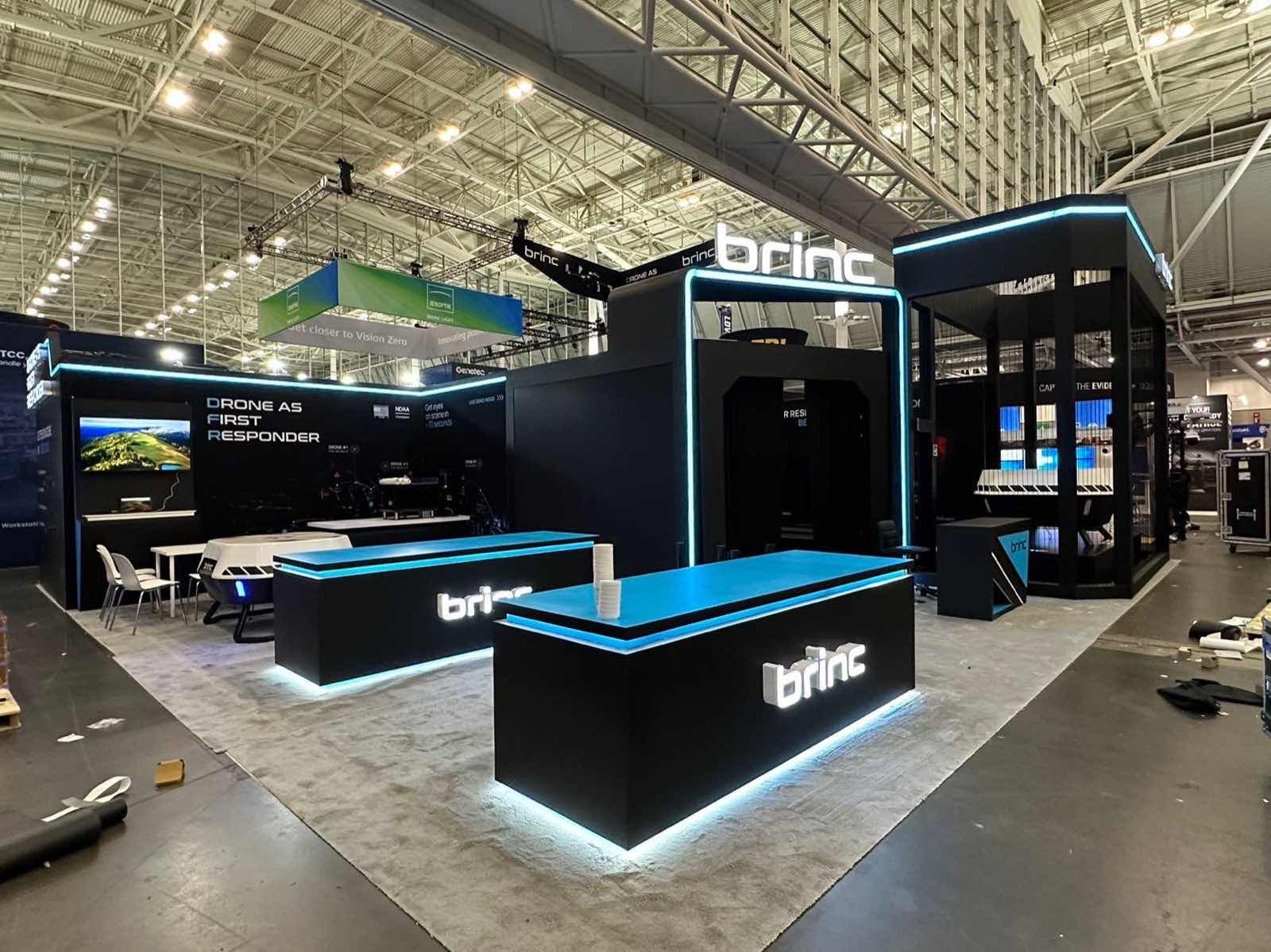
The BRINC 40×40 booth at IACP 2024 shows how to make this feature feel connected to the exhibit below. Its black overhead frames establish the silhouette, while cyan lighting reappears around entrances and lower displays. From a distance, people see the shape; as they approach, the same visual language leads them into the space.
This idea earns its footprint and budget when the booth has more than one approach or needs to stand out across a large hall. It is less convincing when a high sign floats above an unrelated booth. Repeat its color, geometry, or lighting at eye level. For most 20×20 and larger booths, that connection matters more than making the structure taller.
3. Let the Real Product Carry the Booth
Large machinery, vehicles, furniture, and production equipment already give your booth something many exhibitors spend heavily to create: scale. Use it. When the real product is the largest visual feature, visitors immediately understand what your company makes, and technical discussions can happen around the actual controls, access points, finishes, or components.
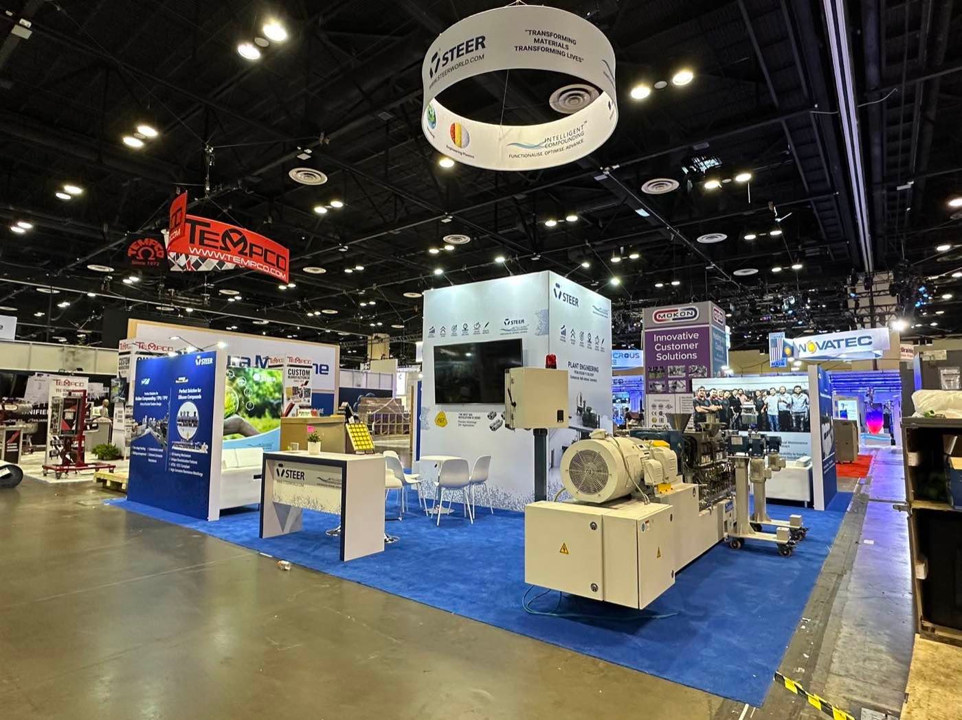
In the STEER 30×30 booth at NPE 2024, the equipment occupies the foreground while the wall, screens, and blue floor create a quieter frame. The booth feels substantial because the product is not competing with decorative architecture. Start the layout with the most important viewing angle. Face the side your sales team needs to explain toward the strongest aisle, then protect enough open space for two or three people to stand there without blocking the product. Utilities, weight, loading sequence, operating clearance, and service access still have to be resolved, but they should support the display instead of pushing the machine into a leftover corner. If the product itself is impressive, do not make visitors search for it.
4. Turn a Small Product Into an Oversized Model
When your product fits in a hand, it is difficult to make it visible from twenty feet away. An oversized model changes that instantly. It gives your component the stopping power of a large exhibit and makes details such as an internal channel, locking action, layered structure, or material transition easier to explain.
The best oversized models enlarge the product advantage, not just the outside shape:
- A valve cutaway can reveal the flow path.
- A closure can let visitors operate the locking action.
- A layered package can open to expose the protection that is normally hidden.
Keep the production part beside the model. The large version attracts attention and starts the explanation; the real part gives the conversation credibility. Without that handoff, an expensive model may become a photo prop that people remember without remembering the company or product advantage.
5. Create a Recognizable Color World
Color can make your booth recognizable before anyone reads the logo. This is particularly effective when your company sells food, beauty, pet, consumer technology, or lifestyle products, because the exhibit also becomes a background for photography and social content.
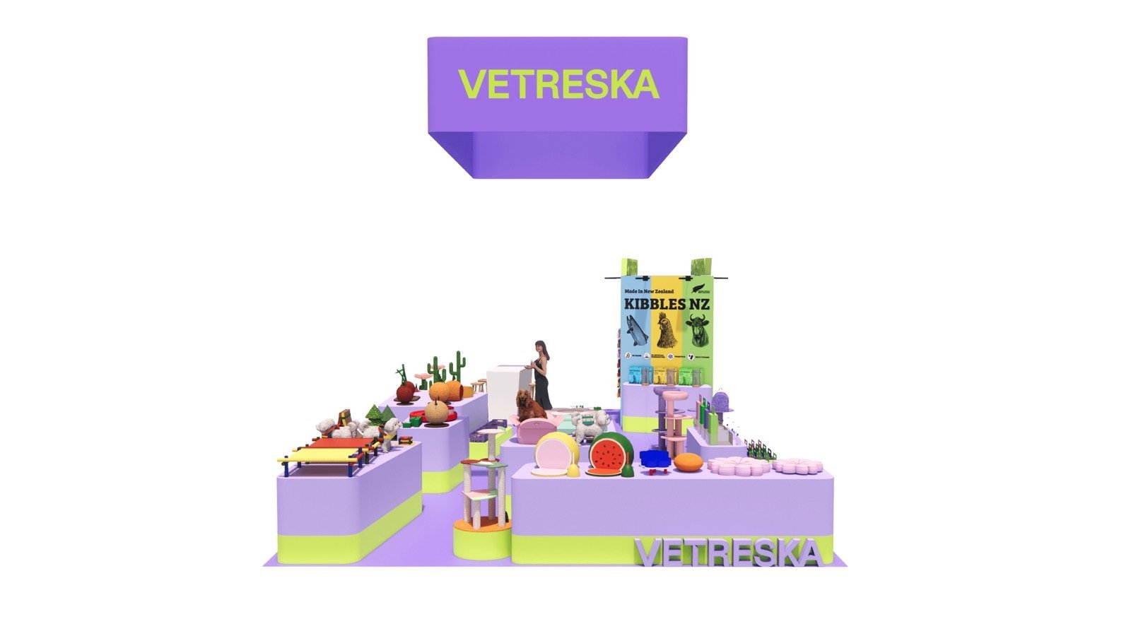
The Vetreska booth concept uses a broad lavender field, smaller lime accents, and products displayed at several heights. The palette gives the space a playful character, but it does not ask every surface to compete. That restraint is what keeps the products visible. Build your palette around one dominant color, one quieter supporting surface, and one accent that repeats in a few deliberate places. If your packaging already uses several strong colors, a neutral wall or shelf may sell the range better than another saturated background. Also review physical samples under lighting similar to the show. A color that looks premium on a laptop screen may print dull, shift under cool LEDs, or clash with the product once it is installed.
6. Use a Screen or LED Wall to Show More Than the Booth Can Hold
A moving screen lets your booth show things that cannot travel to the show floor: your production line in operation, a large installation, the complete product range, a transformation over time, or a finished application in another country. That wider picture helps communicate your company’s capabilities while the real samples in the booth prove the details. Motion also catches peripheral vision, so a good sequence can pull attention toward your booth from farther down the aisle than a static graphic.
Your screen should answer one visual question at a time. Show the problem, the change, and the result in a short loop that makes sense without sound. Large product footage and close-up movement work better in an aisle than a three-minute corporate film filled with small subtitles. Most passersby will give the opening scene only a few seconds.
The added cost is often lower than exhibitors expect when a large television is enough. As a U.S. planning reference, a 2026 official exhibitor AV order form lists 50–80 inch commercial displays at about $1,300–$3,000 for the event equipment rental. After the same form’s 70% setup and strike charge, the display and labor come to roughly $2,200–$5,100, before tax, electricity, mounting, and content. A true seamless LED wall is a different investment: published U.S. packages start around $3,000 for a small 8×6-foot one-day wall, while a close-viewing 10×6-foot wall commonly falls between $6,500 and $15,000, depending on pixel pitch and included service (LED Brothers; AVR Expos).
For a 10×10 booth, a well-positioned 65–80 inch display usually delivers better value. Move to a modular LED wall when seamless scale, long-distance visibility, or a major launch is central to the show. Spending more on screen area will not help if the footage is generic; one strong product story will.
Ideas That Make the Product Easier to Experience
7. Make a Live Demonstration Easy to Understand Mid-Cycle
People rarely arrive at the beginning of your trade show demonstration. They join while the machine is already running, stand behind someone taller, and decide quickly whether the result is worth waiting for. Design the demo so your input, process, and output remain visible at the same time.
For a compact printing system, blank material could enter on the left, pass through the machine, and appear as finished output on the right. If the important action is too small for the second row to see, an overhead camera can enlarge that exact moment. The viewer does not need a full technical presentation to understand what changed.
Short, repeatable cycles usually generate more useful stops than one long scheduled performance. They give your sales team a visible starting point and turn a performance claim into something visitors can judge for themselves. The practical work belongs behind or beside the demonstration: consumables, spare samples, waste, reset tasks, and staff movement should not interrupt the sightline. A live machine attracts a crowd; a clear result keeps the right people there.
8. Give Visitors One Useful Comparison to Make
A row of samples shows variety. A comparison station shows a difference.
Give visitors one quick action:
- Feel two finishes.
- Operate two closures.
- Compare two printed results.
- Bend two materials.
- Match a sample to an application.
Participation makes a technical point easier to remember, and the choice gives your team a natural opening: “Which result is closer to what you need?”
Keep the comparison fair and obvious. Samples should have similar dimensions, sit under the same lighting, and carry labels that describe the meaningful difference rather than only internal model numbers. Leave enough clear counter space to place two samples side by side. Otherwise, people pick up one item, return it, and try to compare from memory.
This idea is strong for materials, coatings, packaging, components, fabrics, and finishes because the product itself provides the evidence. Resist filling the station with the entire catalogue. One comparison that proves a reason to choose is more valuable than twenty samples that need a salesperson to decode them.
9. Turn a Tasting Counter Into a Product Display
Sampling can make your food or beverage booth busy, but activity is not the same as product recognition. If a visitor receives your drink from an unbranded dispenser or a snack from a plain tray, the taste may be remembered while the pack and product name disappear.
Keep your sample, retail pack, and brand cue in the same field of view. An unopened bottle beside each serving point connects the flavor to the exact SKU. Color-coded trays that repeat your packaging make a product family easier to compare. An illuminated shelf behind the server keeps the packs visible in photographs even during a crowded tasting period. The working side needs equal attention: cups, utensils, refrigeration, waste, cleaning supplies, and replenishment stock all need assigned places. Once those items spread across the customer-facing surface, the booth starts to look like a temporary kitchen. A good tasting counter continues to advertise your product while the team serves it.
10. Pair a Digital Configurator With Something Real
If your product has hundreds of combinations, bringing every option creates a crowded booth and still leaves gaps. A configurator can narrow your range by application, size, finish, accessory, or layout and produce a relevant result in a few steps.
The most persuasive sequence moves from screen to sample:
- Narrow the options by application or need.
- Show the recommended configuration in context.
- Hand over the matching finish, control, attachment, or package sample.
Visitors get the breadth of a digital catalogue without losing the confidence that comes from touch and scale.
Place the screen where you and a visitor can use it together. Someone facing an unattended kiosk often browses without giving your team any context. Side-by-side use turns the same technology into product qualification and makes it easier to save or email a configuration for follow-up. Keep the path short; if reaching a useful result takes ten screens, a printed selector may do the job faster.
11. Project Movement Directly Onto a Model
Projection mapping is worth considering when your product story depends on showing exactly where a process happens. It can trace airflow through your device, product movement through a line, energy use across a building, or water through a system directly on the physical form. Viewers no longer have to look back and forth between your model and a separate animation.
One model can also carry several stories. A production line may first show normal flow, then highlight inspection points, cleaning zones, or an alternative route. The physical object supplies scale and orientation while the projected layer changes. This is a specialist idea, not an automatic upgrade from a monitor. It needs controlled light, accurate alignment, stable geometry, and content produced for the final model. Use it when spatial understanding would influence the buying discussion or when the full-size system cannot be brought to the show. If the content is simply a sequence of product slides, a bright screen will be clearer, easier to update, and less expensive.
Ideas for Small, Corner, Island, and Meeting Booths
12. Remove the Barrier From a 10×10 Booth
Your 10×10 booth usually does not have a space problem. It has a priority problem. Once a table spans your entrance, two chairs occupy the center, and literature covers the remaining counter, the booth may be full before a visitor steps inside.
Use your rear wall for the main message, place a slim counter or lockable cabinet along one side, and reserve the other side for the product or sample. The open center lets someone enter without committing to a formal meeting and gives your staff room to start a discussion without standing in the aisle.
The design will feel larger because the eye reaches the back wall uninterrupted, not because the booth contains less value. One product story and one compact interaction point usually look more confident than five features squeezed into 100 square feet. Whenever another chair, shelf, or screen enters the plan, decide what it replaces. The same principle appears in these 10×20 booth layout examples, where the extra frontage allows a second zone without closing the entrance.
13. Use the Diagonal View in a Corner Booth
A corner booth gives you two open aisles, but the most valuable sightline often runs diagonally across the exposed corner. Place your hero product or strongest visual where it can be discovered from that angle, and keep the intersection free of tall counters and storage towers.
The two aisle approaches do not need identical displays. Your longer sightline may carry the bold brand image, while the busier aisle offers a product sample or quick reception point. What matters is that both lead into the same story. Two unrelated “fronts” make the booth feel divided and force your staff to choose which side to watch.
Before approving the rendering, check the view from:
- the longest approach;
- the busier cross aisle; and
- the exposed corner itself.
Neighboring booth heights, entrances, food areas, theaters, and main traffic routes change which view deserves priority. Simply mirroring a previous corner layout can put the strongest feature on the quiet side and the storage door on the busy one.
14. Give an Island Booth One Center of Gravity
Your island booth is open on four sides; it does not need four versions of the same front wall. Repeating reception desks and headlines on every edge breaks your generous footprint into smaller, unrelated pieces.
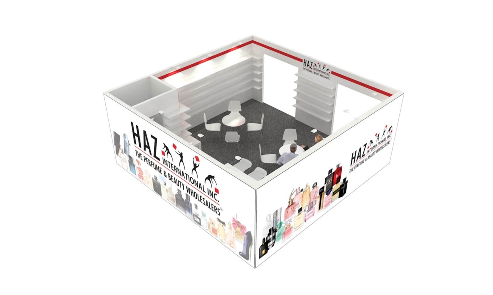
A central tower, framed screen, product platform, or architectural canopy gives the booth one recognizable center. Different product zones may address different aisles, but repeated materials and lighting make them feel like parts of one exhibit. Storage and reception often fit closer to the core, leaving the perimeter open for approach and product viewing.
The centerpiece should help visitors orient themselves after they enter, not hide your products behind a monument. Walk around the layout from all four aisle directions and check what disappears. A central feature that looks impressive in the front rendering may block your key demonstration from two sides. Our 20×20 trade show booth designs provide more examples of how open-sided layouts handle this balance.
15. Replace One Large Lounge With Several Consultation Points
One oversized lounge often looks comfortable in a rendering and sits half-empty during the show. Several compact consultation points give your team more chances to continue a product discussion without taking every visitor away from your display.
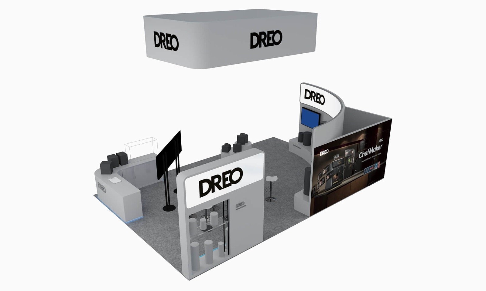
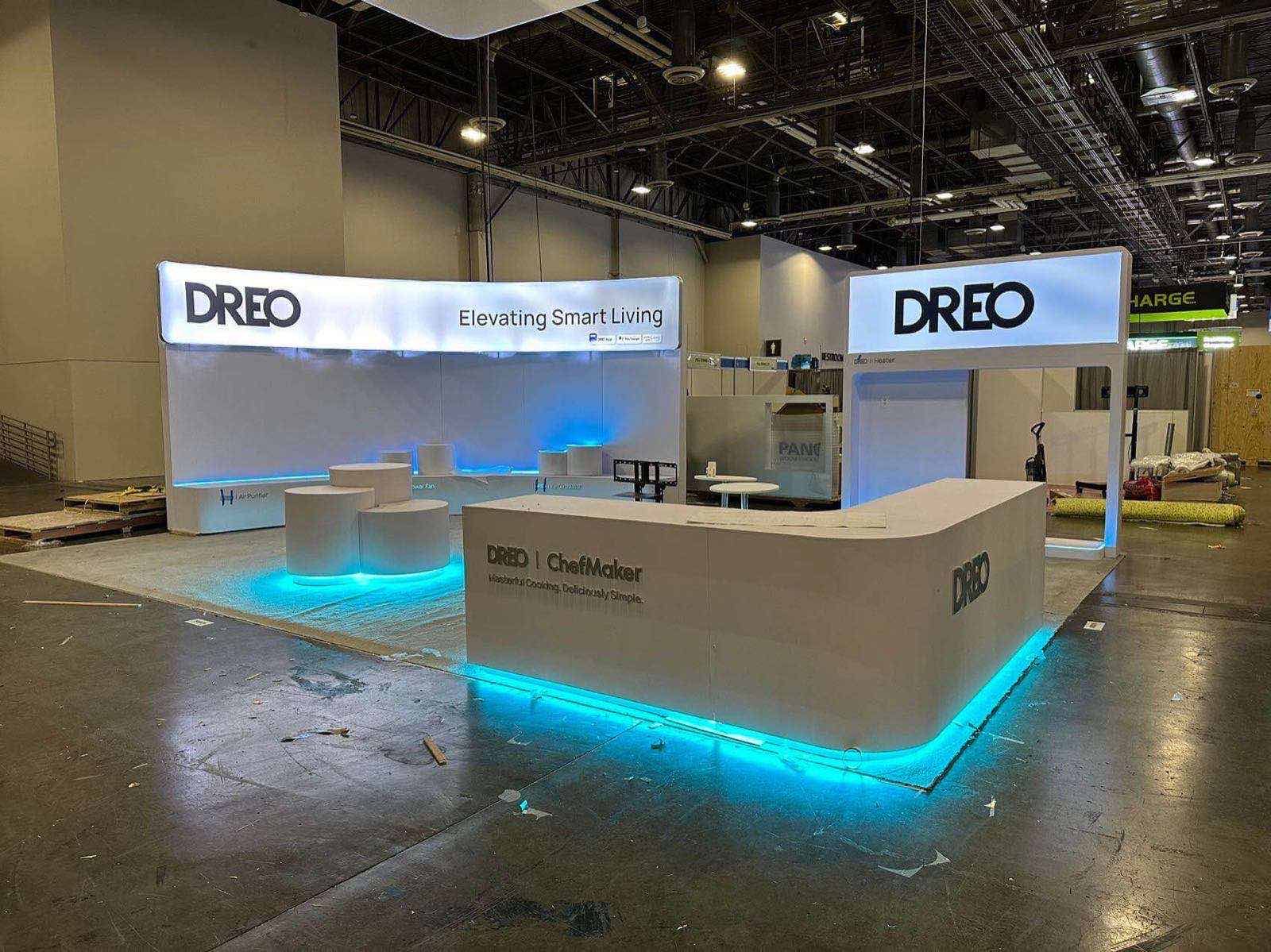
The DREO 20×30 booth at CES 2024 uses small tables alongside illuminated brand elements and product displays. The meeting areas feel connected to the exhibit, and several discussions can happen at the same time.
Size each point for the material your team will discuss. Two people reviewing a laptop need a smaller table than four people comparing drawings or samples. Screens and products should be visible from both seats, and tables need enough separation that adjacent discussions do not merge. This layout suits short qualification, product review, and next-step conversations. When your meetings are confidential or regularly last half an hour, one enclosed room or an off-floor meeting becomes the better tool.
16. Use a Double Deck Only When the Upstairs Space Has a Job
A double-deck structure gives your large booth one of the strongest silhouettes in the hall, but height alone is not the reason to build it. The real return is separating your scheduled meetings from demonstrations, reception, and aisle traffic below.
Upstairs, a quieter lounge gives customers more privacy and keeps longer discussions from consuming the product floor. Downstairs remains open for the people who came to see the equipment or experience the brand. The staircase can reinforce the design through a branded side wall, open profile, or illuminated handrail instead of being treated as an awkward service element.
The decision should begin with your meeting schedule. Stairs and supports consume valuable ground-floor space before the second level adds any capacity, while engineering, approvals, freight, labor, and installation raise the total investment. When your team expects mostly walk-up introductions, use the footprint for products and several smaller tables. When valuable meetings are already booked and privacy matters, the upper lounge has a clear commercial purpose.
Ideas That Add Context or Long-Term Value
17. Show the Product in One Recognizable Application
Visitors often understand your product faster when they see one piece of the world it belongs to. You do not need to build a complete showroom. A carefully chosen fragment is usually more focused and easier to execute.
The scene only needs enough context to answer a product question:
- Outdoor lighting beside a short path can reveal beam, finish, and mounting height together.
- An architectural material in a finished wall section can sit beside its cutaway.
- A pet product in one correctly scaled home or retail scene can remain next to the packaged item.
Choose the application that answers what people struggle to imagine from your loose sample. The setting may clarify scale, installation, light quality, material transition, workflow, or the final customer experience. If removing the scene would not change your product explanation, it is decoration. If the scene helps someone picture the product in a real project, it is doing sales work before your team speaks.
18. Design One Booth System for Several Shows
If you exhibit several times a year, brand consistency may be more valuable than building a completely new booth for every event. A modular system keeps your recognizable frame proportions, counters, lighting, and product fixtures while changing the graphics and arrangement for each audience.
One kit might change in several ways:
- Two frames join into a long back wall for a 10×20 inline booth.
- The same frames separate to mark two approaches in a 20×20 island.
- Graphic panels move from a corporate message to an industry-specific campaign.
- Replaceable shelf inserts support another product family without making the booth look improvised.
The saving comes from planning your future layouts before the first booth is built. If every new footprint requires cutting panels, drilling fresh holes, reinforcing frames, and replacing cases, your system is reusable in name only. Map the sizes and shows you are likely to use over the next twelve to twenty-four months, then design the joints, graphics, lighting connections, packing, and storage around those changes. Reuse works when adaptability is part of the original idea, not a promise made after production.
Frequently Asked Questions
What Makes an Exhibition Booth Stand Out?
Give people one feature they can recognize from a distance and one product-related reason to stop at eye level. Your distant feature may be color, height, light, an oversized model, or motion. The stopping point should help them see, touch, test, taste, or understand your product—not read another general slogan.
How Should You Design a Small Exhibition Booth?
In a 10×10 booth, place the main message on the rear wall, keep the center open, and put storage or a slim counter along one side. Use the remaining side for one product or interaction. That gives you 100 square feet with a clear entrance instead of a room filled before the first visitor arrives.
What Is the Best Layout for a Trade Show Booth?
Your open sides determine the starting layout: a rear focal wall for an inline booth, an open diagonal approach for a corner, and a central landmark for an island. Your product size and demonstration space come next, followed by meeting and storage needs. There is no single floor plan that performs equally well in all three booth types.
How Can You Make a Booth Look More Expensive?
Reduce the number of visible finishes and execute the remaining ones consistently. Straight graphic joints, aligned edges, concealed cables, repeated lighting details, and enough empty space around your product create a more finished impression than several unrelated premium materials.
How Many Products Should You Display?
Start with one hero product and add only the samples needed to prove a meaningful difference. Your machine launch may need one operating unit; a material comparison may need four or six equal-size samples. Move minor colors, models, and configurations to a digital catalogue rather than displaying every SKU.
Can a Rental Booth Still Look Custom?
Yes. A rental structure looks brand-specific when the layout, graphics, lighting, product fixtures, and visible finishes are designed as one exhibit. Visitors respond to the experience they can see; whether every hidden frame was fabricated for a single show has far less influence on the final impression.
Choose the Idea That Improves the Visitor Experience
Start with the result you need: stronger aisle visibility, clearer product explanation, more hands-on interaction, better meeting space, or a system you can reuse. Then decide which idea deserves the budget and floor area. A booth becomes memorable when its main feature helps people understand the company and product—not when it simply adds more things to look at.
If you already know the show and booth size, send us the floor plan, product dimensions, target visitors, working budget, and deadline. We will use those details to develop a practical design direction for your U.S. trade show. You can also review completed work in our trade show booth design gallery.