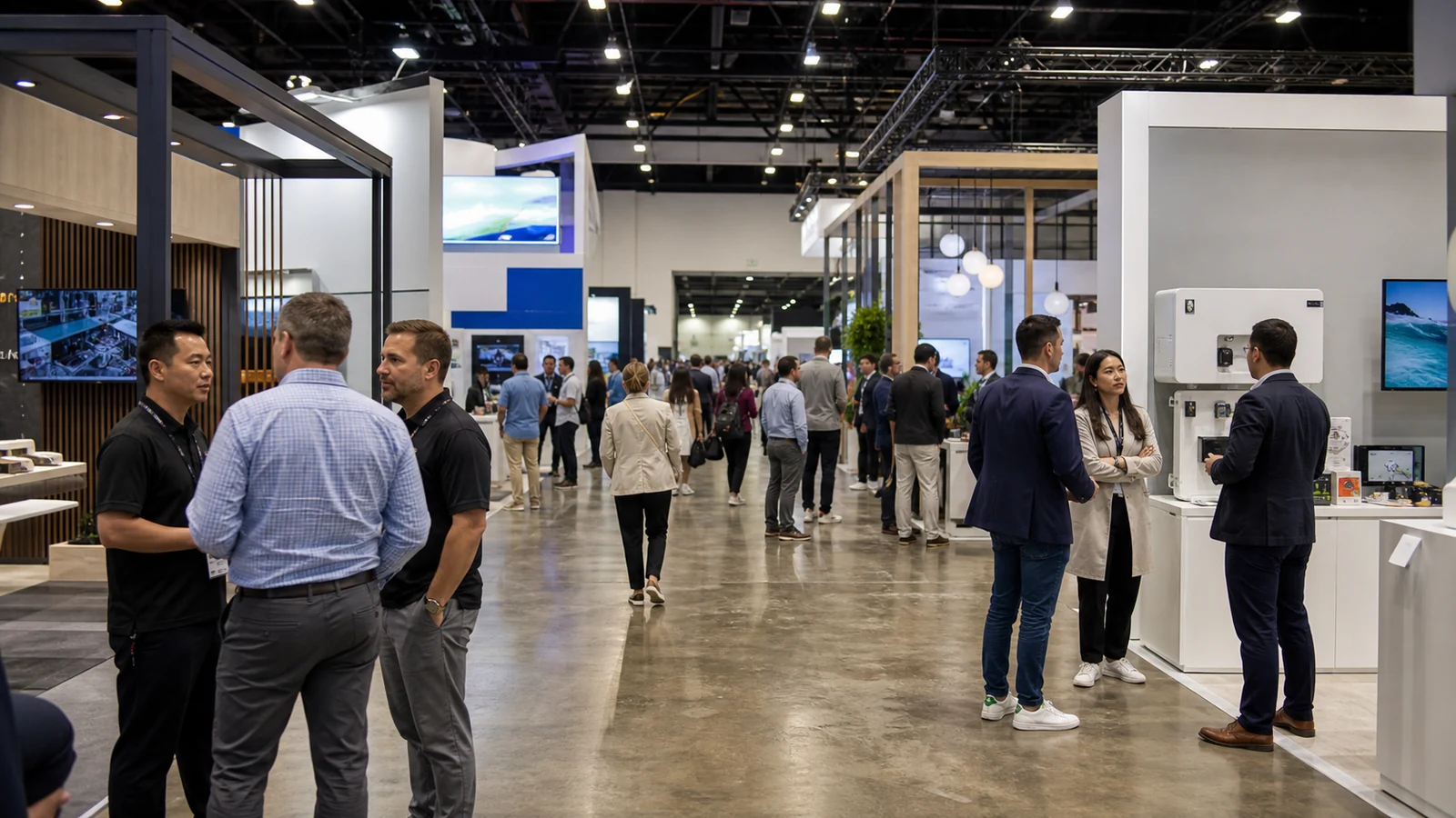
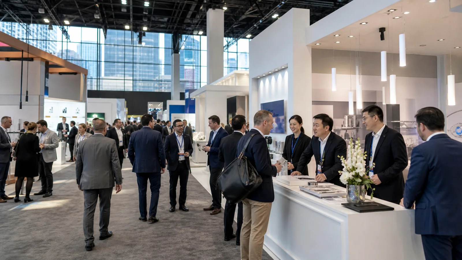
If you are planning a booth redesign for 2026, you face a familiar risk: a concept can look current in the rendering yet fail on the show floor. Visitors may not understand your product, enter comfortably, or reach the right conversation, while your budget disappears into features that add spectacle but not business value.
This guide evaluates eight trade show booth design trends against those risks. You will see what each trend changes, when it deserves your budget, what to verify before approval, and when to leave it out.
The Bigger Shift: From Static Display to Working Experience
Among the broader trade show trends for 2026, the strongest design change is not a color, material, or screen format. Booths are being treated less like branded scenery and more like places where visitors do something useful.
That “something” depends on your show goal. A technical product may need a controlled demonstration. A new market entrant may need a ten-second explanation that earns a longer conversation. A company with a mature product line may need to route different visitors to different specialists.
Start with one job for the booth. Then judge every trend by whether it makes that job easier. If the feature attracts people but creates a queue, hides the product, or overwhelms the staff, it is not progress.
1. Modular Architecture Designed for More Than One Show
Modular no longer has to look like a generic kit. Current systems can combine reusable frames with custom graphics, lighting, product fixtures, and selected architectural pieces. The important trend is not the hardware itself. It is designing a booth family that can change size without losing its identity.
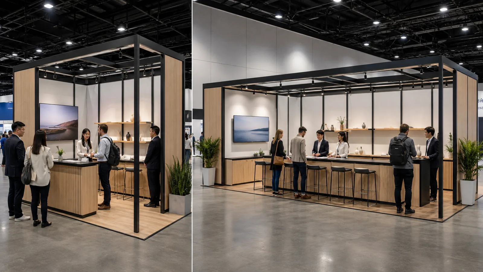
This is useful when your program includes several shows, especially if the footprints vary. A central tower, demonstration wall, reception point, or lighting language can remain recognizable while the surrounding layout changes from an inline booth to an island.
Ask for more than a rendering of the largest version. Request floor plans for the actual sizes you expect to book. Identify which components are reused, which graphics must be replaced, and where storage, repair, packing, and transport enter the plan.
Do not choose modularity only because it sounds efficient. If every event requires a completely different story, product set, or structural rule, forcing one system across the program may create awkward compromises. Reuse should protect the parts of the experience that deserve to remain consistent.
2. Sustainability Built Into the Booth's Next Use
Greenery and wood-look finishes can create a natural mood, but they do not prove that a booth is sustainable. The more meaningful direction is circular design: fewer one-use components, replaceable graphics, reusable structures, materials that can be separated, and a documented plan for what happens after dismantling.
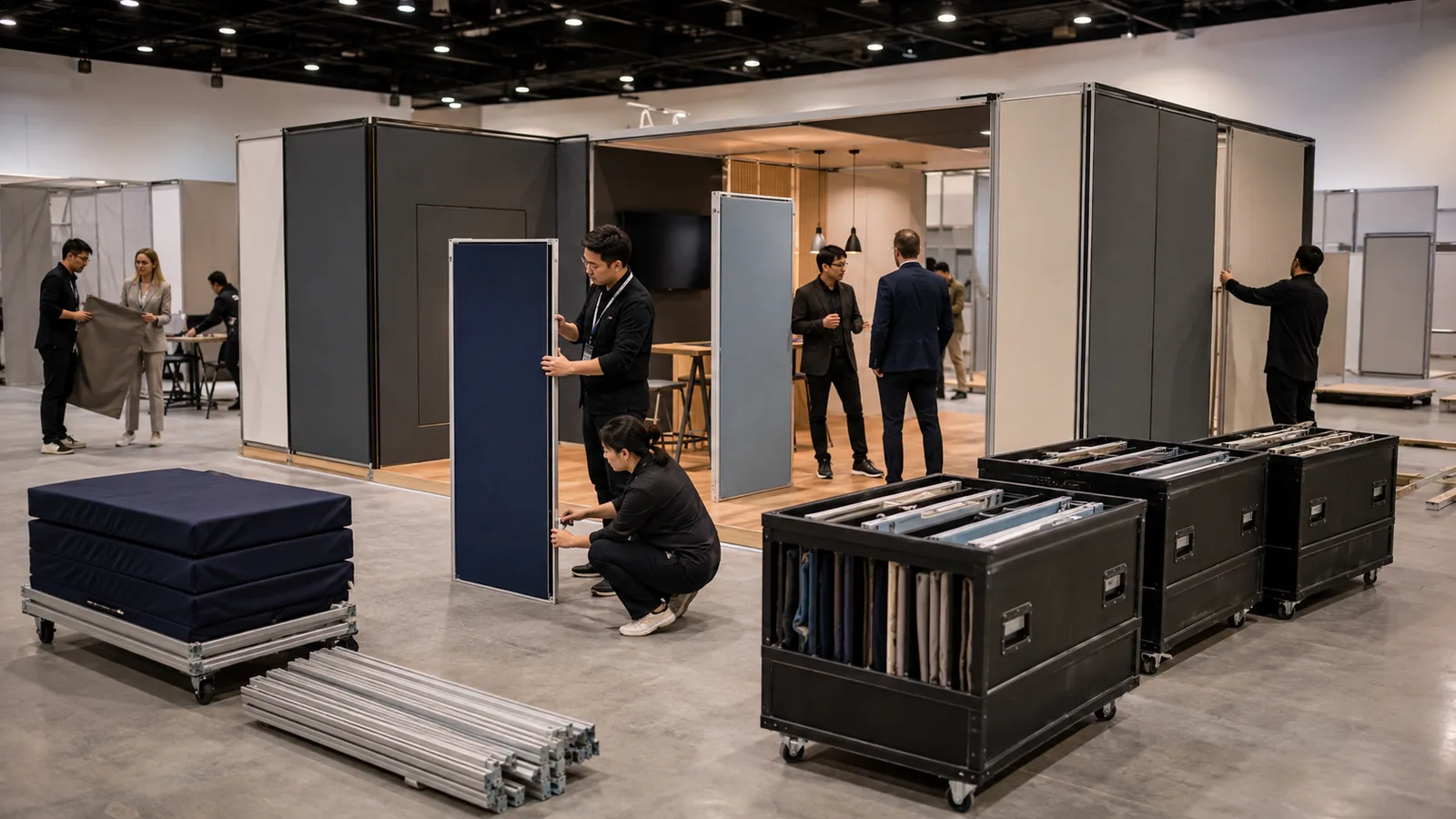
This changes the design conversation. Instead of asking only, “What material looks sustainable?” ask:
- Which major parts will be used again?
- Can damaged surfaces be repaired without replacing a full wall?
- Can graphics be removed without destroying the underlying panel?
- Can the structure adapt to another booth size?
- Who records what is stored, recycled, returned, or discarded?
These questions also expose weak marketing claims. “Eco-friendly” is too vague to guide a build. A component list, reuse plan, packing method, and end-of-life route give your team something it can verify.
The trend is most valuable when it begins with your show calendar. A reusable structure that travels repeatedly may be a better decision than a visually “green” booth that is built once and discarded.
3. The Product Demonstration Becomes the Visual Center
For years, many booths put a large brand statement at the center and squeezed the product demonstration into whatever space remained. The more useful direction reverses that order. The moment that proves the product becomes the organizing feature of the booth.
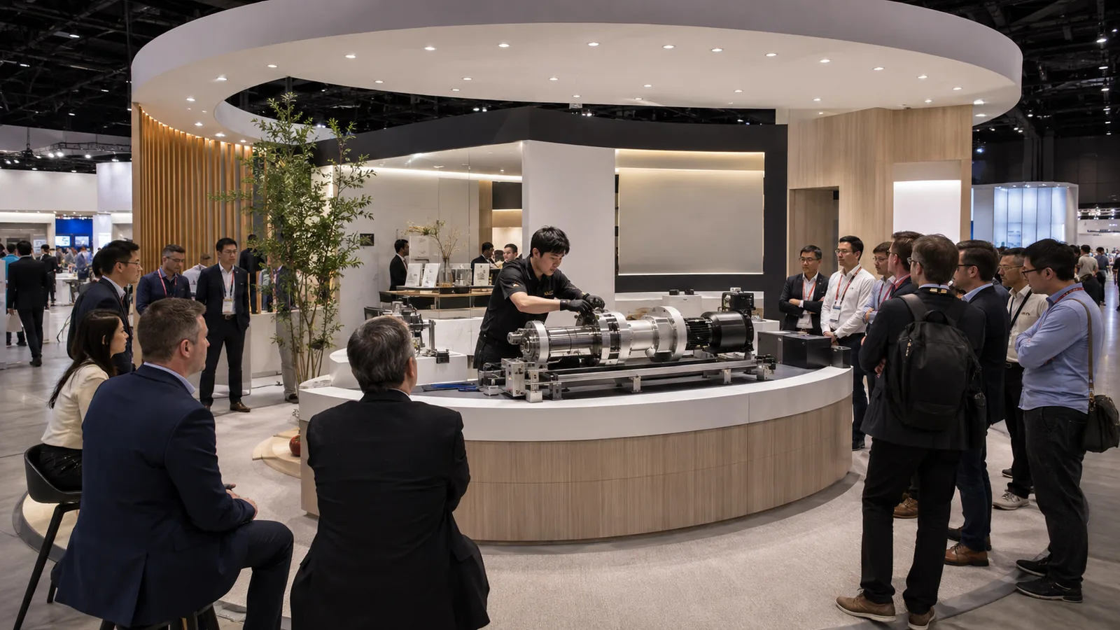
For a machine, that may mean safe viewing lines, operator access, power, and room for components. For software, it may mean a short guided workflow instead of a wall of dashboards. For a consumer product, sampling, comparison, or hands-on use may need to pull visitors into the space without blocking the aisle.
Design the demonstration as a sequence:
- What can a visitor understand in five seconds from the aisle?
- What action reveals the main difference?
- What proof supports the claim?
- Where does the deeper conversation happen?
A demonstration should shorten the explanation, not create another layer of explanation. If it needs constant troubleshooting, hides behind a crowd, or cannot operate under show conditions, a simpler physical sample or guided presentation may work better.
4. Digital Technology With a Specific Assignment
AI tools, interactive screens, sensors, projection, augmented reality, and real-time content can all support a booth. None of them is a strategy by itself.
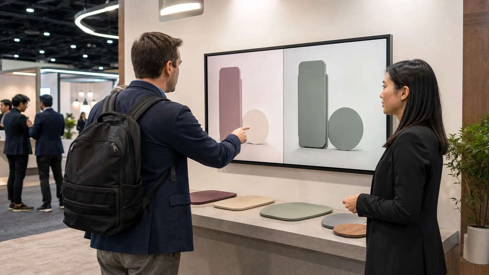
Give the technology one clear assignment. It might help visitors find the right product, visualize a configuration, compare performance, translate a technical concept, or save a personalized takeaway. Then decide what the visitor does, what the booth staff learns, and what happens when the device is unavailable.
This prevents a common failure: a large screen plays a beautiful loop while the product and staff wait for attention. Motion can stop someone, but the next step must be obvious. A visitor should not need instructions just to discover why the experience matters.
Keep the fallback visible. Static graphics, physical samples, and a trained explanation still need to carry the core story if the network, software, or hardware fails. Technology is worth the budget when it makes a difficult idea easier to understand or a useful interaction easier to complete.
5. One Booth, Several Conversation Speeds
Not every visitor needs the same path. Some people need a quick answer before their next appointment. Others want a detailed demonstration. A smaller group may be ready for a private technical or commercial discussion.
Zone-based design supports these different speeds without turning the booth into a maze. An effective plan might place a clear message and fast product touchpoint near the aisle, a deeper demonstration just inside, and a quieter conversation area farther from the main flow.
The zones do not need walls. Changes in flooring, lighting, counter height, furniture orientation, or overhead cues can tell visitors what each area is for. Staff positions should reinforce the same path.
The danger is over-zoning. A compact booth divided into reception, theater, lounge, demo, storage, and hospitality areas may leave no area working properly. Protect clear circulation and give priority to the two visitor behaviors that matter most.
6. Hospitality That Supports Business Instead of Hiding It
Comfort is returning to booth design, but the best hospitality areas are not detached lounges. They are connected to a reason for the visitor to stay.
A standing rail beside a demonstration can support a short technical exchange. A small seated table may help a team review a sample or drawing. A semi-private area can make a scheduled conversation easier without closing the booth behind opaque walls.
Choose furniture by conversation length and task. Soft seating encourages longer stays but consumes space and can slow turnover. Café-height tables support faster discussions but may exclude some visitors. A mixed-height plan can serve more people if the route and clear floor space remain open. For meeting zones with different conversation lengths, compare trade show rental furniture against chair clearance and accessible routes before fixing the floor plan.
Do not let hospitality become the most prominent visual message. Visitors should understand what your company offers before they understand that coffee is available.
7. Fewer Messages, Stronger Recognition From the Aisle
The show floor is crowded with light, motion, sound, and competing claims. Adding more messages rarely solves that problem. A stronger current direction is to make one idea recognizable at aisle speed, then reveal supporting detail as the visitor moves closer.
This may use a dimensional logo, a bold silhouette, controlled lighting, one large product image, or a short statement with real meaning. The choice depends on the viewing distance and the neighboring booths, not on a generic style board.
Test the design at three distances:
- From across the aisle: can visitors identify the brand and category?
- At the edge of the booth: can they understand the main reason to enter?
- Inside the booth: can they find the proof, product, or specialist they need?
This trend requires editing. If every business unit demands equal space on the highest wall, hierarchy disappears. Keep secondary messages where interested visitors can discover them instead of forcing everyone to process them at once.
8. Accessibility Designed Before the Floor Plan Is Approved
Accessibility is more than leaving a gap between counters at the end of design. It affects routes, turning space, thresholds, counter and control positions, seating choices, captions, audio, color contrast, and how a visitor reaches the same information or activity as everyone else.
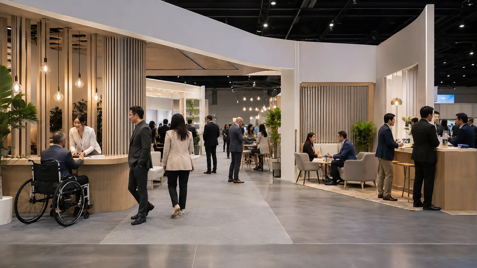
Begin by tracing a complete visitor path. Can someone enter, approach the key demonstration, use or understand the content, speak with staff, and leave without meeting an avoidable barrier? Check physical and digital interactions together. A touchscreen may be visually impressive but still fail if controls are out of reach, instructions depend on sound alone, or the interface is difficult to read.
Accessibility can also improve the experience for visitors carrying bags, managing fatigue, reading in a second language, or trying to hear in a noisy hall. Clear routes and understandable controls reduce friction for everyone.
Use the current exhibitor manual, venue information, applicable standards, and qualified guidance to verify the final plan. A general design article cannot determine compliance for a particular booth or event.
How to Decide Which Trends Belong in Your Booth?
Do not ask your design team to “use the latest trends.” Give each idea a business test.
| Your situation | Trend to consider | What to verify before approval | Warning sign |
|---|---|---|---|
| You exhibit at several shows with different footprints | Modular, multi-show architecture | Real layouts for each footprint, component reuse, packing, repair, and storage | Only the largest version has been designed |
| Your company has a sustainability commitment | Circular, reusable construction | Component list, reuse count assumptions, replaceable graphics, end-of-life route | The proposal relies on natural-looking finishes and vague claims |
| Your product needs proof | Demonstration-centered layout | Safety, utilities, reset time, sightlines, staffing, and a fallback | The demo is hidden or needs a long explanation |
| Visitors need help choosing among products | Assigned digital interaction | The exact visitor action, data captured, staff handoff, and offline mode | Technology exists mainly to create motion |
| Your booth serves both quick visitors and scheduled meetings | Multiple conversation speeds | Two priority visitor paths, circulation, staffing, and acoustic needs | Too many zones compete for limited space |
| Your message gets lost on busy floors | Aisle-speed brand hierarchy | Viewing distances, neighboring visual noise, one main claim, legibility | Every product and department appears at the same level |
| You want more visitors to use the experience comfortably | Accessibility-first planning | Routes, reach, seating, captions, contrast, controls, and equivalent access | Accessibility is left for a final compliance check |
Select no more than two or three trends as design priorities. Other ideas can support them, but they should not compete for equal attention.
Turn the Selected Trends Into a Design Brief
A useful brief connects inspiration to real constraints. Before concept work begins, prepare:
- the show, city, dates, booth number, footprint, and floor plan;
- the booth's single most important job;
- the primary visitor and the action you want that person to take;
- products, samples, equipment, demonstrations, and required utilities;
- fast conversations, deeper demonstrations, and scheduled meeting needs;
- brand files and the one message that must be readable from the aisle;
- accessibility, captioning, language, and visitor-support needs;
- reusable assets, planned future shows, storage, and repair expectations;
- the exhibitor manual, approval deadlines, and third-party service scope;
- the working budget and the features that may be removed first.
This brief gives a designer a better starting point than a folder of attractive trade show booth ideas. It explains what the space must accomplish and where a trend has to earn its place.
Frequently Asked Questions
Do current booth design trends only work in large island exhibits?
No. A 10-by-10 or 10-by-20 booth can use the same principles at a smaller scale. A compact space may benefit most from one clear aisle message, a focused demonstration, accessible circulation, and graphics that can be reused. Large structures create more options, but they also create more places for the message and visitor path to break down.
Should we redesign an existing booth or adapt what we already own?
Inventory the current components before deciding. Record their dimensions, condition, packing method, graphic attachment points, and which booth sizes they can support. Keep the parts that still serve the new visitor path. Replace or reconfigure the parts that block the demonstration, message hierarchy, accessibility, or reuse plan. A trend does not justify discarding a useful structure.
How should we divide budget between structure and interactive technology?
Fund the reliable physical experience first: safe structure, clear graphics, lighting, product presentation, utilities, storage, and circulation. Add interactive technology only after its task and operating conditions are defined. Include content creation, testing, hardware, network needs, staff training, and an offline fallback in the technology budget rather than pricing the screen alone.
How can we tell whether a booth trend worked after the show?
Choose a measure that matches the feature. For a demonstration, track completed demos and qualified follow-up requests. For a zone-based plan, record where congestion occurred and which areas supported useful conversations. For a digital selector, compare starts, completions, saved results, and staff handoffs. Pair counts with staff observations so the next design change responds to behavior, not just traffic.
Final Thoughts
The best trade show booth design trends for 2026 are not shortcuts to looking modern. They are practical ways to make the booth easier to understand, use, adapt, and run.
Choose your booth's main job first. Then select two or three trends that improve that job under real show conditions. If you are preparing a new concept, bring your floor plan, products, visitor goal, demonstrations, reuse plan, exhibitor manual, and budget to the first conversation. KingExhibits can help you compare those constraints against a practical design direction and identify which trends deserve your space and budget. The goal is not to force all eight ideas into your booth; it is to move from an attractive rendering to a workable show-floor experience.