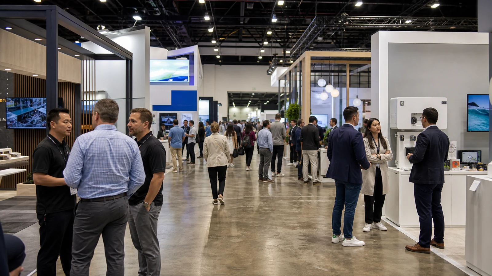
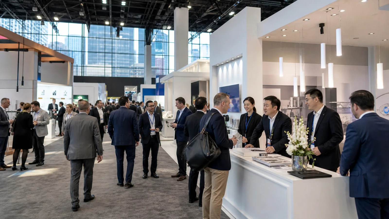
A 3D trade show booth rendering can make almost any concept look spacious. The camera floats above eye level, neighboring exhibits disappear, storage doors stay closed, and no visitors stand in front of the product. The real booth will not enjoy those conditions.
Use three-dimensional design to make the exhibit work from actual aisles and at human scale. The ideas below show how height, depth, structure, and sightlines can help a B2B buyer recognize the offer, find the proof, and move into the right conversation. Each one also includes the condition that can make it fail.
First decide what the third dimension must do
Before adding shapes, choose the job:

- Be recognized from a distance: use height or an overhead element to identify the booth.
- Explain the offer from the aisle: use layered planes to reveal a message, product, and proof in order.
- Make a product understandable: expose important sides, scale, access, or operating movement.
- Create different conversation conditions: use volume and enclosure to separate quick viewing, demonstration, and meetings.
- Hide operation without hiding the brand: use a service core or storage wall that also organizes the visitor-facing space.
- Guide movement: use openings, lighting, floor direction, and orientation rather than barriers or arrows alone.
If the concept cannot name the job, the added volume is probably decoration. Decoration can be worthwhile, but it should not consume the height, floor area, freight, labor, or budget needed for the selling work.
1. Use an overhead marker as orientation, not just branding
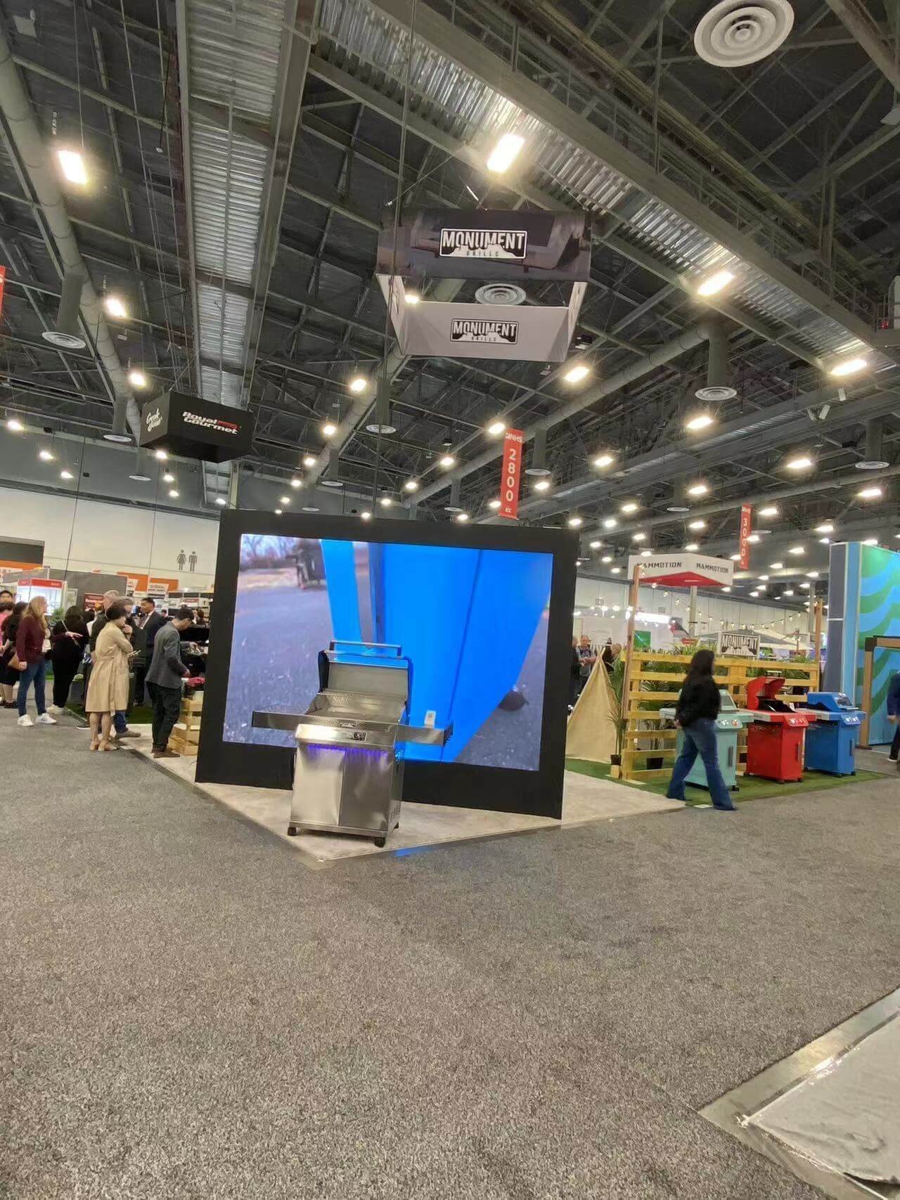
A hanging sign, suspended frame, or high architectural element can help visitors find the booth across a large hall. Its useful job is orientation: identify the brand or product zone before the lower booth is visible.
Keep the high message short. A logo, product category, or one recognizable problem can work; a paragraph cannot. Check how it reads from the main attendee approach, not only from the render's front view.
This idea fails when the overhead piece competes with the booth below or hangs over a different zone than the one it names. It also depends on show-specific height, setback, rigging, and submission rules. Do not release it until those conditions and the rigging quote are confirmed. For a proposed overhead feature, compare a truss trade show display only after its location, structure and rigging quote are defined.
2. Build a layered aisle view
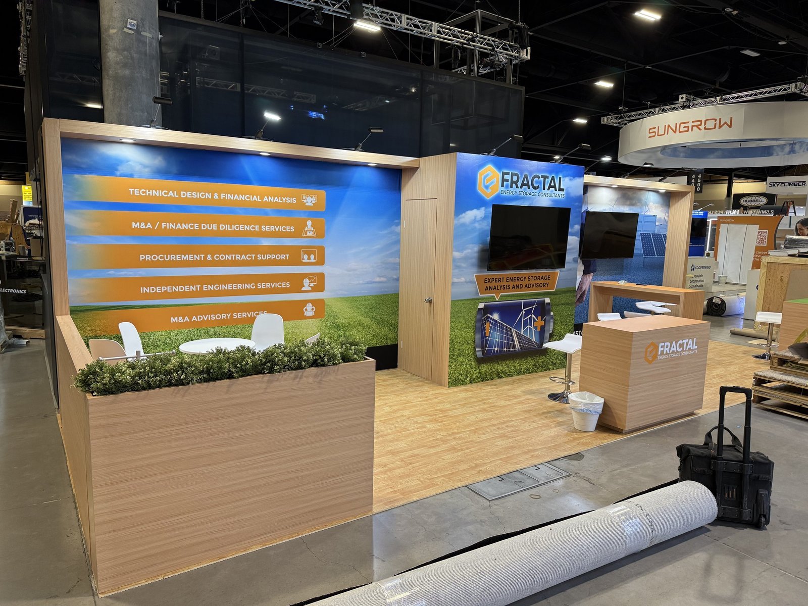
Instead of placing every message on one back wall, use three depths: a short recognition message at the edge, a product or proof element several feet inside, and a deeper consultation or meeting layer.
The first layer answers “Is this for me?” The second gives a reason to enter. The third supports a longer conversation. The layers should remain visually connected so the booth does not look like unrelated rooms.
Test the view with people standing at the edge. A pedestal, screen, plant, or visitor can easily block the second layer. If the product disappears whenever two people talk, move it, raise it safely, or create another view angle.
3. Turn the product into a three-sided hero
For equipment, components, furniture, assemblies, or other physical products, a central or offset product island can reveal more than a wall display. Buyers can see operating sides, access panels, connections, finish, and scale.
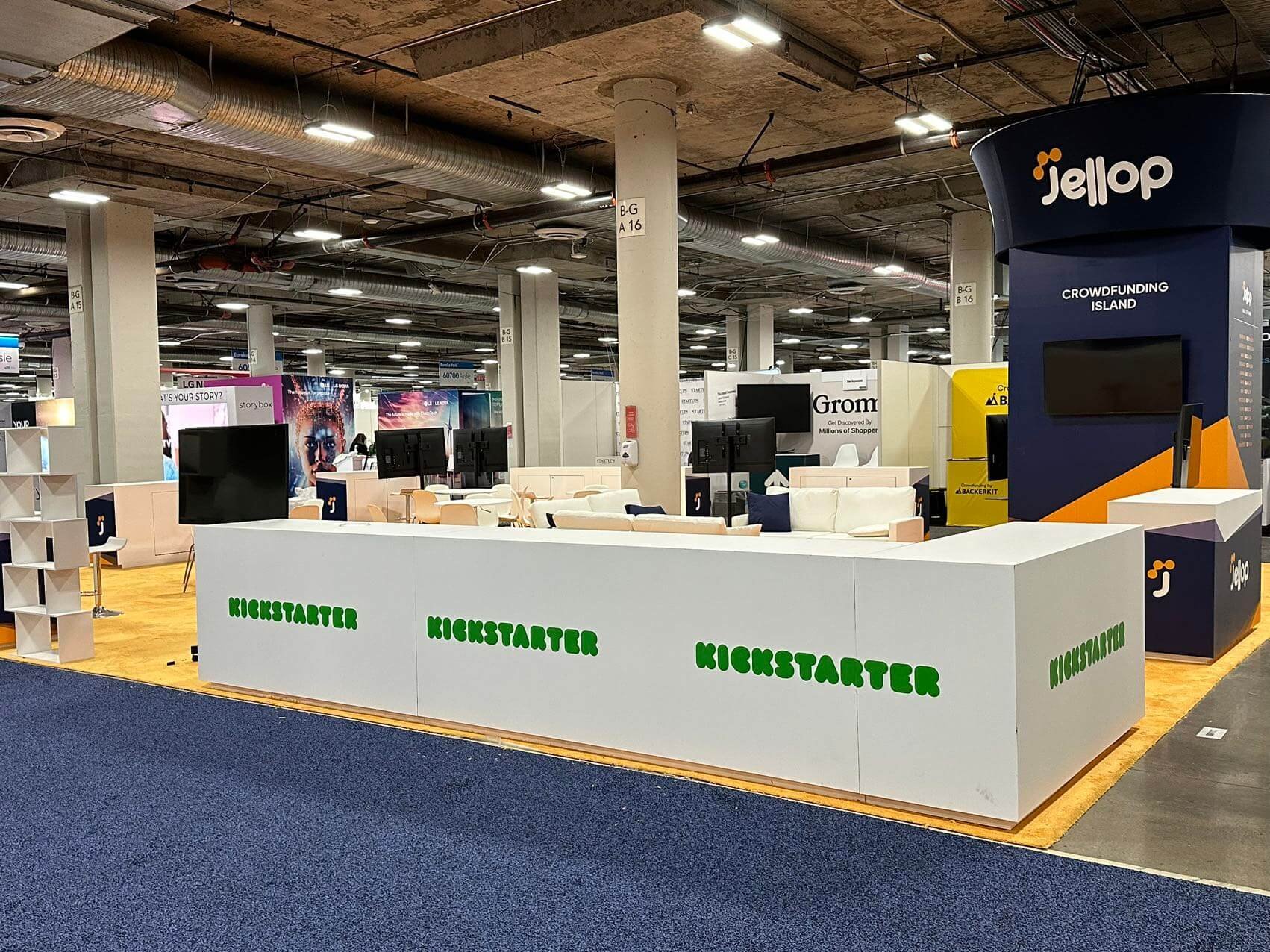
Do not center the product by habit. Place the most important view toward the strongest approach and keep the service or operator side accessible. Mark doors, moving parts, demonstration boundaries, cable paths, and the space staff need to explain it.
This idea fails when “visibility from all sides” creates no safe working side, or when the product blocks entry into a small booth. Use the actual product envelope—including open doors and operator movement—in the model.
4. Use a demonstration frame that explains where to look
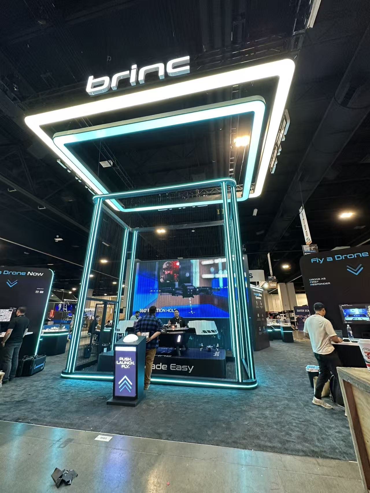
A frame, canopy, lighting plane, or partial enclosure can make a live demonstration legible. It tells visitors where the action happens and helps contain screens, lights, cameras, tools, and supporting graphics.
The structure should support the sequence: waiting, viewing, participating, then talking. Keep spectators and queues inside the booth footprint. If people naturally stand in the aisle to see the result, the 3D form has designed a traffic problem.
Avoid building a solid theater around a product that needs spontaneous short conversations. Enclosure improves focus but reduces visibility and makes entry feel like a commitment. Use the amount of enclosure that fits the demo duration.
5. Create a service spine that works from both sides
A thick wall or central spine can carry graphics and products on the public side while holding storage, electrical distribution, staff supplies, and small equipment on the service side. In a larger island, it can also separate two product stories without building two unrelated booths. If the assigned island is 40 × 40, compare the 40×40 trade show booth rental layout for a central spine, product zones and access from all four aisles.
Design the spine from the inside out. Inventory coats, bags, literature, tools, waste, cases, chargers, cleaning supplies, and daily product stock. Show door swings and the person using them.
This idea fails when the spine becomes too wide, creates a blind corridor, or leaves no place to open a door during peak traffic. It also needs coordinated access to floor power or overhead feeds.
6. Frame entrances without creating a gate
Portals and vertical frames can make an open booth feel intentional. They can identify product zones, hold lighting, and create depth as visitors see one frame through another.
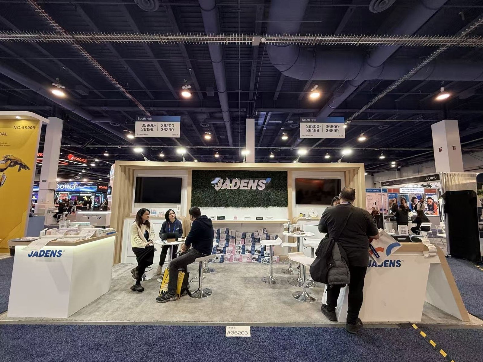
Keep the main opening wider than the render suggests. People rarely enter one at a time in the center. They approach from angles, pause, turn to colleagues, and avoid spaces that feel controlled by a greeter.
A low crossbar, narrow opening, or dramatic tunnel can reduce access and hide activity. Test every open side from both directions. The frame should invite movement, not require visitors to guess where permission begins.
7. Use translucent layers to show activity without exposing everything
Mesh, slats, perforated panels, fluted materials, and translucent graphics can define a meeting or demonstration zone while allowing light and movement to remain visible. This can give a booth depth without creating a solid box.
Choose the material by viewing distance and camera behavior, not only by a small sample. Fine patterns may produce visual interference on video; backlighting may reveal structure or people more clearly than expected.
Privacy is partial. Do not use a translucent wall for confidential discussion unless the visual and acoustic conditions have been tested. It is a spatial filter, not a private room.
8. Stack proof vertically
When product range is broad, use height to organize evidence rather than hanging more slogans. Put hands-on samples at reachable level, detailed proof where staff can point to it, and family or category identification higher up.
The stack should follow the conversation. A buyer first identifies the category, then inspects the relevant sample, then reads or receives the technical detail. Avoid mounting the most important sample where it can be seen but not handled.
Check reach, glare, label size, replacement, and how staff retrieve samples without climbing or blocking visitors. A vertical library is useful only if daily operation is safe and simple.
9. Carve a semi-private meeting pocket from open space
Use an L-shaped screen, offset wall, planter-height divider, or change in ceiling and lighting to create a quieter meeting edge without closing a room. The goal is to reduce visual distraction while keeping the area easy to enter and easy for staff to monitor.
Place the opening away from the noisiest demonstration and direct sightlines toward a calm surface. Include the real number of chairs, table clearance, bags, devices, and one person joining late.
This idea fails when “semi-private” is treated as acoustically private. If pricing, regulated information, drawings, or sensitive account issues will be discussed, plan an appropriate room or move the meeting off the floor.
10. Use the ceiling plane to connect separate zones
A repeated overhead frame, lighting line, or ceiling feature can make several product areas feel like one exhibit. It can guide the eye from a recognition point to demonstration and meeting zones without filling the floor with walls.
The ceiling concept must coordinate with lights, sprinkler and detector conditions, covered-booth rules, rigging locations, HVAC comfort, and the view of the hanging sign. A beautiful top plane that forces last-minute safety changes is not complete design.
Where overhead suspension is not available, a ground-supported frame may create a similar visual effect. That alternative adds columns, base plates, ballast, and freight, so compare the whole scope rather than only the rigging line item.
11. Use a change in floor level only when it earns the risk
A raised platform can create cable space, level equipment, define a premium zone, or support a special finish. A recessed or flush transition is usually easier for visitors, but not every venue or booth system allows it.
Do not add a platform merely to make the render look architectural. A level change affects accessible entry, edges, ramps, product movement, trip risk, hand trucks, cleaning, and installation time. Include the full transition in every visitor view.
If the only benefit is color separation, flooring material, lighting, or ceiling treatment may do the job with less operational cost.
12. Create one deliberate reveal
A partial wall, angled plane, curtain, or nested volume can hide part of a product until the visitor changes position. A reveal works well for a before-and-after comparison, internal component, prototype, or story that benefits from sequence.
Give the buyer a reason to move. The visible first element should pose a relevant question or show enough evidence to make the hidden part worth seeing.
This idea fails when the main offer is hidden from everyone who does not enter. Do not make mystery the price of basic understanding. The reveal should deepen the story, not conceal what the company sells.
Use the 3D model as an operating test
A useful model should allow review from real positions, not only from selected marketing-camera angles.
Request views from:
- each open aisle at adult eye level;
- the main approach from both directions;
- directly behind a small group standing at the edge;
- inside each demonstration and meeting area;
- the staff position behind a counter or product;
- the door of every storage and service area;
- a seated visitor's position;
- the location of critical graphics, screens, samples, and products after people are added.
Ask for dimensions on the same drawings: aisle-facing openings, clear circulation, product envelope, counter depth, door swing, reach height, screen viewing distance, and the space between chairs. Perspective images alone cannot verify those conditions. For the review that connects those clearances with equipment and build details, use 3D exhibit design and engineering before approving the visual concept.
Add people who behave like real visitors
Rendering people are often placed to make the booth look busy without blocking anything. Replace them with operating scenarios:
- two visitors stop at the aisle while a third enters;
- six people watch the demo and two wait;
- a staff member opens storage while a conversation continues;
- one customer sits and another joins the meeting;
- the product door is open and the operator steps back;
- a mobility-device user approaches the key experience;
- staff replenish samples during show hours.
Look for blocked messages, trapped staff, blind corners, crossed cable routes, crowding, and entrances that disappear. The goal is not to make the render attractive. It is to expose problems while they are still cheap to change.
Review the model with the service plan
The 3D structure depends on systems the image may hide:
- power source and cable route;
- data connection and equipment cabinet;
- rigging point and sign suspension;
- lighting instruments, focus, and heat;
- plumbing, compressed air, drainage, or ventilation;
- product loading and removal path;
- crate, case, and empty-container plan;
- fire equipment, egress, and inspection access;
- daily cleaning, waste, consumables, and repair access.
Overlay these items before approving the visual form. If a wall covers a floor port, a light requires an unavailable rig point, or a machine cannot turn through the planned opening, the model is showing an unbuildable booth.
Know which idea belongs in which booth size
| Booth condition | Ideas that often fit | Watch first |
|---|---|---|
| 10×10 inline | Layered aisle view, vertical proof, one framed product moment | Do not narrow the only open side or add furniture that blocks entry |
| 10×20 or 10×30 inline | Product hero, shallow service wall, one demo frame, semi-private rear conversation | Respect sidewall and height rules; keep long frontage understandable |
| 20×20 island | Overhead marker, central spine, multiple approaches, semi-private pocket | Each open side needs a reason to enter; avoid a solid central block |
| 20×30 or larger island | Connected ceiling plane, multiple proof zones, service core, deliberate reveal | Plan staff, queues, sightlines, utilities, and wayfinding as one system |
| Peninsula or split open-side condition | Directional frames, offset product, layered depth | Confirm which sides are genuinely open and how neighboring booths affect views |
These are planning tendencies, not permission. The current show rules and approved booth type control what can be built.
Frequently Asked Questions
How should we compare two 3D booth concepts fairly?
Put both concepts under the same conditions: footprint, open sides, product count, storage, meeting capacity, demonstration requirement, service needs, reusable inventory, and working budget. Then review both from the same eye-level aisle positions. One concept should not win because it hides its operational requirements or receives a more dramatic camera and lighting treatment. On a confirmed 50 × 50 assignment, test both concepts against the 50×50 trade show booth rental plan for entrances, scheduled presentations and support areas.
Are curved or angled 3D features harder to reuse?
They can be, especially when the shape depends on one footprint, creates oversized packing, or requires custom infill at every show. Ask which parts are standard inventory, which are show-specific, how they pack, and how the geometry changes in a smaller or differently oriented space. A reusable frame with replaceable infill may preserve the visual idea better than rebuilding the whole form.
Can we approve the booth before the exact space is assigned?
You can develop a modular direction, but mark orientation, open sides, height, columns, utilities, rigging, and neighboring conditions as unresolved. Do not release location-dependent graphics or structure until the actual space and rules are confirmed.
How accurate do materials and colors need to be in the render?
Accurate enough to make a purchasing decision, but not at the expense of unresolved layout. Mark whether a surface is paint, laminate, fabric graphic, lightbox, printed film, rental system, or illustrative placeholder. Physical samples and print proofs—not screen color alone—should approve critical finishes.
Who should join the final 3D design review?
Include the marketing owner, exhibit partner, product or demo owner, and the person responsible for show services and logistics. Add sales, accessibility, safety, IT, or engineering reviewers when the concept depends on their decisions. Keep one person accountable for resolving conflicts and recording approvals.
Approve the booth from the aisle, not from the camera
Select two or three ideas that each perform a named job. Put them into the real footprint with products, people, doors, utilities, and neighboring masses. Then walk the model from the buyer's likely approach and from the staff's working positions.
The best 3D trade show booth design is not the one with the most shapes. It is the one where the third dimension makes the offer easier to see, the product easier to understand, and the next conversation easier to begin. Before production, check every selected feature against the current trade show booth design process and event rules.