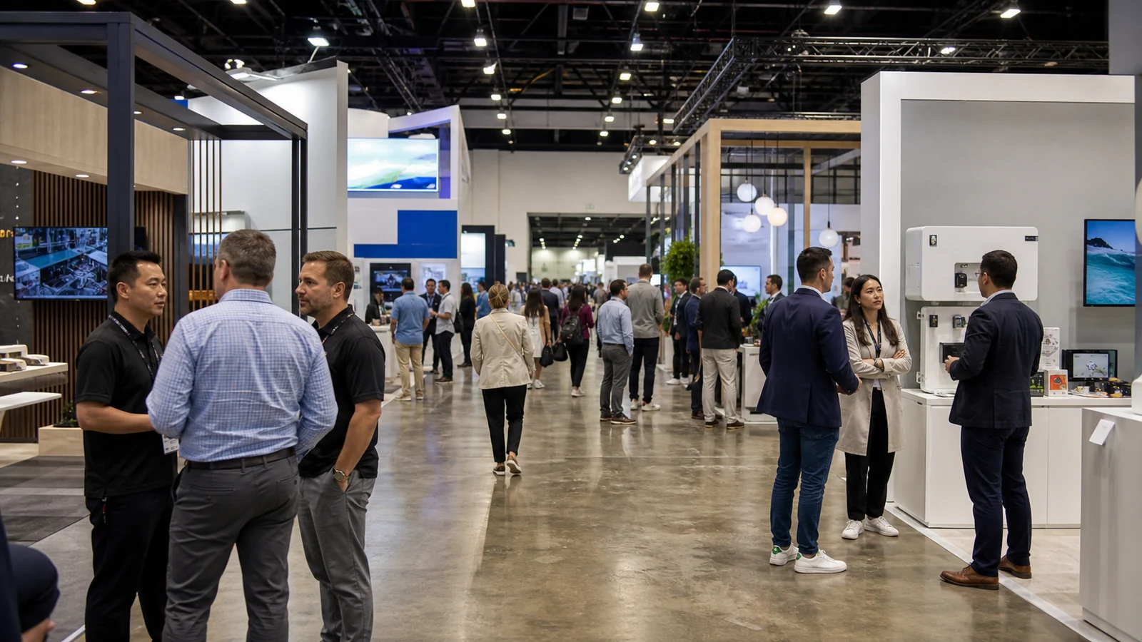
Your booth rendering looks clear until you add a sample counter, a screen and two people. Now the product message is behind someone’s shoulder, and the extra banner is in the entrance. For a small booth, a useful sign has to survive that crowded view.
These trade show signage ideas show how to use a backwall, counter and a few carefully chosen signs in a 10×10 or 10×20-foot exhibit. Each gives visitors something specific to notice, compare or ask about. Choose the ones that support your demonstration; you do not need the whole list.
1. Pair a Product Close-Up With a Plain-English Headline
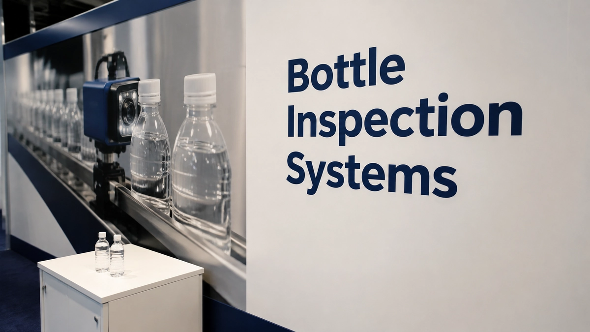
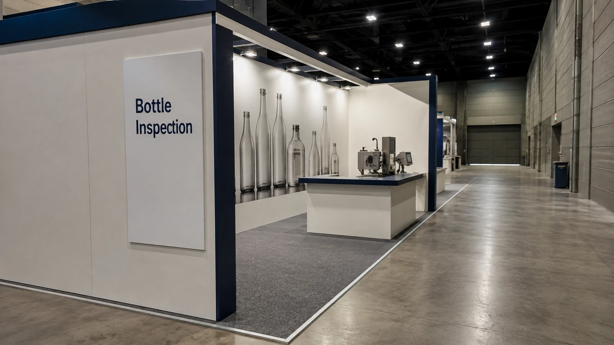
Use the backwall to show one recognizable product or application, with a headline that explains what your company sells. For example, “Bottle Inspection Systems” could sit beside a close-up of a bottle passing through the inspection station. The photo shows the application, while the headline makes clear that you sell inspection equipment.
Within the approved backwall height, leave a clear area around the headline and position it above likely obstructions from the counter and staff. The company logo can sit alongside it without consuming the entire wall. If you need several photos to explain the product, move those to a closer reading position instead of making the headline smaller.
This is the first sign to resolve when your brand is unfamiliar to the audience. A clever slogan cannot help visitors choose your booth if they still do not know what you sell.
2. Use a Question Panel to Introduce the Demonstration
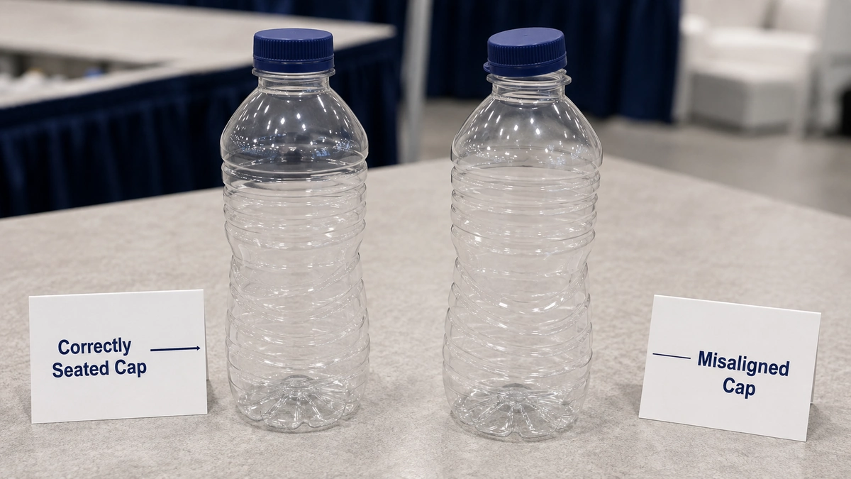
Beside the demonstration, place a short question your customer can answer by looking at the product. “Would Your Line Catch This Cap?” could sit above two sample bottles, one with a deliberately misaligned cap. Use a defect your equipment can actually identify, and label the bottles as demonstration samples.
The question belongs next to the samples, where visitors can see the answer, rather than on a distant wall with no explanation. Keep the product category visible elsewhere so the question does not turn the booth into a guessing game.
A small printed panel attached to the display can do this job. Adding a floor stand is hard to justify if it puts a base where people need to gather around the demonstration.
3. Build a Labeled Comparison Strip Along the Samples
If your samples look alike, make the differences visible with a narrow strip behind or beside them. Label the actual distinction: “Correctly Seated Cap” and “Misaligned Cap,” for example, with a short pointer to the relevant feature. Visitors can compare the objects without waiting for a salesperson to explain which is which.
Keep each label beside the sample it describes. A neat row of cards is little use if staff rearrange the bottles and leave the labels behind. Matching sample identifiers on the objects and cards help the team reset the display after a conversation.
Use color to reinforce those identifiers, but keep the words too. This sign is for close inspection, so it can carry a brief explanation that would be wasted on an aisle-facing banner. Save the full specification table for a handout or follow-up document.
4. Turn the Demo Into a Short Numbered Sequence
For a process that is difficult to follow, place small numbered signs at the points the visitor should watch. An inspection demonstration could use “1. Feed the Bottle,” “2. Check the Cap” and “3. Separate the Reject.” Use the real operating sequence and make clear which actions are performed by staff.
Position the signs where they do not obscure the moving part or display. Someone should be able to connect each number with the action immediately below or beside it. Three numbers printed in a corner of the backwall would lose that connection.
This approach earns its space when staff repeatedly explain the same sequence. For a product whose operation is obvious at a glance, a single label may be enough; numbered signs would only add clutter.
5. Make the Counter an Invitation to Look Closer
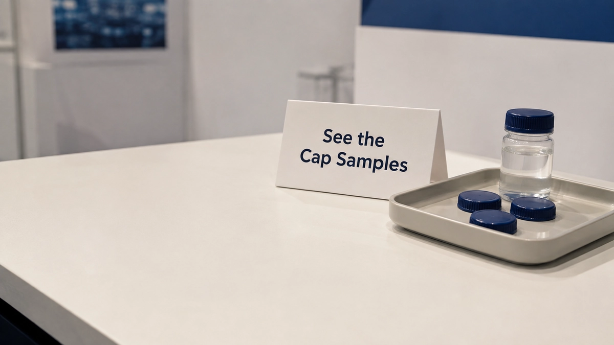
A short counter-front message such as “See the Cap Samples” can tell a nearby visitor what is available. Repeat that invitation on a small tabletop tent if people routinely stand in front of the counter graphic. A two-sided tent can serve visitors approaching from either side without adding another floor fixture.
Give the tent a purpose beyond repeating the logo. It might identify the sample tray or invite visitors to bring over a particular container for discussion. Keep it beside that activity, leaving room for the samples and the visitor’s hands.
6. Put a Product Silhouette on an Existing Wall
A flat graphic cut to the outline of your product can break up a rectangular wall without taking the space of a freestanding display. For a compact machine, use a clear side profile with a small number of callouts pointing to visible parts. For a tiny component, an enlarged outline can make its shape recognizable before visitors inspect the actual sample.
Keep the silhouette within the permitted wall area and have the exhibit supplier confirm how it will attach. If the graphic enlarges a product, identify the real dimensions nearby so visitors do not confuse the illustration with a life-size representation.
Choose this idea when shape tells the story. If the advantage is hidden software or an internal process, a product outline may be decoration; the numbered demonstration or a screen will explain more.
7. Face a Short Message Toward the Approach
Your main backwall may be easy to read from across the aisle and almost invisible to someone walking alongside the booth. A small message on an approved side-facing surface can introduce the offer before the visitor reaches the entrance. A corner booth with an open side is an obvious place to investigate this option.
Use a brief category such as “Bottle Inspection,” with an arrow only when its direction clearly points to the demonstration. Check both approaches on the floor plan: the reverse face of the sign may point toward a neighboring booth instead of your audience.
Keep the sign, its support and any projecting edge inside your contracted space. Ask the show team whether its height and position are allowed. Do not solve a difficult viewing angle by assuming that a small inline booth can hang a sign overhead: IAAPA Expo's current display rules expressly prohibit hanging signs in linear booths. Your own event’s manual decides what you can install.
8. Use a Replaceable Message Panel for Each Show
Keep the permanent product identity on your main wall and put changing information on a separate insert: the featured model, a demonstration time or a message for that show’s audience. A card held in a suitable slot or a removable panel can update that information without turning the entire backwall into a disposable event announcement.
Place the insert next to the product it describes. If you change it during the day, make one team member responsible for keeping the sign and the actual demonstration consistent. A printed schedule is worse than no schedule if visitors arrive for a session that is not happening.
A retractable banner, also called a roll-up banner, can carry the changing message when there is no suitable surface. Measure its base on the plan before ordering it. If the banner duplicates the wall or crowds the entrance, use the smaller insert instead.
9. Light One Product Image, or Show One Action on Screen
A backlit graphic can give one product image a clear place on a visually busy wall. Ask for a lightbox that fits the planned structure, and review the graphic with its intended illumination. Keep small print away from bright, busy areas of the image. The point is to make the product easy to recognize, not to light every surface.
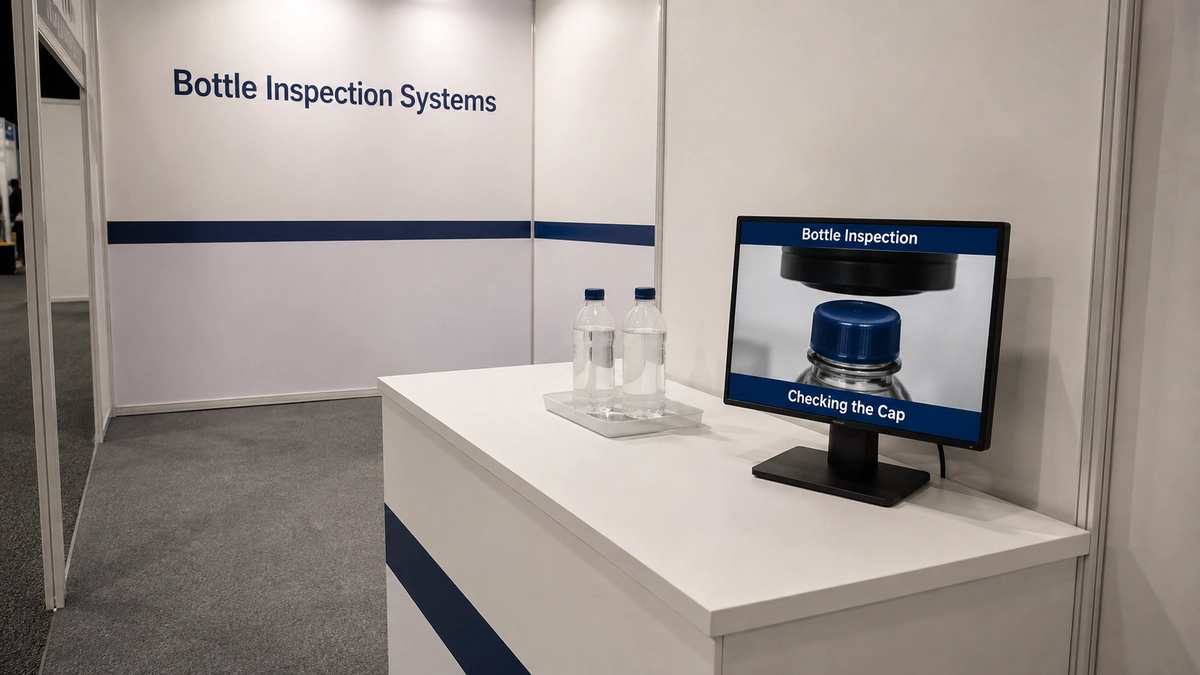
Choose digital signage—a screen with a captioned demonstration—instead when movement explains something a still image cannot: a camera inspecting a passing bottle, for instance. Keep the product name visible and caption the action so someone arriving halfway through can understand it without sound. Position the screen beside the demonstration, not where a viewer must stand in the entrance to watch.
Either choice needs a confirmed power location and room for the equipment and cable route. If a printed image already explains the offer, spend the effort on a better image and readable text before adding electronics. Keep the main printed product message visible even while the screen is being used for a sales conversation.
10. Offer a Specific Takeaway on a Small QR Sign
Put a QR sign where visitors have already stopped: beside the relevant sample or at the end of the demonstration. Explain the destination with a message such as “Get the Bottle Size Guide.” That gives the visitor a reason to scan and tells your team which document the person expects.
The page should open the promised resource on a phone. If it requires a form, say so before the scan. Test the actual printed code on several phones from the position where people will use it; a code that works when held in your hand may be awkward on a wall behind a counter.
Keep a non-scan option available, such as a printed copy or a staff-assisted follow-up. Do not make a QR code the only way to identify a sample or understand what the booth sells.
Choose a Small Set That Works Together
For a 10×10-foot booth, start with the product headline and image, labels for the samples, and a takeaway sign at the counter. If the product needs explanation, add either the question panel or the numbered sequence. These are starting concepts, not a required sign package.
In a 10×20-foot booth, the extra wall length may let you separate the product identity from the demonstration message. Use that room to keep each message clear before adding another freestanding banner. An extra sign should reach a different viewing position or answer a different question.
Before approving the layout, place people in the drawing at the demonstration and counter. Check what remains readable from both aisle approaches. This is where a smaller, better-positioned sign can prove more useful than a larger panel behind the crowd.
Check Letter Height Before Sending the Artwork to Print
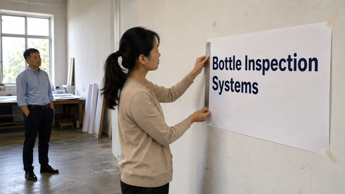
Print the headline at its finished size and view it from the intended distance and angle. Measure the visible letters rather than relying only on the point-size setting in the design file. Test contrast and glare with the intended material if possible. If an unfamiliar reader struggles, shorten the message or give it more space before squeezing the letters closer together.
Finally, put the approved wording into the actual supplier’s graphic template. Check visible edges, folds and panel joins so they do not cut through a word or product feature. Use your own printer’s current specifications for the final file.
Frequently Asked Questions
Can We Attach Signs to the Rental Booth Walls?
Ask the rental supplier which surfaces and fasteners are permitted before specifying adhesive graphics, screws or clamps. Include the sign’s material and weight in that request. A removable label on one wall system may damage another finish. For supplied pipe and drape, get explicit permission and a suitable attachment method instead of treating the fabric as a mounting surface.
Can We Replace the Graphics Without Buying a New Frame?
Ask the original supplier to identify the frame model and confirm the replacement graphic template and attachment method. Do not order from a “10×10 display” label alone; that label does not identify the frame model or printable area. Send the current frame details and proposed artwork for confirmation before printing. If the supplier cannot confirm the fit, resolve that uncertainty before committing to the replacement.
Should We Add Floor Graphics in a Small Booth?
Use them only for a close-range cue that still makes sense when partly covered, such as marking where a visitor should stand for a demonstration. Keep essential product information above the floor. Confirm the permitted floor material, adhesive and removal method with the show or venue before ordering; a general-purpose sticker is not an appropriate substitute for an approved floor graphic.
How Do We Fit Two Languages on the Signs?
Choose the main language for the expected audience, then identify which short labels genuinely need both. Pairing two versions of a product identifier can be useful; duplicating a full paragraph on a small sign usually forces both versions to shrink. Put longer explanations in separate handouts or a mobile resource and have a fluent reviewer check the printed line breaks as well as the translation.
Final Thoughts
For each sign you keep, identify where visitors will read it and the question it answers. Send those notes, your booth plan, and your sample list to KingExhibits. We can help position signs around your demonstration area and the routes visitors use to approach the booth. Before approving the design, check that key messages will remain visible when people gather.
230 container
231